

Dr. Mike's Essentials — Monogram & Logo Design
Project description
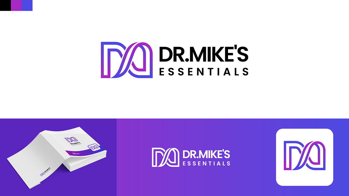
Here is a brand identity concept for Dr. Mike's Essentials.The core of the design is a custom monogram that weaves together the letters D, M, and E into a continuous, overlapping ribbon-like structure. The goal was to create a mark that feels fluid yet structured.I paired the icon with a clean, uppercase sans-serif typeface and used a vibrant purple-to-blue gradient to bring a fresh, modern energy to the identity.I've also shared how the logo translates to stationery and a solid white application. Would love to hear your thoughts on this concept!
Support this project
Be the first to upvote