

Logo Design & App Icon: immeble
Project description
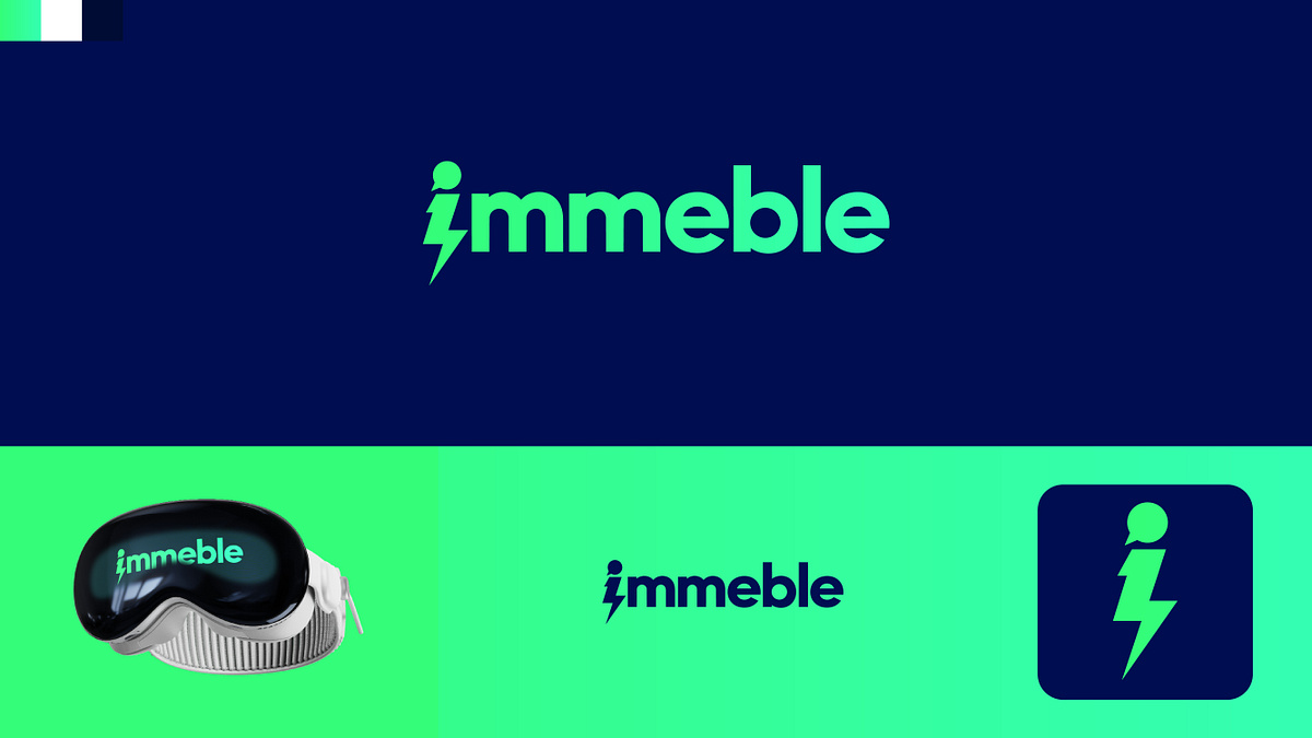
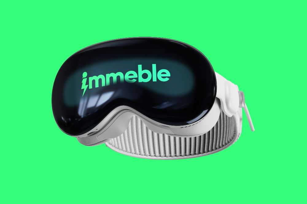
Hey everyone,Here is a brand identity concept I recently designed for immeble, a project focused on spatial computing, VR, and immersive technology.The visual system is built around the lowercase letter "i", which acts as both the start of the wordmark and a standalone icon. I wanted to represent the idea of fast, interactive communication, so I combined a subtle speech bubble (as the dot of the "i") with a sharp lightning bolt for the stem.For the color choices, I went with an energetic mint green paired with a deep navy blue to give the brand a modern, tech-focused, and clean aesthetic that stands out on digital displays.I’ve also included a quick preview of how the identity looks applied to a VR headset and scaled down into a mobile app icon.Would love to get your thoughts on the typography and the icon direction!Press "L" to show some love.
Support this project
Be the first to upvote