

Logo Design: sculpt REBEL (Fitness & Lifestyle)
Project description
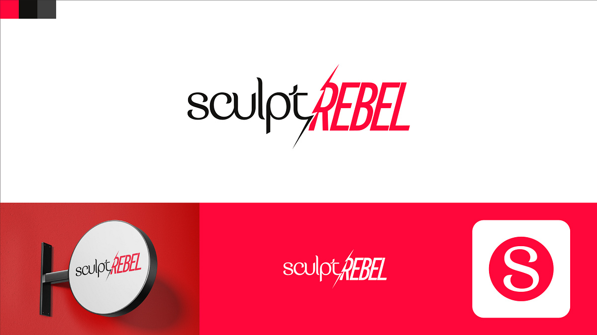
The main challenge here was to balance two contrasting energies in a single wordmark: the smooth, precise flow of "sculpt" and the raw, high-intensity attitude of "REBEL." To show this contrast, I used a clean, rounded typeface for the first half, transitioning into a bold, italicized sans-serif. A sharp, dynamic slash divides the two words, acting as a focal point that brings energy and movement to the logo. For the color palette, I chose a high-contrast combination of deep charcoal, vibrant red, and clean white to give the brand a modern, active, and premium feel. I’ve also included some quick previews of how the system adapts—from physical storefront signage to a simplified circular "S" icon for mobile apps. I would love to hear your thoughts and feedback on this direction.
Support this project
Be the first to upvote