

Logo & Visual Identity for The Clarity Path
Project description
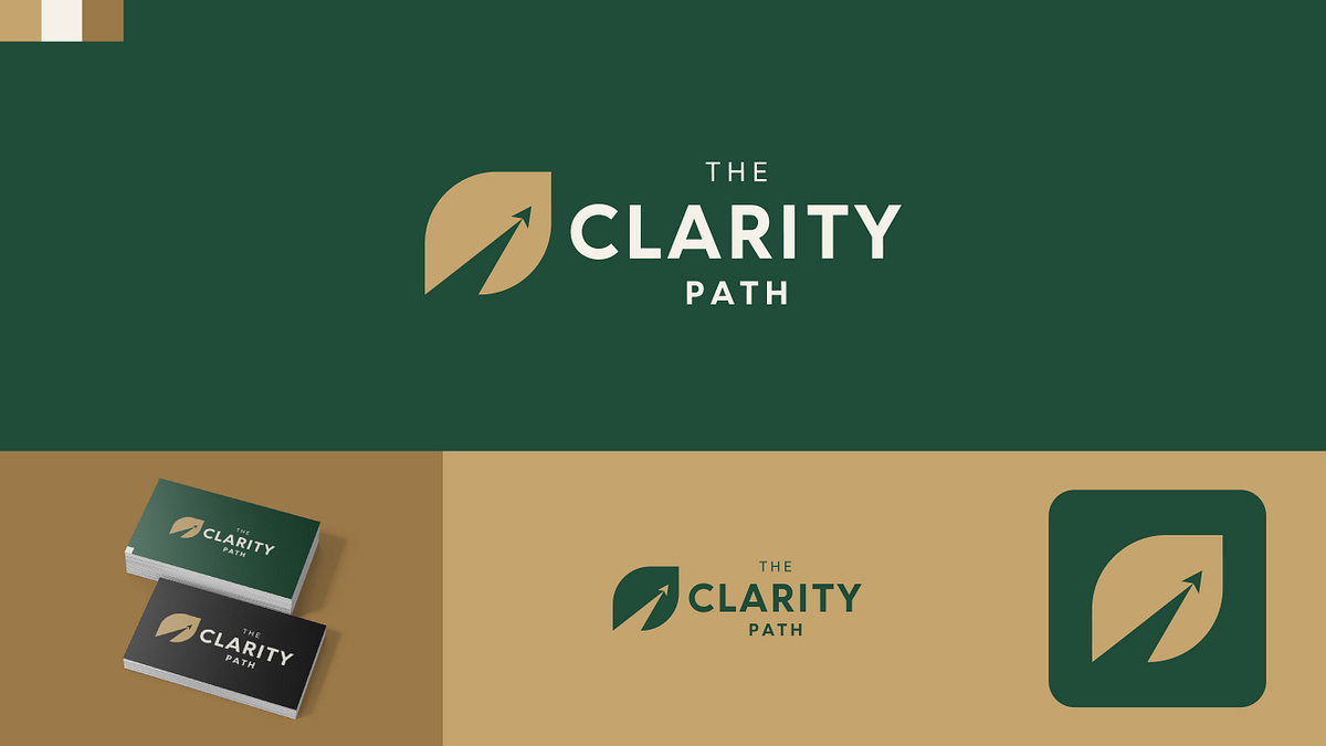
Hi everyone,Here is a brand identity project I recently completed for The Clarity Path.The brand focuses on guidance, strategic planning, and personal or professional growth. To represent these values visually, I designed a clean logo mark that combines a leaf shape (symbolizing clarity, wellness, and organic growth) with a pathway carved out of the negative space, ending in an upward-pointing arrow (representing progress, direction, and forward momentum).For the color direction, I chose an earthy yet sophisticated palette featuring deep forest green, warm gold, and soft cream. This combination is designed to feel trustworthy, stable, and professional.Below, you can see how the identity works on business cards, along with a simplified version of the mark optimized for an app icon.I’d love to hear your thoughts on the negative space mark and the overall color scheme!Press "L" if you like the design.
Support this project
Be the first to upvote