

The Better Cinema — Wordmark Concept
Project description
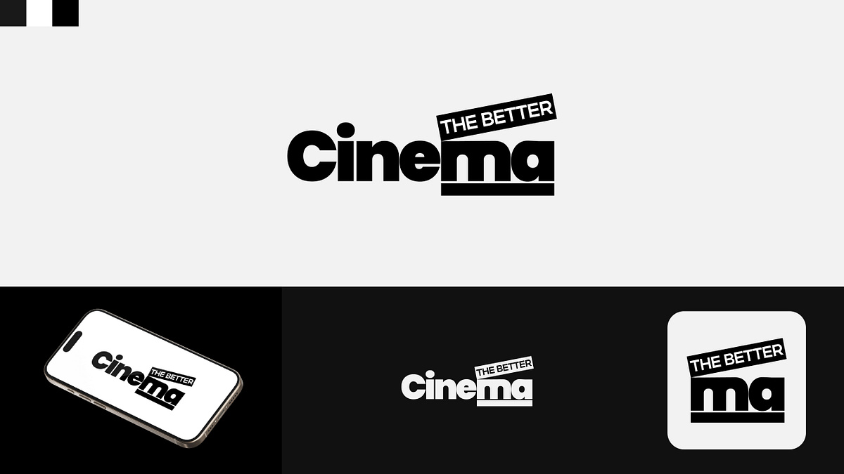
Here is a typographic logo concept for "The Better Cinema."The design focuses on integrating a classic film element directly into the brand's name. I styled the letters "m" and "a" at the end of "Cinema" to serve as the base of a movie clapperboard, placing "THE BETTER" within the slanted top board. The rest of the wordmark uses a bold, heavy sans-serif typeface to give the identity a solid, graphic presence.The strict black-and-white color palette keeps the mark high-contrast and highly legible on digital screens. For smaller formats, the clapperboard "ma" section can be isolated to serve as a standalone app icon.Would love to hear your feedback on this typographic layout!
Support this project
Be the first to upvote