Two-wheeler EMI calculator: Designing clarity for real users

Project description
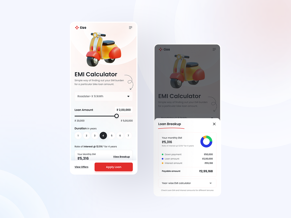
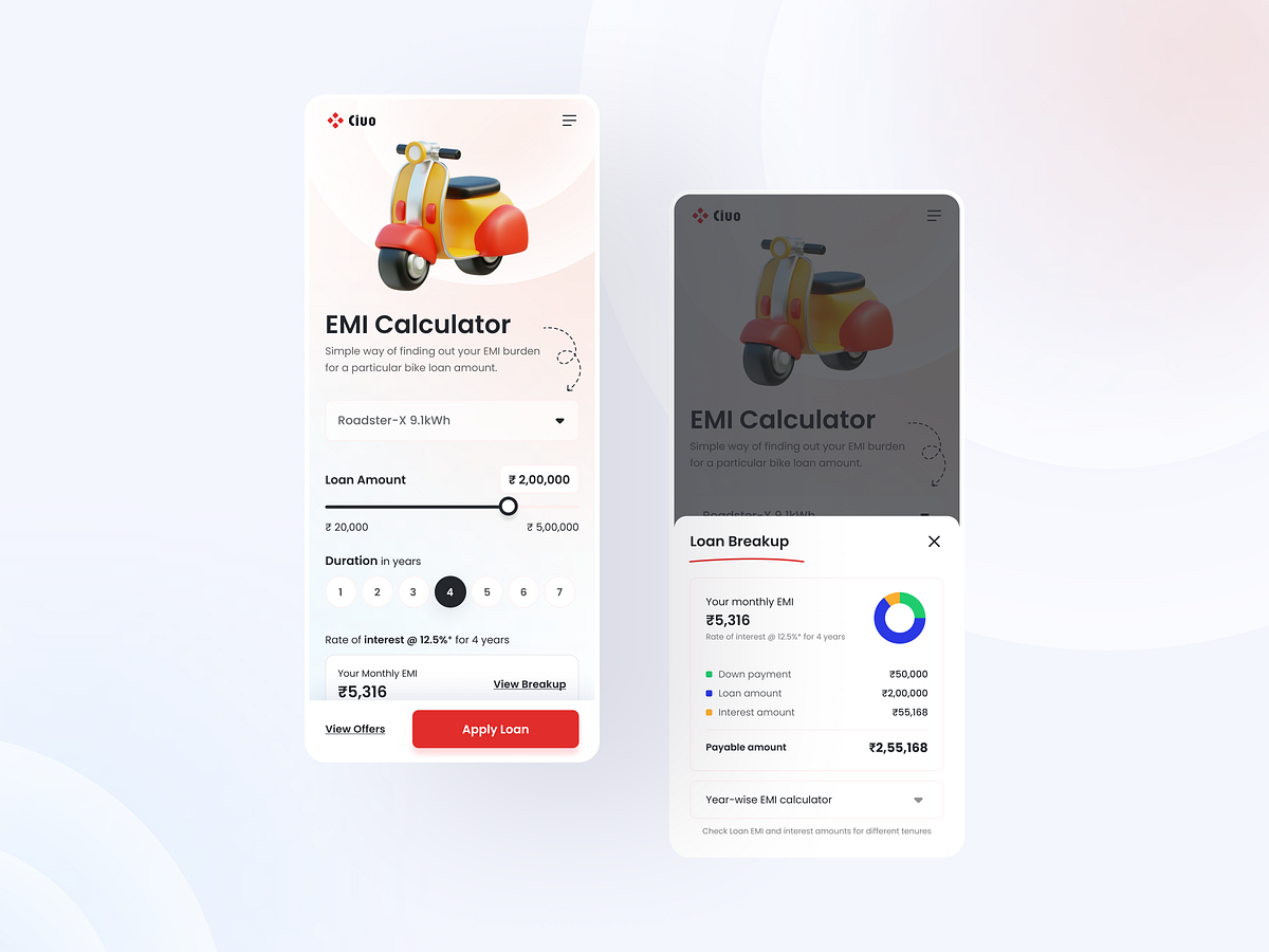
Designing an EMI calculator Most EMI tools feel technical and overwhelming, so my approach was to create an experience that feels guided, transparent, and stress-free. The UI starts with a clean, minimal layout where users enter only what truly matters: loan amount, interest rate, and tenure. Real-time calculation keeps the experience smooth — no extra taps, no confusion, no mental math. To deepen trust, the design includes a clear monthly breakdown showing how much goes toward principal and how much toward interest. This helps users understand the actual impact of their choices rather than just seeing a final number. Smart defaults reduce friction, while subtle microcopy answers unspoken questions like “Why is my EMI increasing?” or “What happens if I change tenure?” The outcome is a calculator that doesn’t just compute EMI - it helps users make confident financial decisions without feeling lost. Good UX translates complexity into clarity. Great UX makes that clarity feel effortless.
Support this project
Upvote