Executive Business Dashboard

Project description
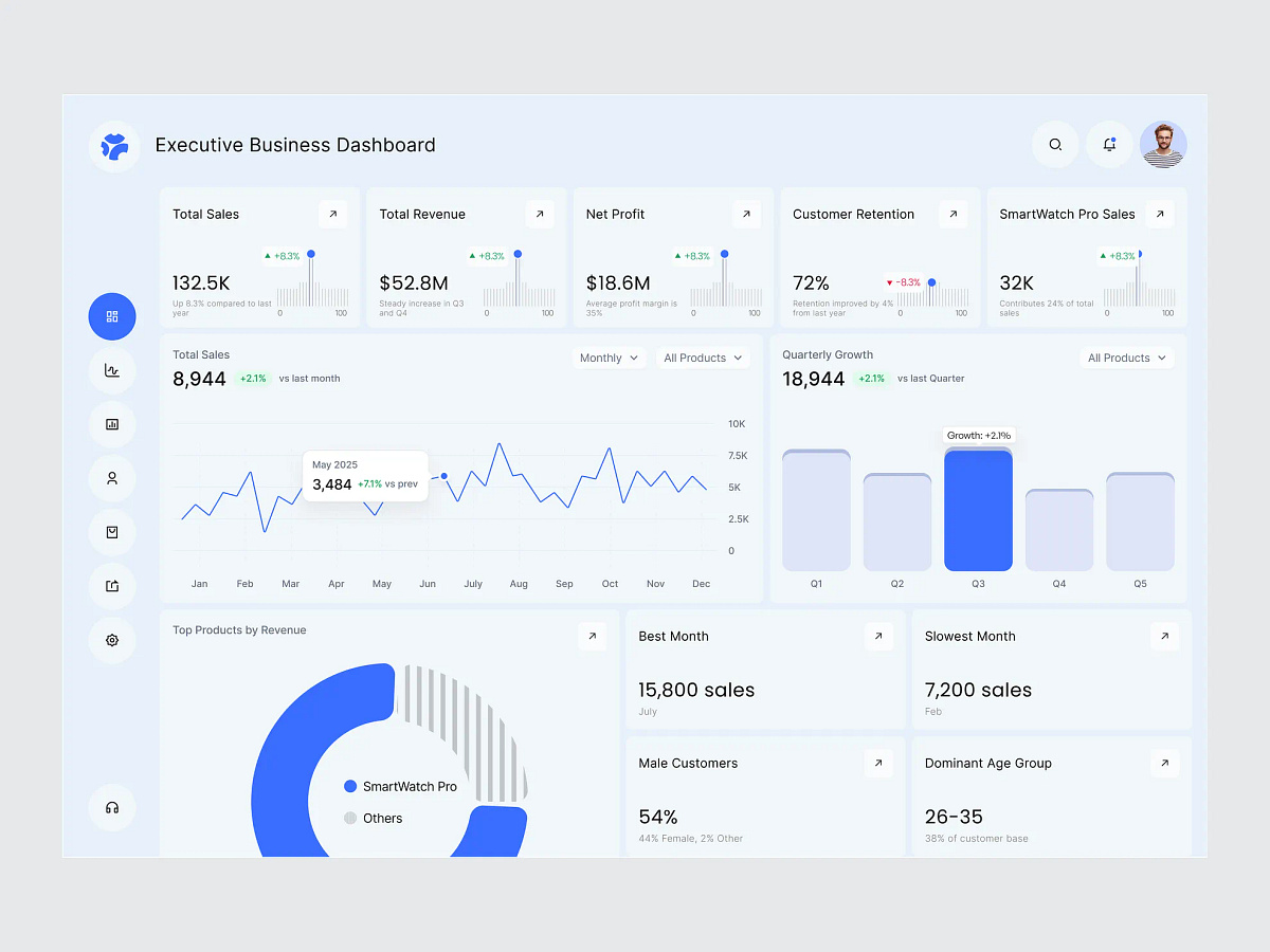
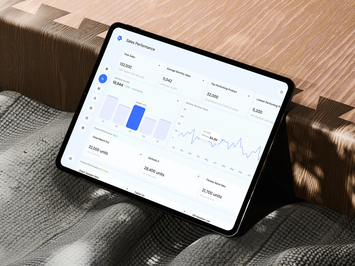
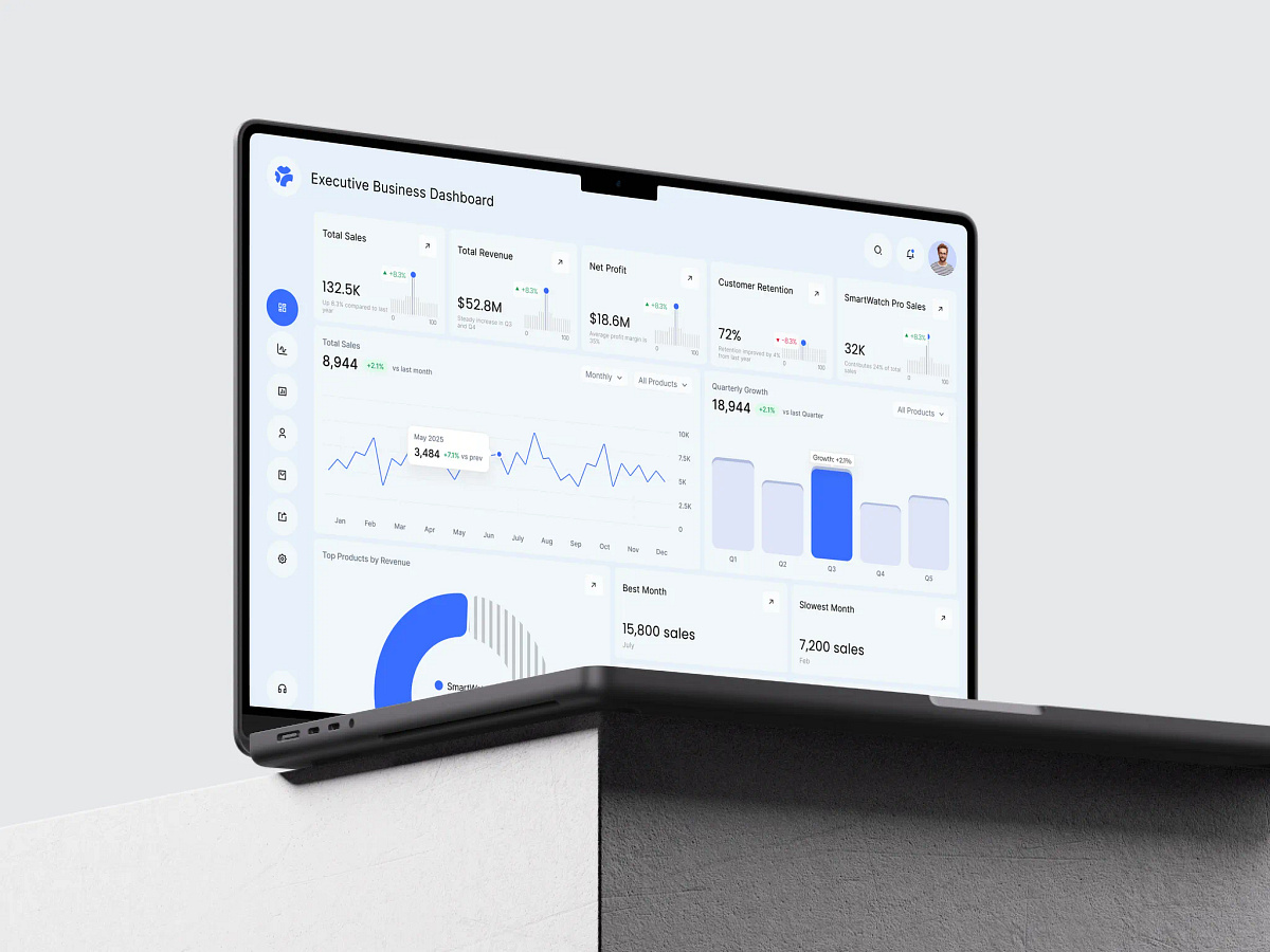
Is your reporting tool giving executives twelve charts and no answer? The monthly deck lands with revenue, units, retention and margin spread across a dozen slides. Nobody can say in one sentence whether the quarter is on track, so the meeting gets spent rebuilding numbers instead of deciding anything. That digging costs decisions. Late decisions cost the quarter. That is where this design changes everything. (Concept dashboard for an Executive Analytics Platform) It bridges the numbers and the decision in one screen with: → KPI strip putting sales, revenue, profit, retention and the lead product on one line → Sales trend with month level tooltips and product and period filters sitting above it → Quarterly growth bars highlighting the standout quarter instead of leaving it to be spotted → Top products donut showing how much of the business one product actually carries → Best and slowest month called out directly, not buried in the line chart → Customer split by gender and age so the numbers point back at a real person
Support this project
Upvote