Health Biomarker Dashboard

Project description
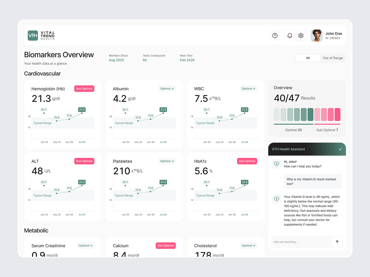
Is your health platform handing people a PDF of numbers and calling it a result? A lab report arrives as rows of values and reference ranges. Nothing says which marker moved, which one matters, or what changed since last year. So the person searches each name online and walks into the appointment more worried than informed. That confusion costs follow ups. Missed follow ups cost the testing programme. That is where this design changes everything. (Concept dashboard for Vital Trend Health) It bridges raw results and understanding in one screen with: → Every biomarker as a card carrying the value, its unit and an optimal or sub optimal tag → Trend line per marker with the typical range shaded behind it, so a number becomes a direction → Markers grouped by body system instead of listed alphabetically → Overview panel splitting optimal and sub optimal counts at a glance → All and Out of Range filter for people who only want to see the problems → Built in assistant explaining a flagged result in plain language, and when to ask a doctor
Support this project
Upvote