Velara - Wellness Website Design
Project description
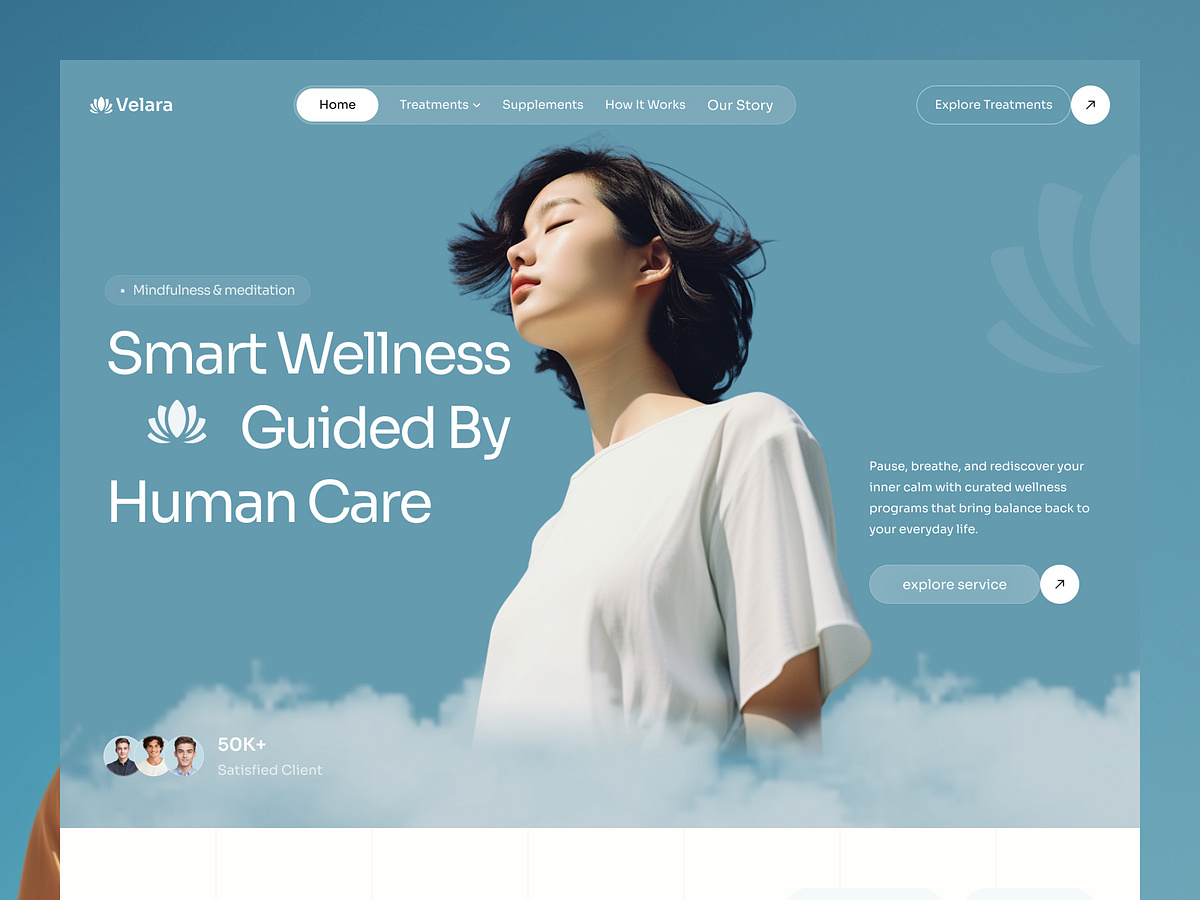
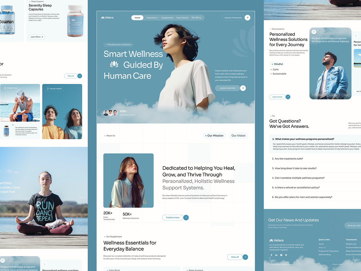
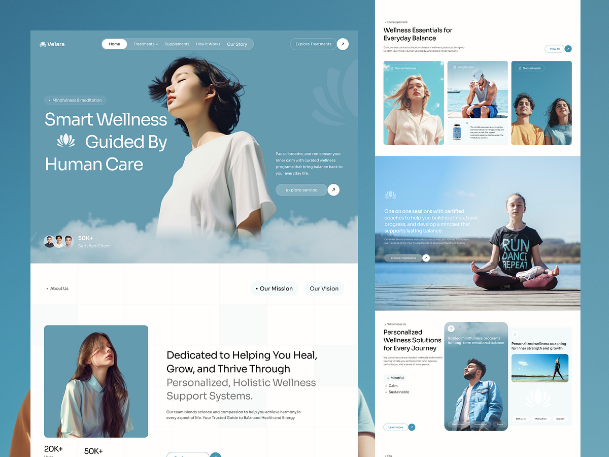
Is your wellness site asking someone who already feels overwhelmed to work out where to start? Meditation on one page, supplements on another, coaching somewhere further down. Every section promises balance; none of them says what to do first. The visitor scrolls, feels exactly the way they felt when they arrived, and closes the tab. That overwhelm costs sign ups. Lost sign ups cost the programme. That is where this design changes everything. (Concept website for Velara Wellness) It bridges calm and clarity in one page with: → Hero holding one promise, one action, and the social proof directly under it → Mission and vision behind a two-tab switch instead of two long paragraphs → Supplement cards sorted by what people need rather than by product name → Coaching band explaining what a one-to-one session actually involves → Why choose us section pairing each claim with photography and short tags → FAQ closing the page for the questions that quietly stop people from booking