

Coolvia: Responsive HVAC website hero design
Project description
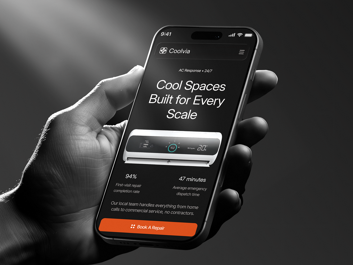
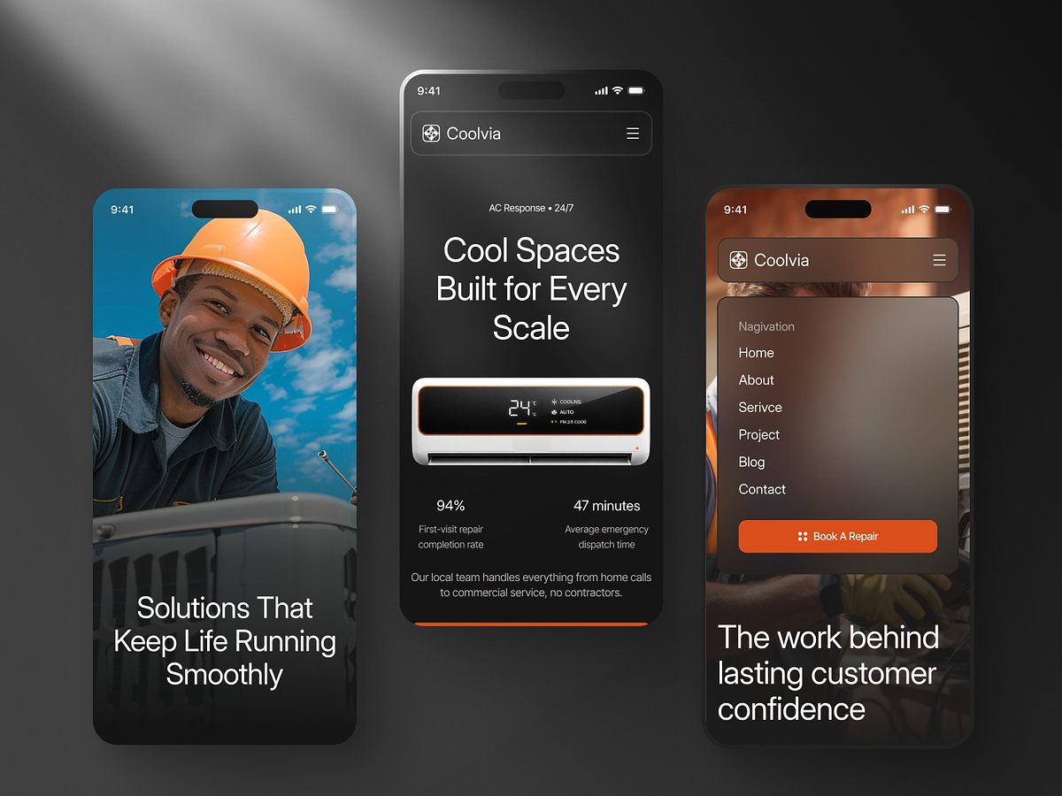
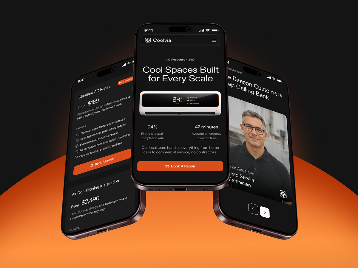
Shot overview The Coolvia hero at desktop and phone widths, side by side. Design decisions At 1440 the AC unit carries three callouts for the filter, the airflow and the diagnostic readout, and the body copy is right-aligned. At 390 the callouts go, because they would crowd the unit. The headline breaks onto three lines, the text centers, the two figures stay side by side, and Book A Repair runs full width above Talk To Us. What stays consistent The 24/7 response label, the headline, the dark background, the content order, and the same compact pill menu at every width. Why it matters Someone on a phone in a warm house wants the booking button within reach, not a diagram of the unit. The desktop view has room for detail, so it gets it. Both figures are demo numbers. Working on something similar? WhiteFrame Creative builds websites end to end: structure, interface, motion, live build. Most of what we do is deciding what stays on the fold and what goes. That's the job. Send a DM with the screen that's giving you trouble and we'll tell you how we'd approach it. Send Message 📩
Support this project
Be the first to upvote