Mobile UI & Responsive Layouts for AI SaaS Platform

Project description
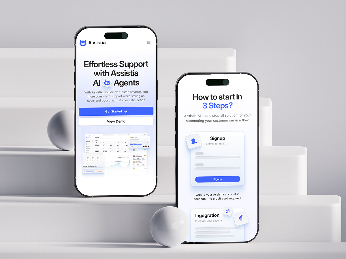
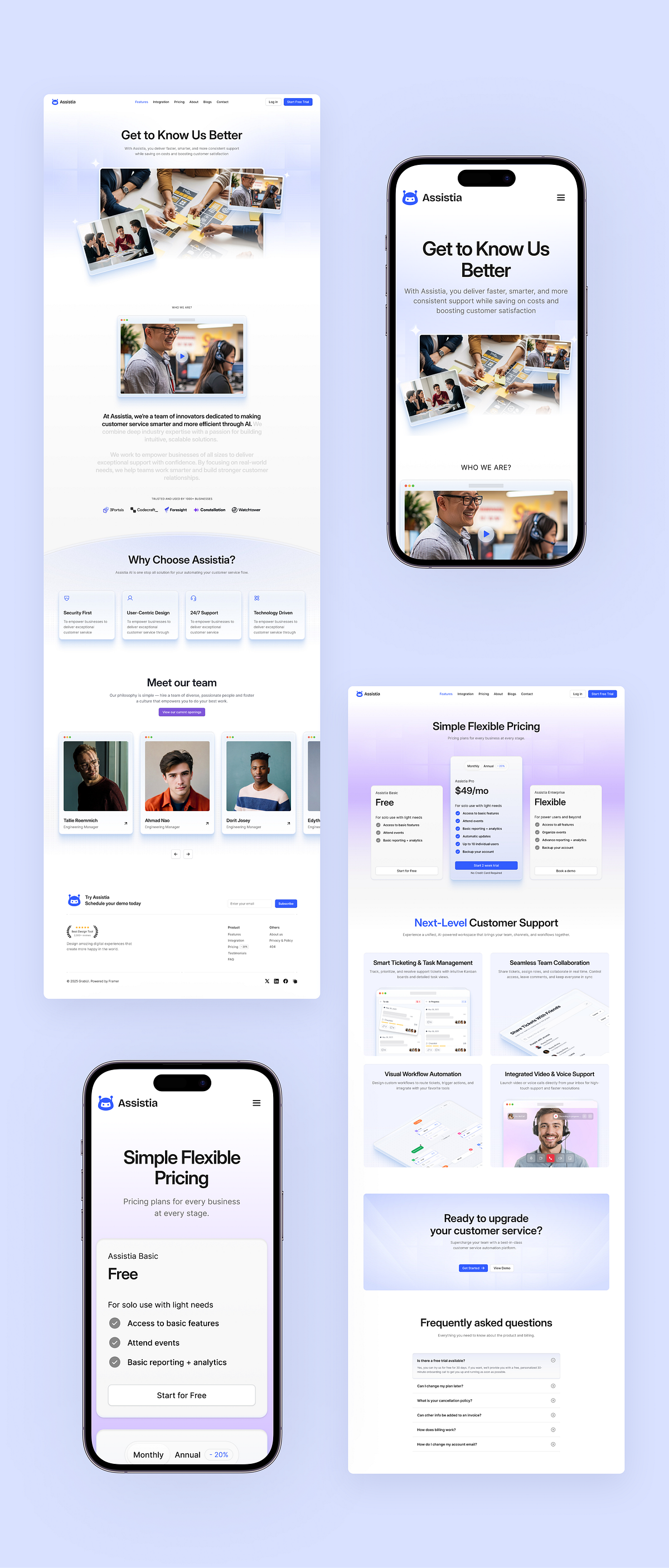
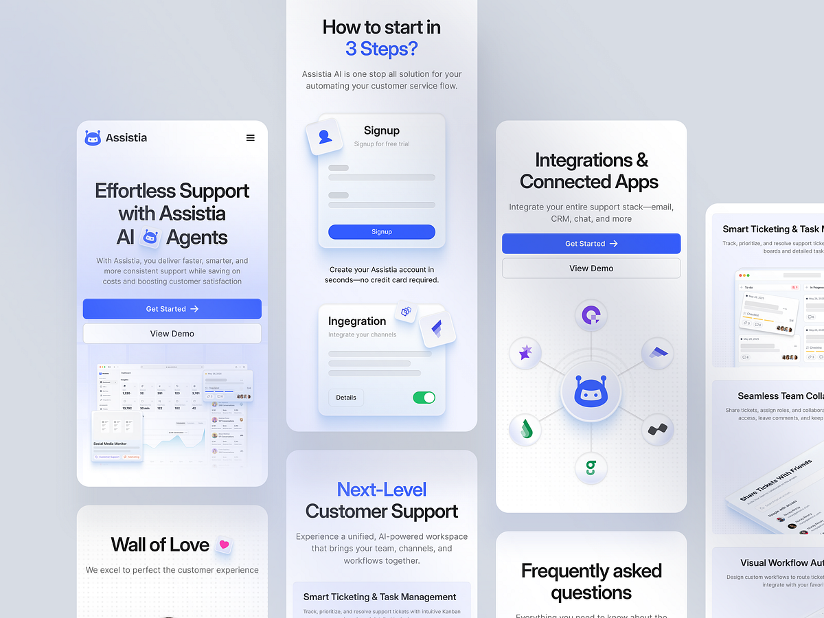
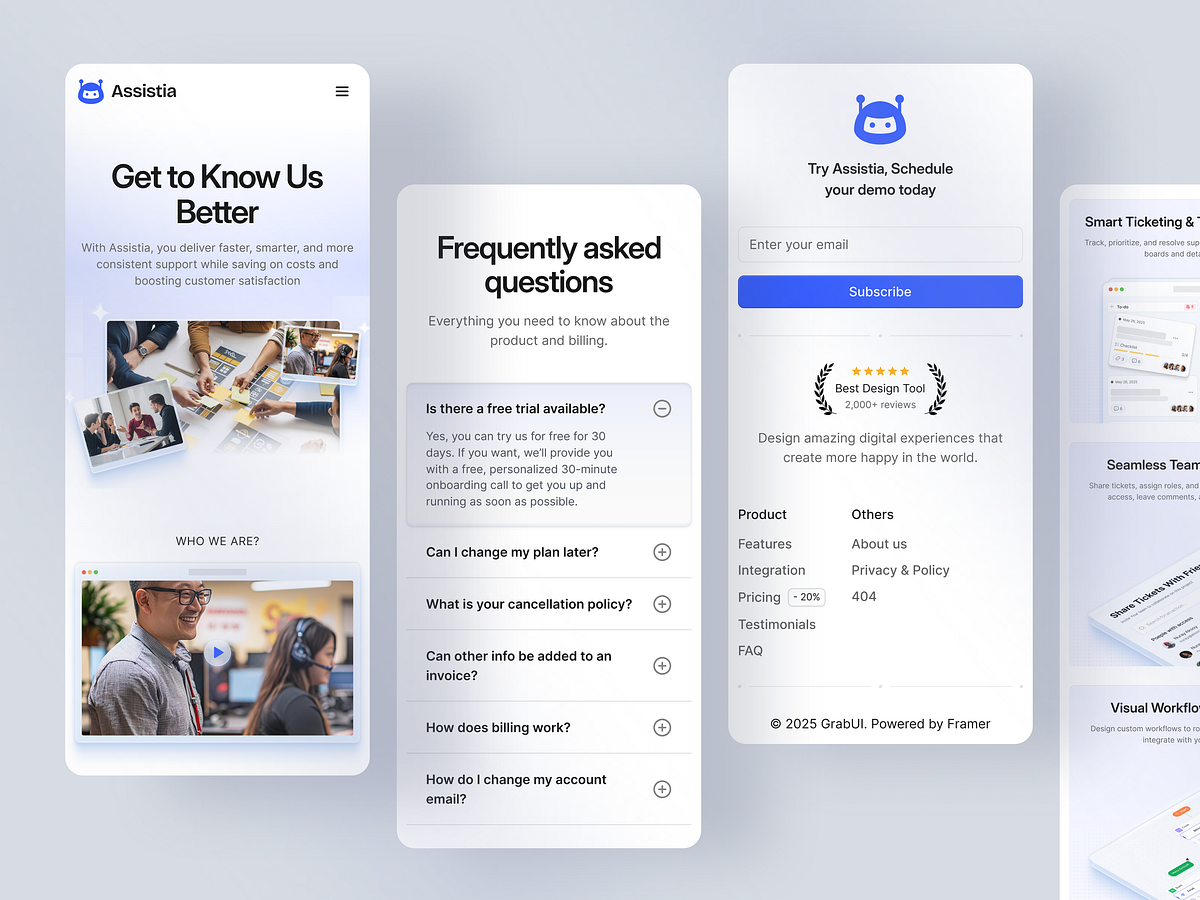
In the SaaS world, decision-makers are often on the go. That’s why our work on Assistia prioritized a "Mobile-First" philosophy rather than treating mobile as an afterthought. Our Approach to Responsive: We engineered a fluid layout system that adapts typography scaling and grid stacking automatically. The navigation transforms into an accessible, thumb-friendly drawer menu, ensuring that complex data dashboards remain readable on smaller screens. Why it matters: 55% of B2B search traffic comes from mobile devices. We optimized touch targets to be 44px minimum for effortless interaction. Load times were optimized for 4G networks to ensure global accessibility. The result is a seamless cross-device experience that retains the premium feel of the desktop version.
Support this project
Upvote