Renoria — Mobile Responsive Architecture Template

by WhiteFrame Creative · Feb 2026
shot
Project description
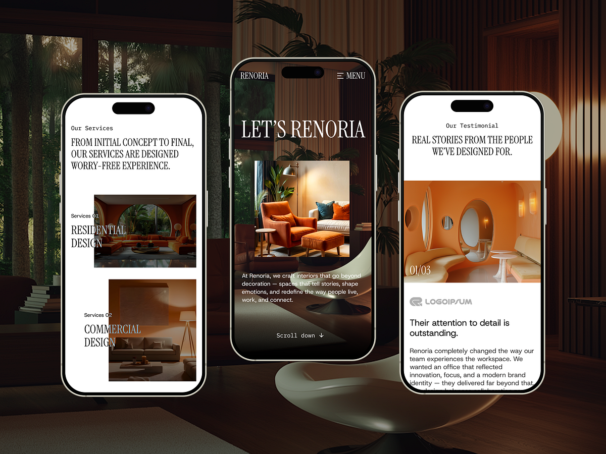
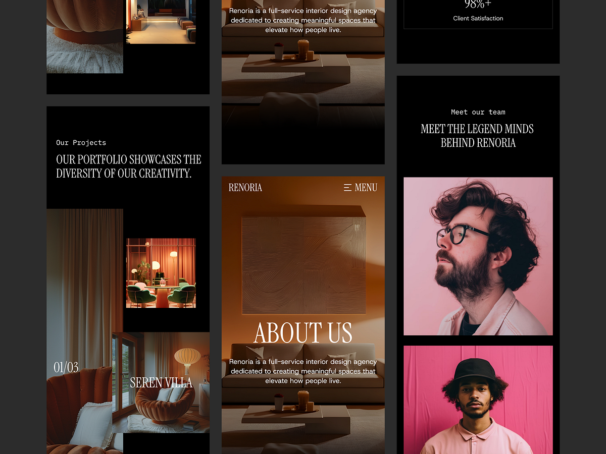
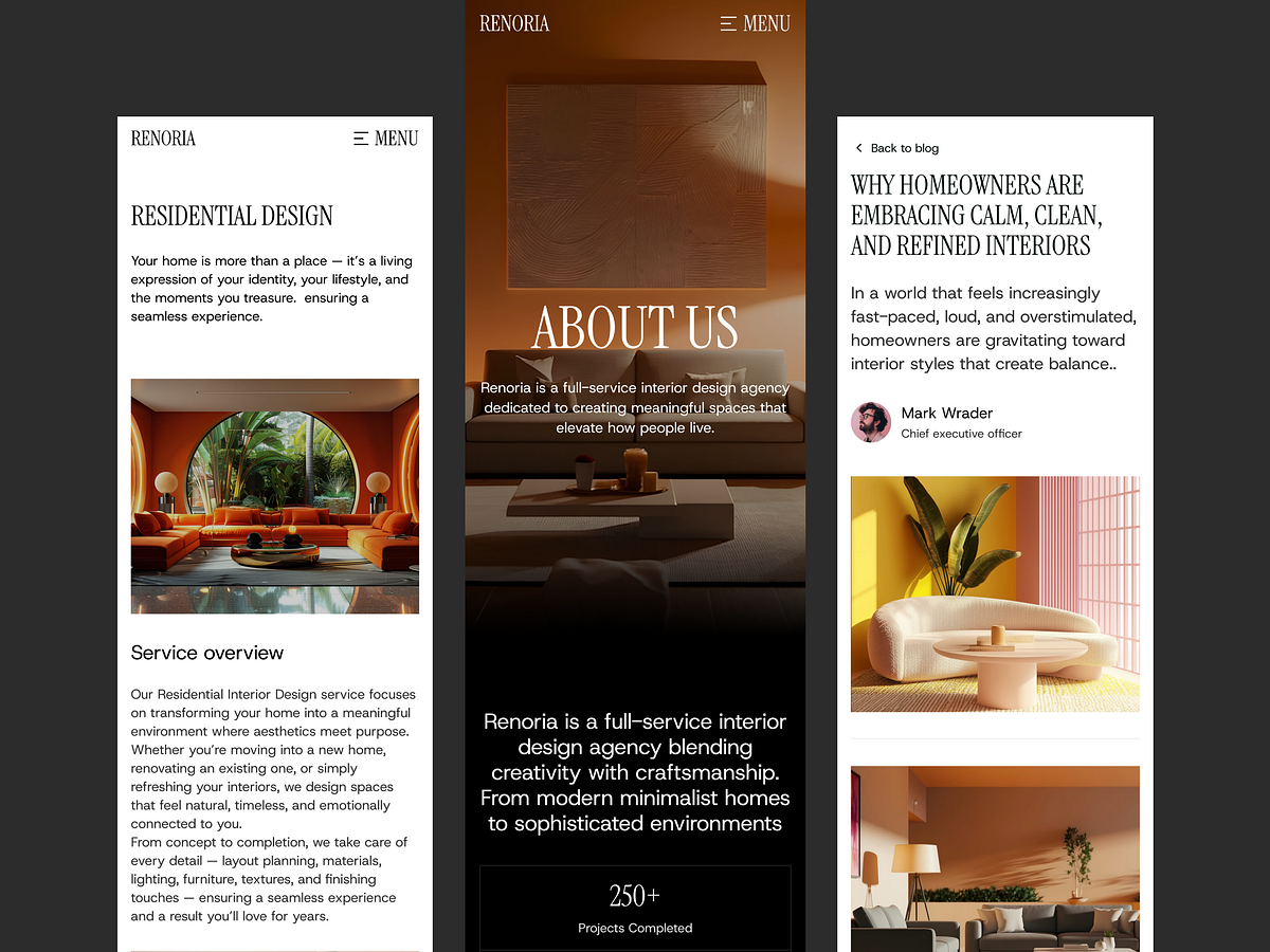
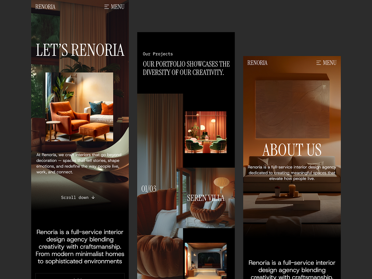
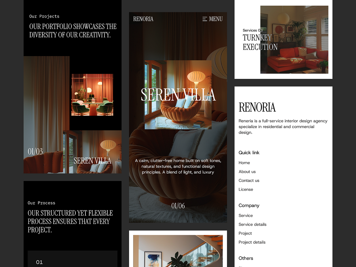
Over 55% of portfolio traffic now comes from mobile devices, yet many architecture sites break on smaller screens. With the Renoria template, we prioritized a "mobile-perfect" experience. We ensured that the intricate grid layouts and high-resolution architectural photography scale down flawlessly without losing impact. This shot highlights the adaptive navigation and touch-optimized galleries included in the template. By using Renoria, you ensure your potential clients get the same premium experience on an iPhone as they do on a 4K monitor. Fully responsive, tested across all breakpoints, and ready to ship.

Support this project
Upvote