Strux — Responsive Design That Converts Everywhere

Project description
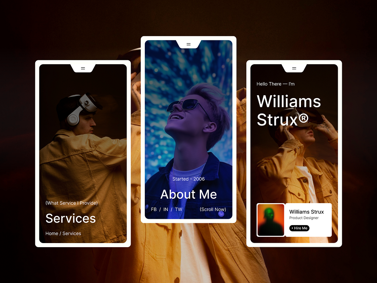
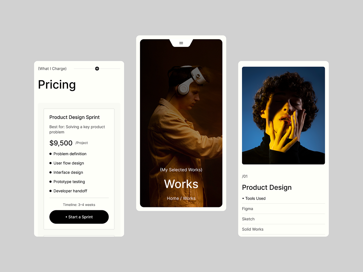
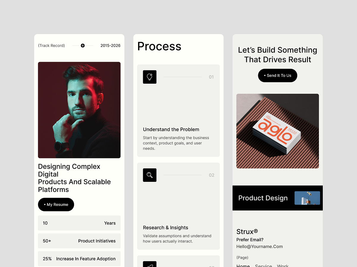
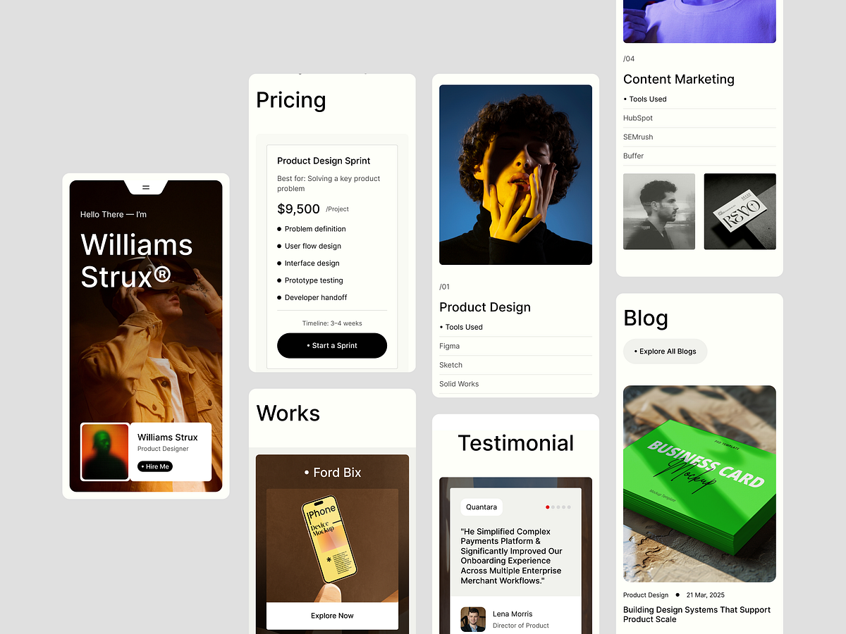
A portfolio that only works on desktop is a portfolio half-seen. We designed Strux to perform flawlessly across every breakpoint — desktop, tablet, and mobile. Responsive wasn't an afterthought. It was a design decision from day one. Every layout, every type scale, every spacing token was stress-tested across devices to ensure clarity and conversion at any screen size. Responsive by the Numbers: ✦ 3 fully optimized breakpoints — 1440px, 768px, 375px ✦ 100% layout integrity across all devices ✦ 60%+ of recruiter traffic comes from mobile — we designed for that ✦ Fluid typography & adaptive spacing system ✦ Touch-optimized CTAs & interaction zones What We Did Differently: → Designed mobile-first, then scaled up → Rebuilt navigation hierarchy for thumb-zone comfort → Ensured case study readability on every screen → Maintained visual impact without sacrificing load performance Your portfolio should work as hard on a phone screen as it does on a 27" monitor. Strux makes sure it does.
Support this project
Upvote