Tasklyn Mobile - Responsive SaaS Experience

by WhiteFrame Creative · Mar 2026
shot
VIDEO
Project description
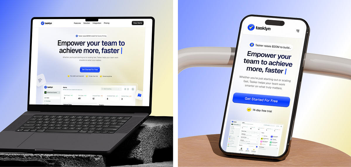
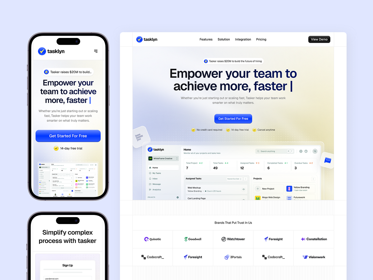
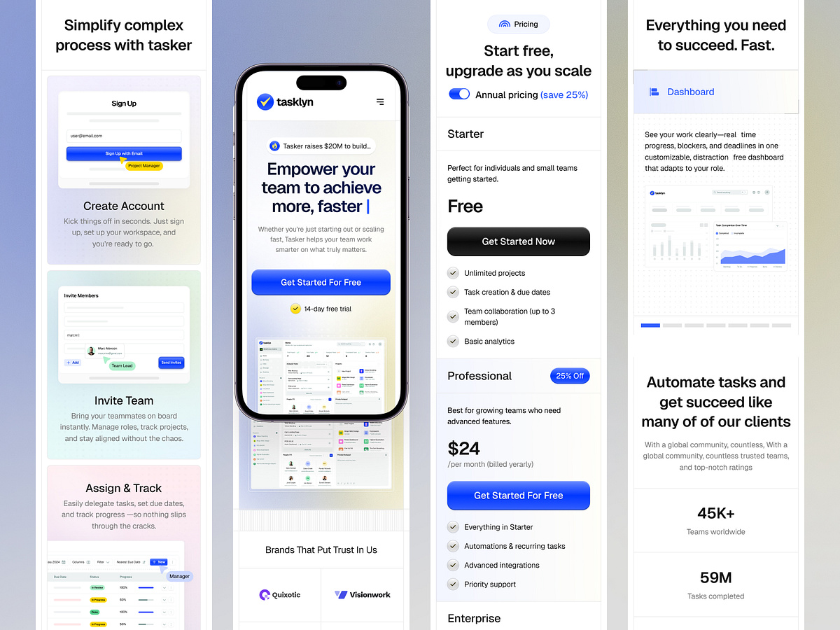
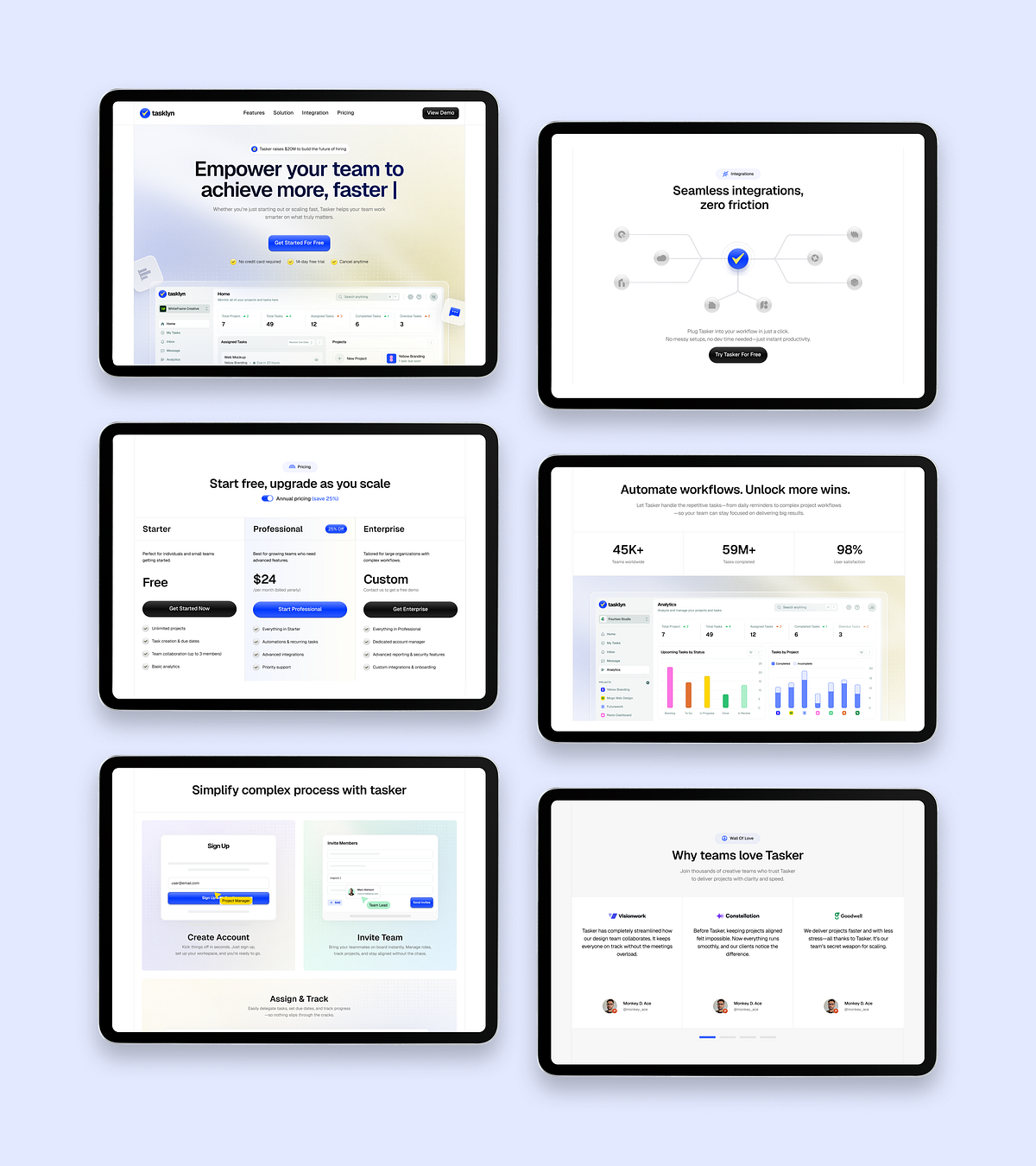
In a world where 55% of web traffic comes from mobile devices, a desktop-only dashboard is a broken product. For the Tasklyn project, we didn't just shrink the desktop view; we reimagined the mobile experience. Our Responsive Strategy: Touch-First Navigation: We relocated primary actions to the "thumb zone" for effortless interaction on handheld devices. Adaptive Data Visualization: Complex analytics charts automatically transform into simplified summary cards on smaller viewports. Performance Optimization: Zero layout shift (CLS) and lightning-fast load times ensure the app feels native. The Result: A seamless transition from the office monitor to the commute on a phone, ensuring productivity never drops.
Support this project
Upvote