Unfold - Flawless Responsive Web Design & Mobile UI

Project description
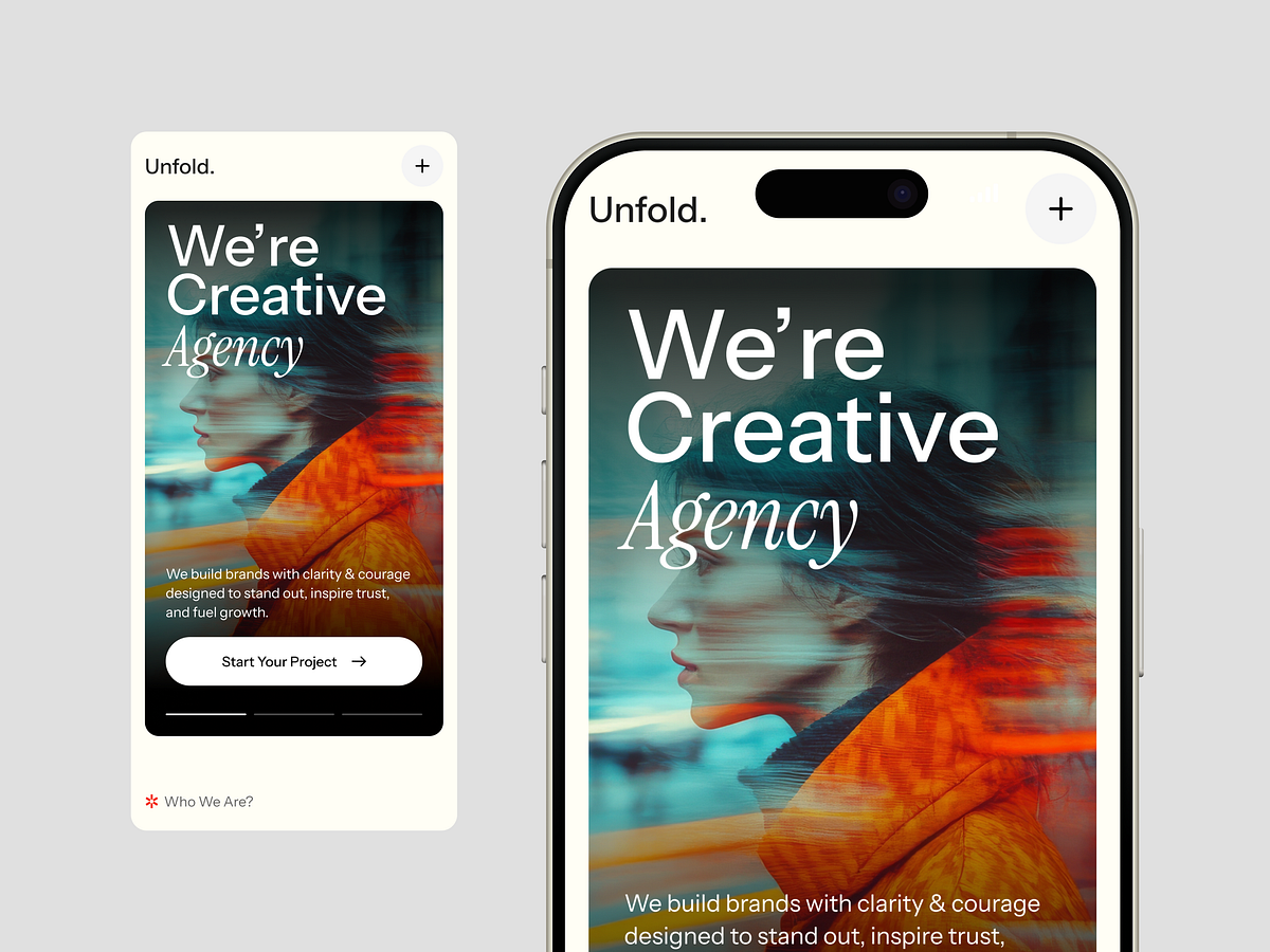
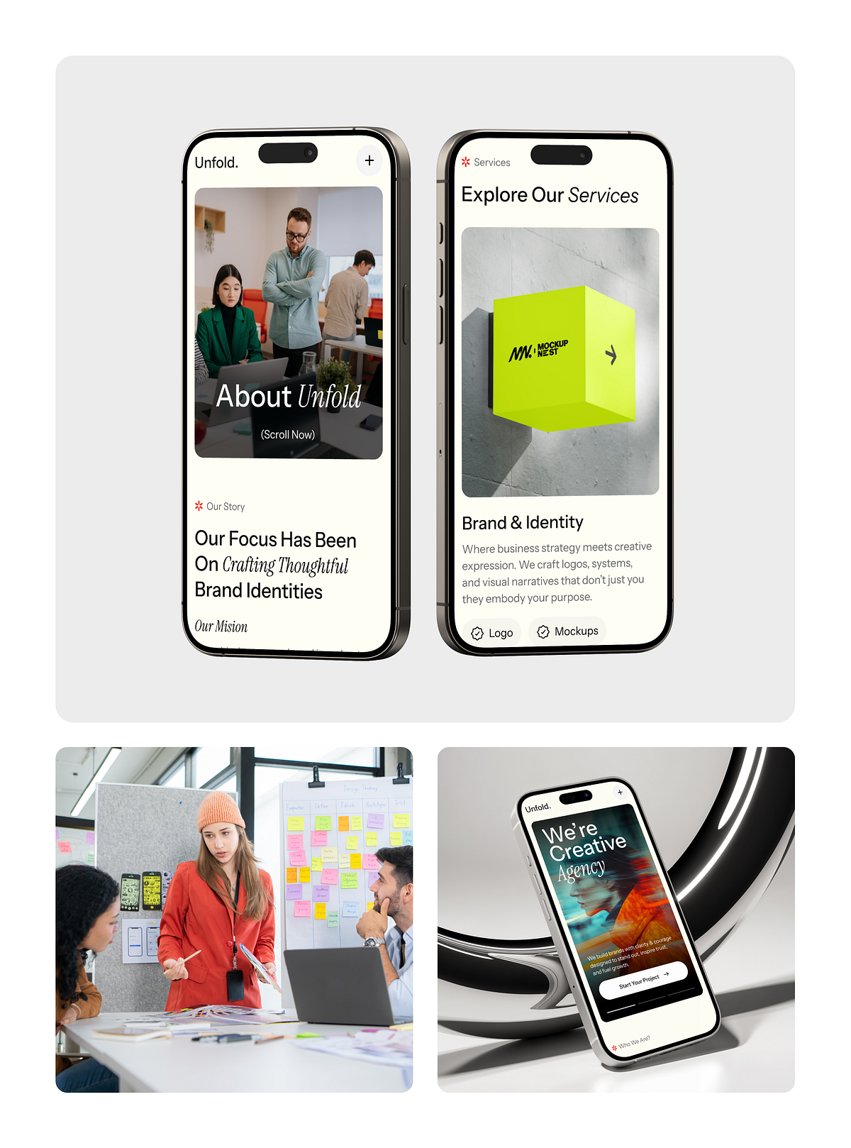
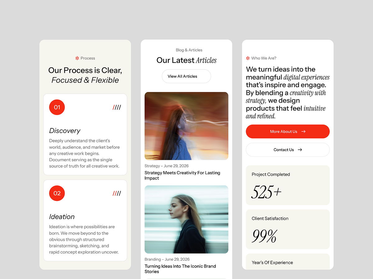
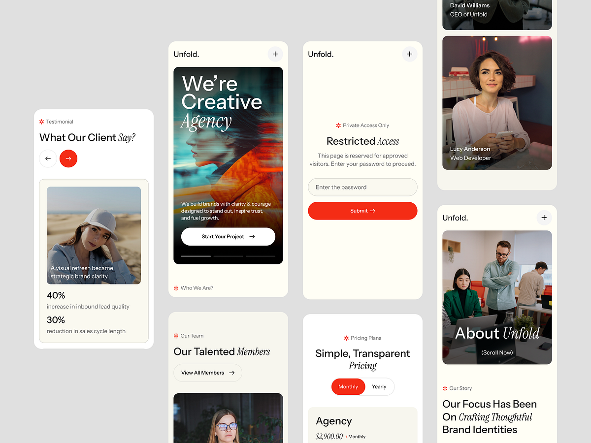
Did you know that over 55% of global website traffic comes from mobile devices? If your agency's site isn't flawless on smaller screens, you're leaving clients on the table. As part of the GrabUI library, we ensured that Unfold takes a mobile-first approach. What we do for responsive design: • Adaptive Typography: Fluid font scaling ensuring readability on every screen size. • Touch-Friendly UI: Optimized touch targets for seamless navigation on smartphones and tablets. • Optimized Asset Loading: Fast load times on cellular networks without sacrificing visual fidelity. • Perfect Breakpoints: Custom adjustments across Desktop, Tablet, Mobile Landscape, and Mobile Portrait so the layout never breaks. Don't compromise on user experience. Unfold guarantees your portfolio looks stunning and performs perfectly, no matter where your users are browsing from.

Support this project
Upvote