Arabic Real Estate Website - Responsive RTL Design

Project description
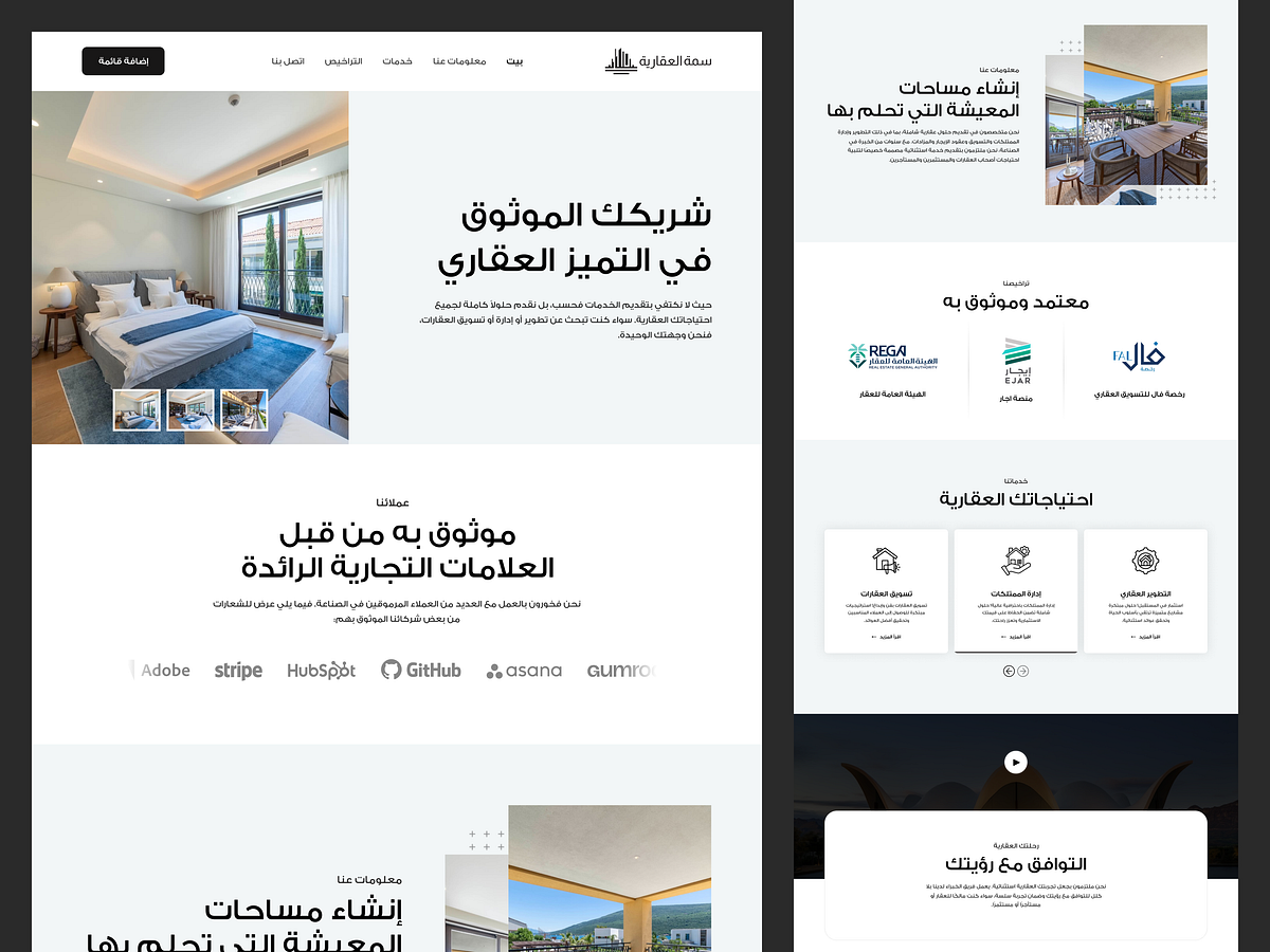
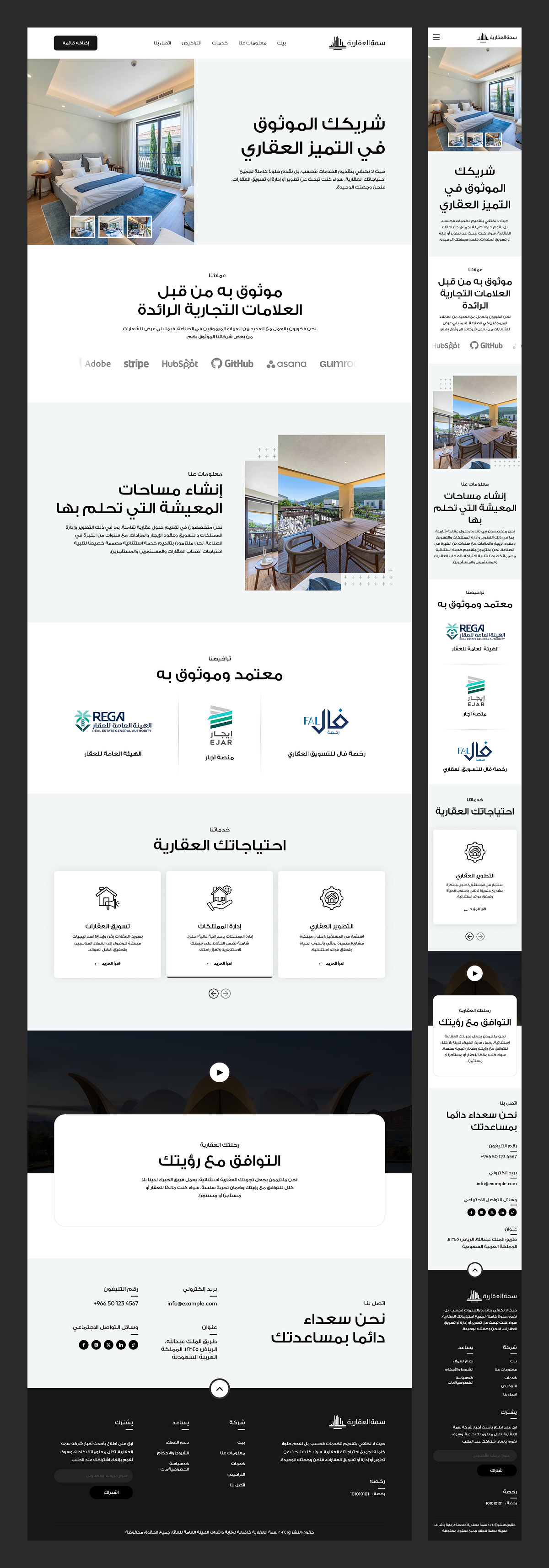
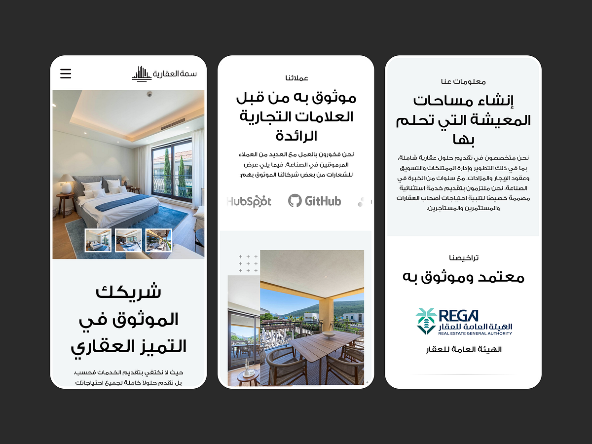
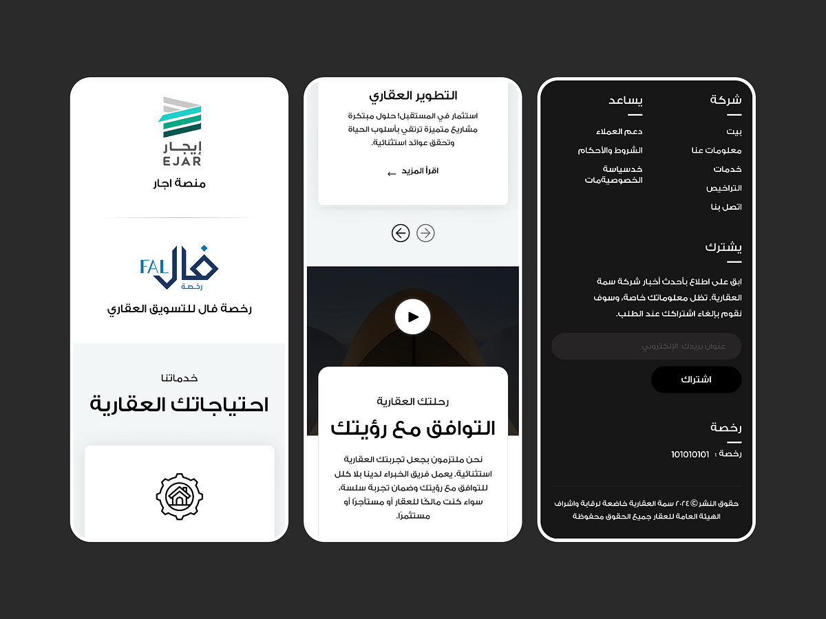
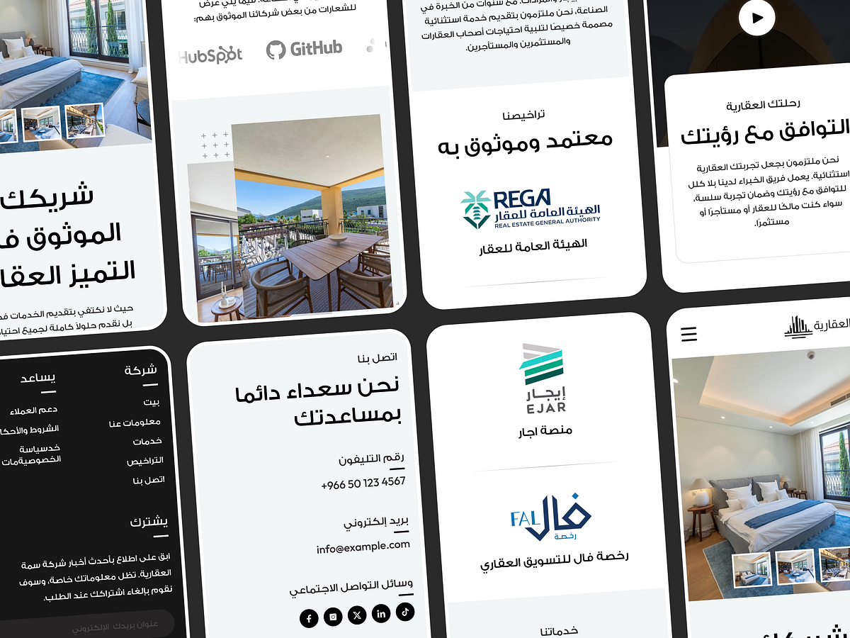
Designing in Arabic changes more than just the text direction; it changes how the whole layout thinks. This project came from a Dubai-based real estate client, and the brief called for a full RTL (right-to-left) website that felt just as polished as any English-first design, not a mirrored afterthought. The biggest challenge was making sure RTL wasn't just flipped LTR. Icons, arrows, image galleries, even the way testimonials and stat cards sit next to text- all of it had to be rebuilt with the reading direction in mind rather than just reversed. Getting the visual hierarchy to feel natural in Arabic meant paying close attention to how the eye actually moves through the page. The client's identity leaned clean and trustworthy, a soft, light-first palette with generous white space, broken up by warm interior photography in the hero section. Trust badges (regulatory licenses, platform partnerships) got their own dedicated section, which matters a lot in real estate; credibility sells before the property does. Responsiveness was non-negotiable here too. The mobile version isn't just a squeezed-down desktop; sections were re-sequenced, the image carousel got touch-friendly, and the navigation collapsed into a clean hamburger menu that still feels intentional rather than default. This one was a great exercise in designing for a direction and a market I don't usually work in, and a reminder that "responsive" and "RTL" both mean rethinking structure, not just resizing it. Would love to hear your thoughts!
Support this project
Upvote