Hot Otter - Landing Page Design for a Mail Reading App
Project description
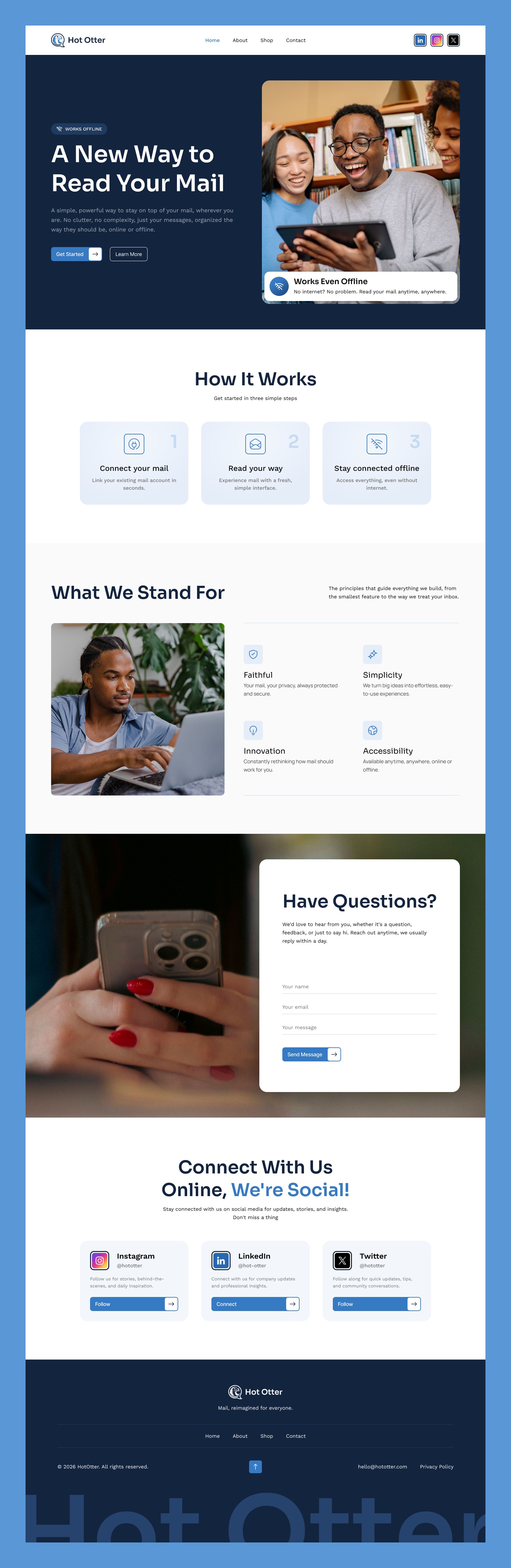
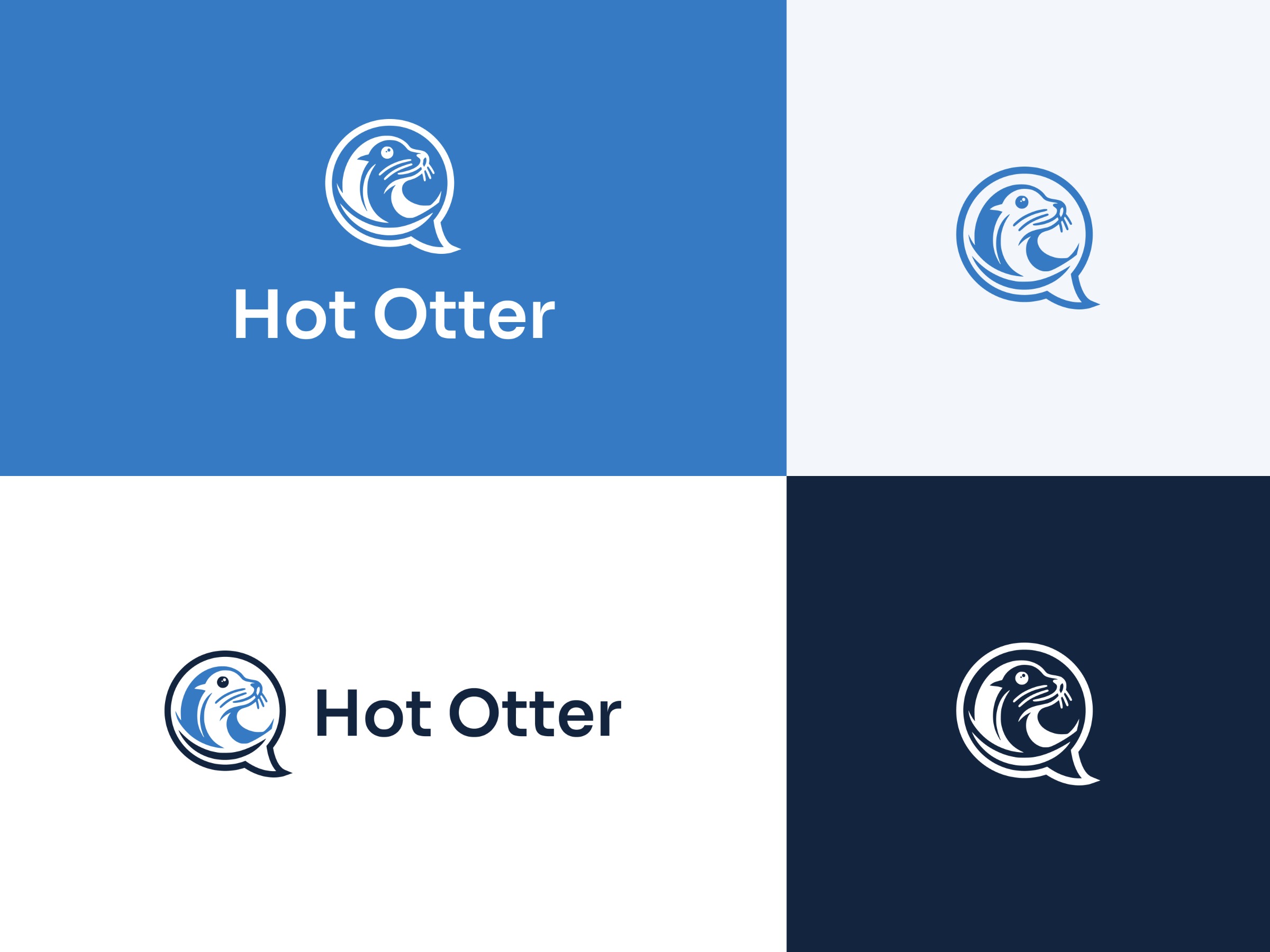
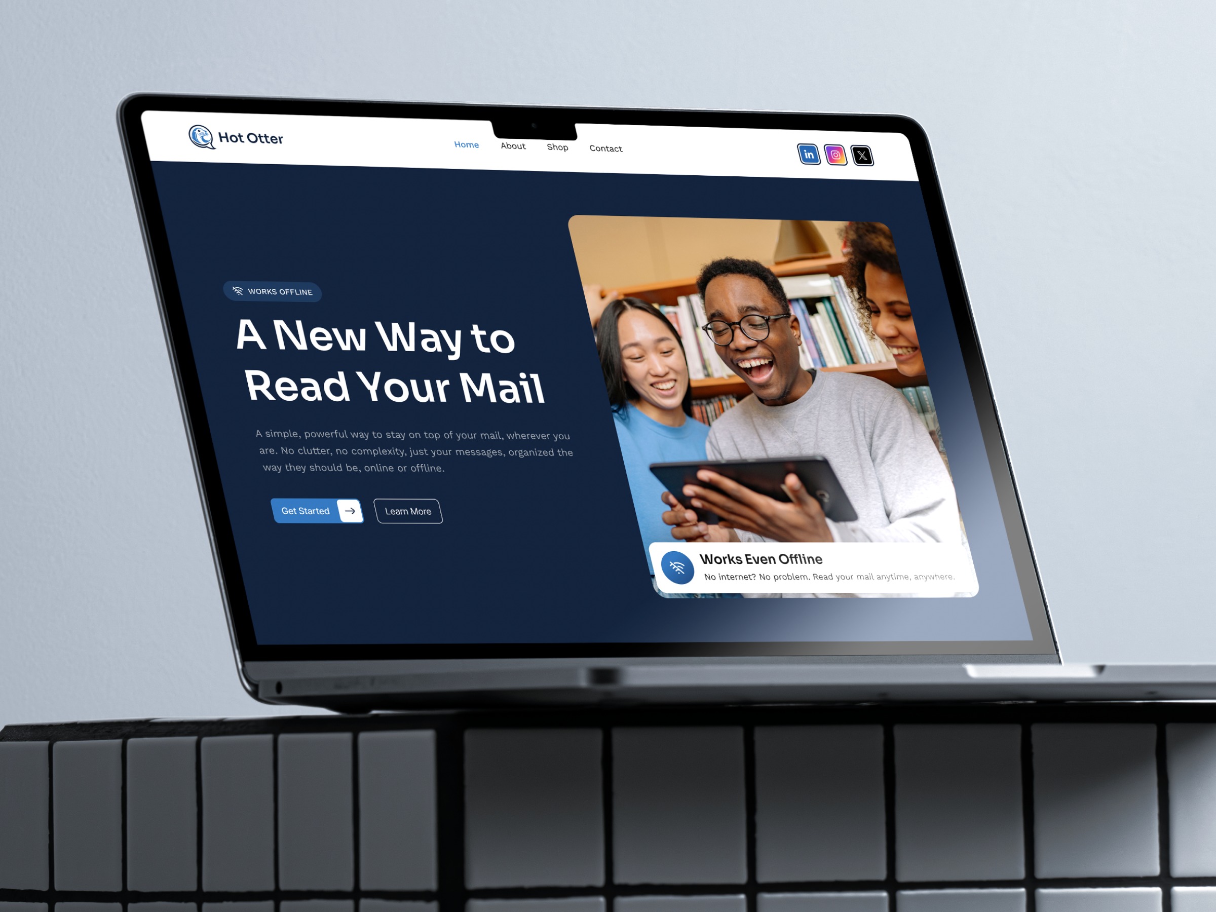
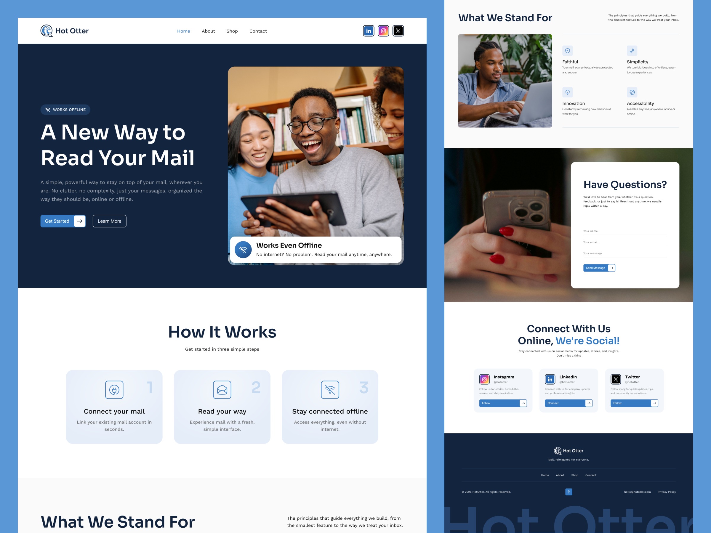
Some projects make you think differently about something you've been doing the same way for years. That's what Hot Otter was for me. The idea: a landing page for a company that's changing how people read their mail. With one big feature, it works even without internet. The tricky part was mixing two feelings that don't usually go together: trustworthy and friendly. People need to feel safe using this, but it also shouldn't feel cold or too corporate. That's why I chose a clean navy-on-white palette and kept the type modern but approachable. My favorite part was the logo. The otter's face sits inside a speech bubble, a small nod to communication, tied to the brand's playful name. Fun, but still professional. The layout stays simple on purpose. A hero section with a floating "works offline" highlight, a quick "how it works" breakdown, a values section built around trust, a friendly contact section, and a CTA to follow along on social. No pressure to sell anything here, just enough to make people want to stick around. Not every project needs a big problem to solve. Sometimes it's just about making something people enjoy using. Would love to hear your thoughts!