Nexus - SaaS Landing Page

Project description
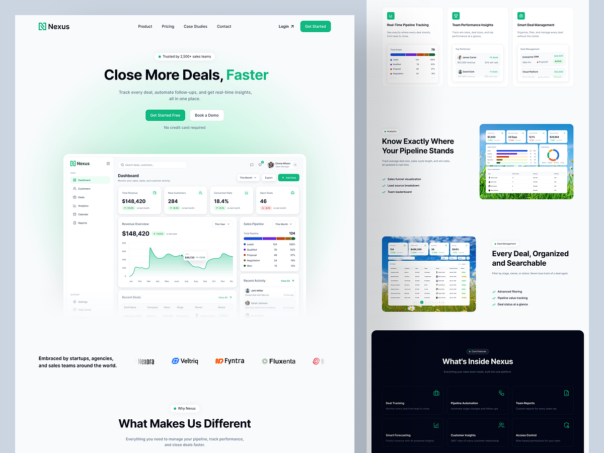
Most CRM landing pages sell a promise. This one sells the product itself. Nexus already had a fully working dashboard, so rather than designing generic mockups, I built the entire page around real screenshots, the pipeline, the deals table, and the analytics, letting the actual UI do the convincing instead of stock illustrations or vague copy. Every section stays within a single green accent, stat cards, icons, and the highlighted pricing plan, so the page reads as one cohesive product rather than a template with a logo dropped in. A dark section breaks the rhythm midway through and returns for the final CTA, adding contrast without losing that consistency. The detail I'm proudest of: the same rep names, deal values, and company names from the dashboard reappear in the testimonials and client logos. Nothing on the page feels invented; it's all traceable back to the product itself. That's the kind of detail that makes a landing page feel less like marketing and more like proof. Got a SaaS product that needs a landing page like this? Let's build it.

Support this project
Upvote