Student Scheduling Mobile App
Project description
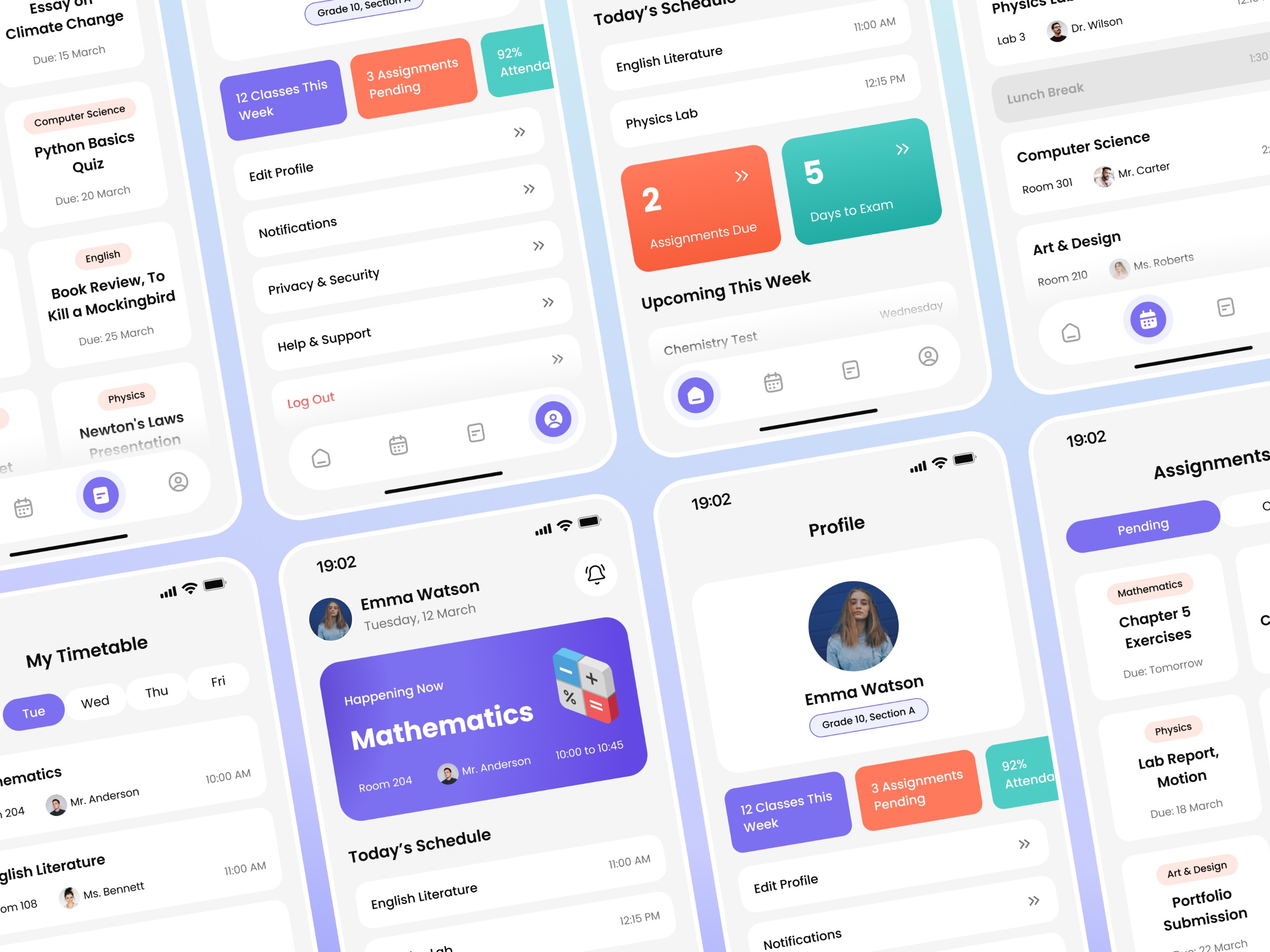
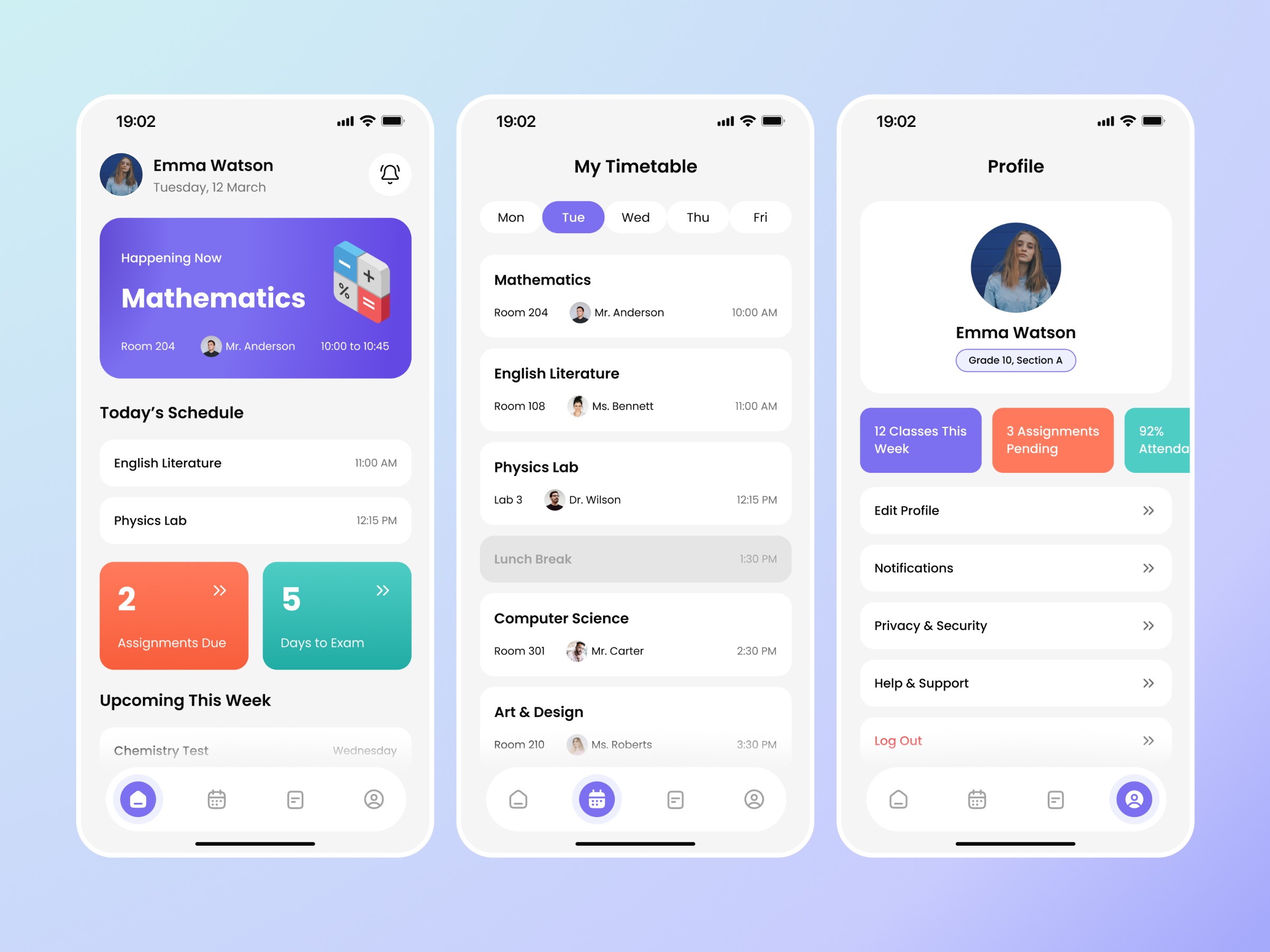
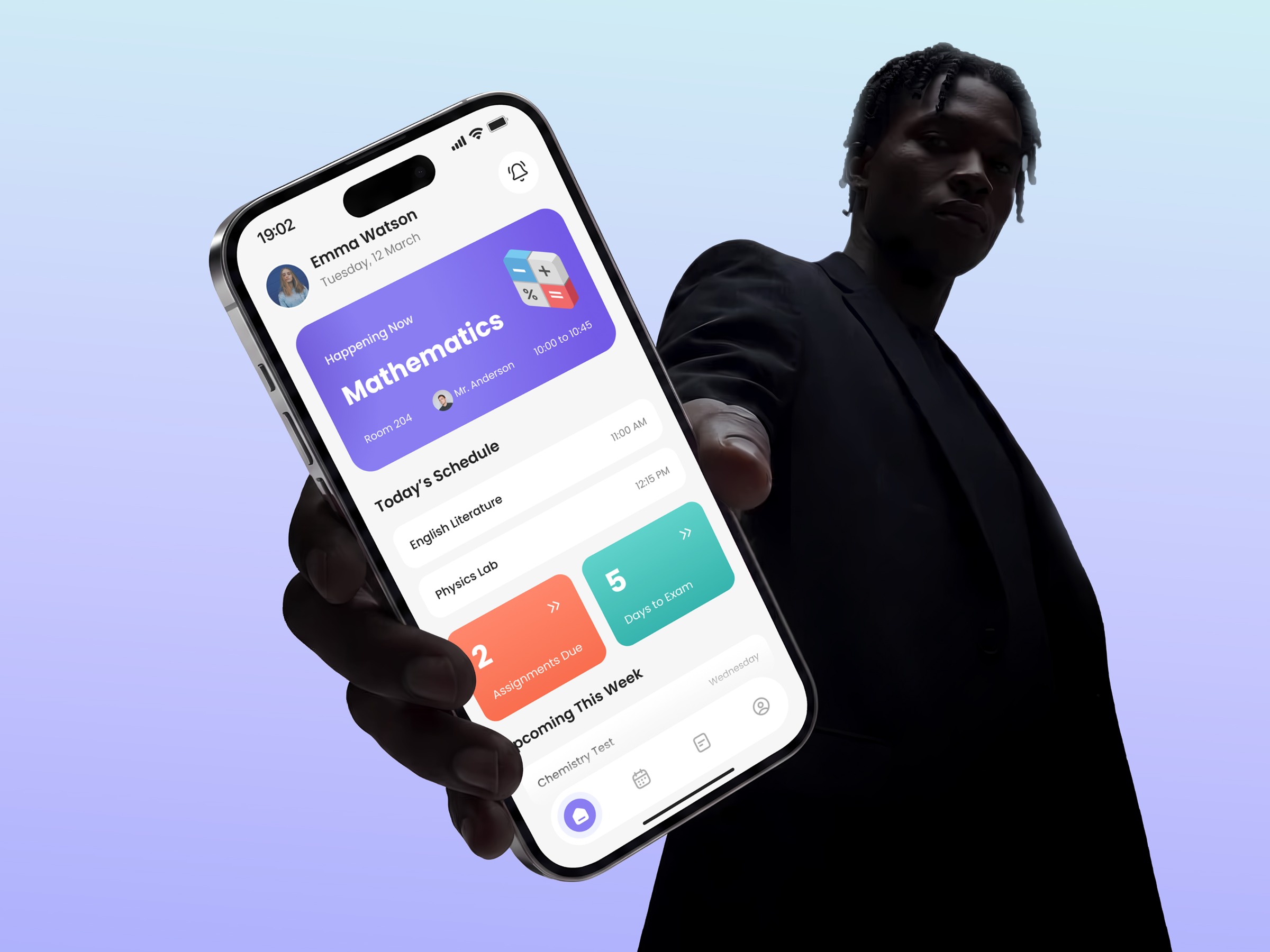
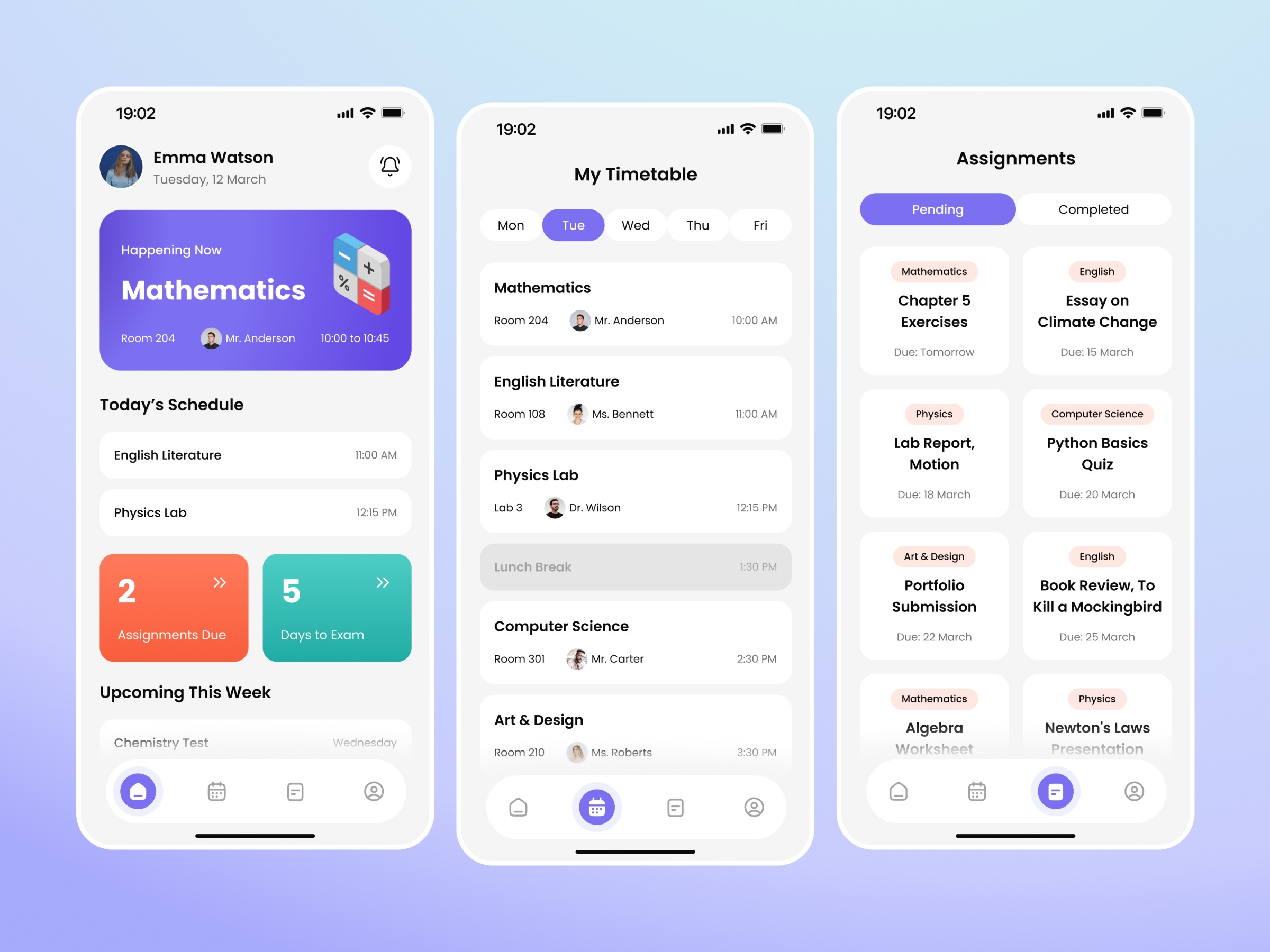
Some design challenges are refreshingly open-ended, and this one was exactly that. The brief: design a scheduling app for a high school. No client, no constraints, just an idea to run with, so the first real task was deciding what actually to build. I picked the student side of things and narrowed it down to four screens that cover a full daily rhythm: a home dashboard for "what's happening right now," a weekly timetable to plan, an assignments tracker to stay on top of deadlines, and a profile to tie it all together. Keeping it to four meant every screen could be fully thought through instead of half-finished. For a high schooler, the UI needed to feel energetic without being chaotic. I built the palette around purple, coral, and mint, three colors doing three different jobs. Purple anchors the primary UI, coral flags anything urgent (due assignments, live classes), and mint marks the calmer, informational stuff. Paired with Poppins, it gives the whole thing a rounded, approachable feel that still reads clearly at a glance. My favorite detail is probably the "Happening Now" card on the home screen; it pulls double duty as both the most useful info on the page and the visual anchor that makes the rest of the layout make sense. Everything else- the timetable's day-chips, the assignment cards, the settings list- follows the same card-based language, so the whole app feels like one connected system rather than four separate screens. This one was a good exercise in structure, taking a single line of a brief and building an entire, coherent flow around it.