

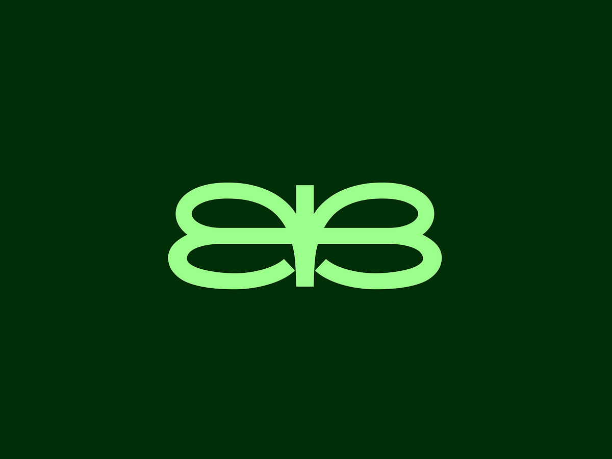
Double B — Butterfly Logo Mark
Project description
A minimal logo mark built around a simple visual idea — two mirrored B letterforms forming the shape of a butterfly. The Double B creates the foundation of the identity, while the butterfly adds a second layer of meaning around transformation, growth, beauty, and freedom. The goal was to keep the form simple, balanced, and recognizable without making the butterfly too literal. Logomark is Available for sale.

Support this project
Be the first to upvote