

Organic Flow — Minimal Leaf Logo, Letter S Logo
Project description
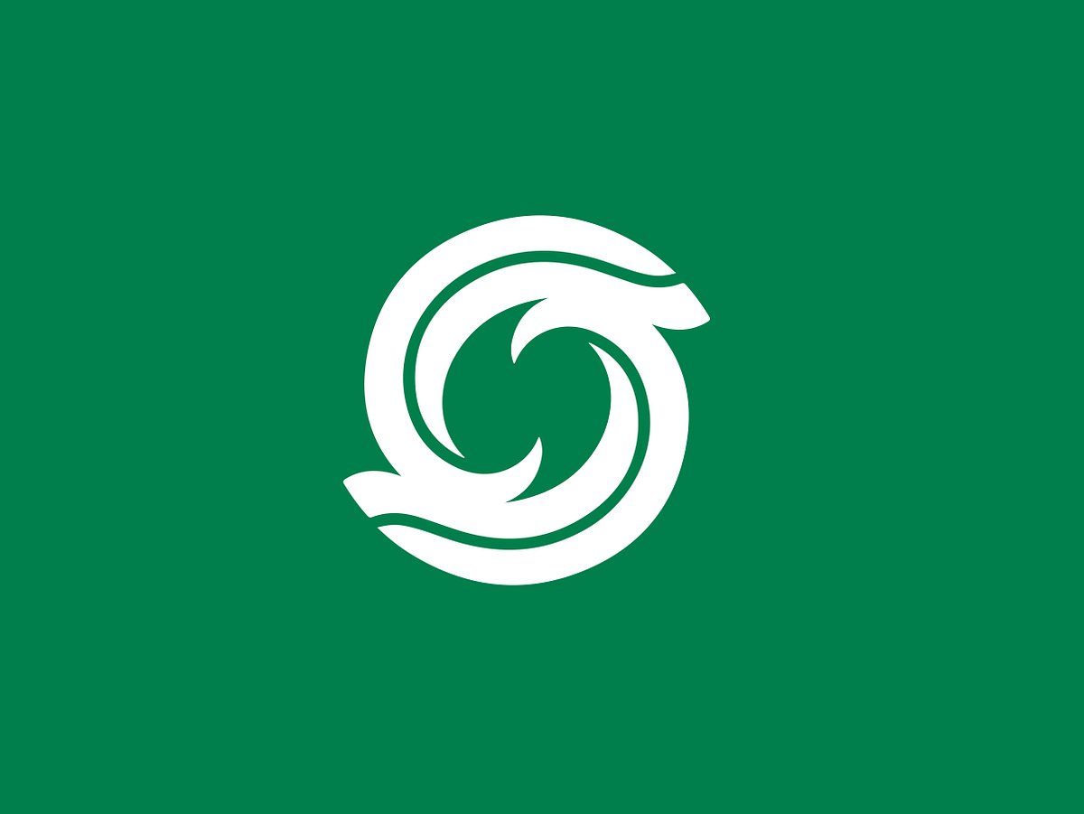
A minimal symbol inspired by the natural movement of leaves, growth, and continuous flow. The mark uses flowing curves and circular motion to create a distinctive organic form that feels modern, balanced, and memorable. The simplified silhouette allows the identity to remain strong across both digital and physical applications. Designed with a clean geometric approach, the symbol can work well for brands in sustainability, wellness, nature, agriculture, eco-tech, or modern lifestyle spaces. A study in how simplicity can turn a natural idea into a recognizable brand mark. Logomark is Available for sale.
Support this project
Be the first to upvote