Modern Financial Dashboard with Transaction Batching

Project description
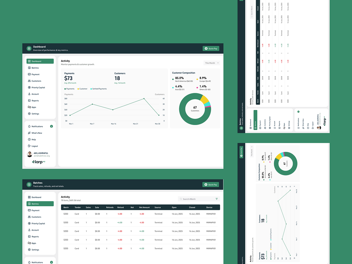
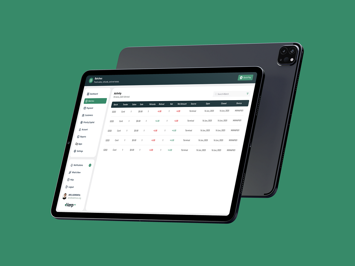
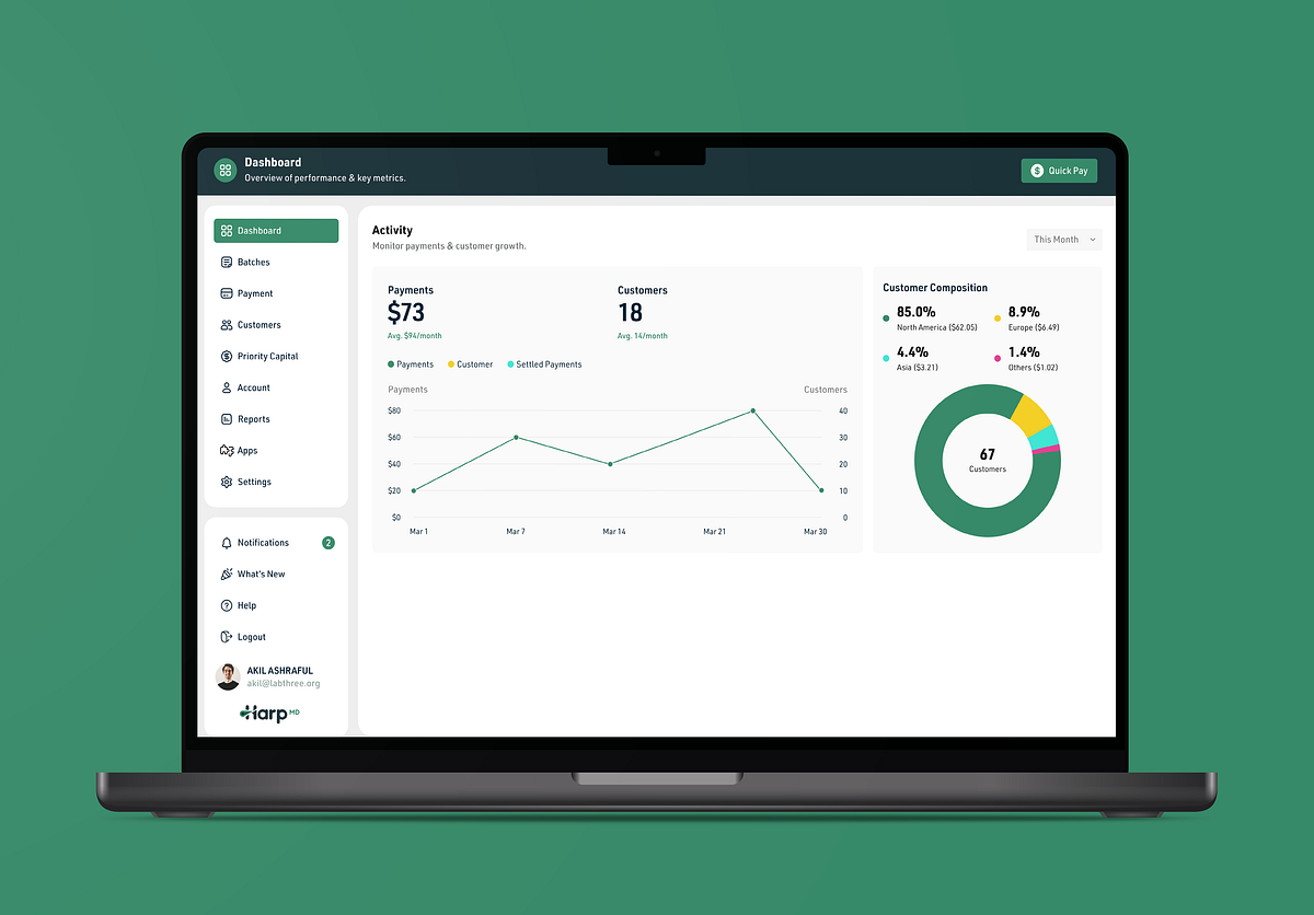
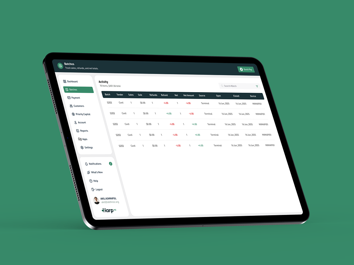
Payment Analytics Dashboard with Transaction ManagementThe interface architecture balances sophistication with accessibility, transforming dense financial data into actionable insights. The consistent teal-green palette with neutral grays conveys trustworthiness essential for financial software, while strategic whitespace and typography hierarchy prevent cognitive overload during extended usage sessions. Dashboard Tab Delivers Comprehensive Financial Oversight through Strategic Design Elements: ✔ Real-time metrics display showing total payments and customer counts at prime viewing positions ✔ Visual trend analysis using line charts for payment patterns and donut charts for geographic segmentation ✔ F-pattern layout placing critical information where users naturally scan first ✔ Color-coded indicators with green representing positive metrics and growth trends ✔ Quick Pay button enabling immediate transactions without navigation disruption ✔ Organized sidebar separating primary functions from secondary utilities like notifications and help Batches Tab Streamlines Transaction Management with Focused Functionality: ✔ Comprehensive data table displaying batch numbers, tender types, sales, refunds, and net amounts ✔ Two-column layout clearly separating navigation controls from working space ✔ Color-coded financial indicators using red for negative values and green for positive amounts ✔ Device ID tracking for transaction source identification and audit trails ✔ Context-aware header providing clear page purpose with persistent Quick Pay access ✔ Single-view design enabling complete workflow execution without screen switching This design prioritizes user goals over technical complexity by implementing proven fintech UX principles. The combination of immediate metric visibility, conditional formatting, and streamlined navigation reduces decision-making time while maintaining comprehensive financial oversight capabilities, ensuring efficient transaction management across all user workflows. How should financial dashboards manage data density? Strategy: Progressive Disclosure & The F-Pattern To prevent cognitive overload, dashboards must align with the F-pattern, placing critical metrics in the top-left for immediate visibility. Complex data tables should be replaced by abstract visualizations to allow users to grasp trends instantly. High-Stakes Insight: Corporate fintech rely on glanceability. In high-risk environments, clutter creates distrust. If a user cannot assess their financial status or vendor reputation in under three seconds, the interface fails. How does color psychology build trust? Strategy: Conditioned associations & signaling color is functional, not just aesthetic. Green leverages universal associations, while Red acts as a visual brake for alerts. A consistent header color anchors the navigation and builds trust through visual consistency. High-Stakes Insight: In high-stakes financial applications, consistent design systems function as trust markers. Rigorous adherence to brand identity, typography hierarchy, and color patterns creates visual reliability that users subconsciously recognize, making fraudulent interfaces immediately identifiable through their inconsistent execution. Persistent user identity components reduce cognitive friction and prevent costly transaction errors.


Support this project
Upvote