Parcodata visual identity


Project description
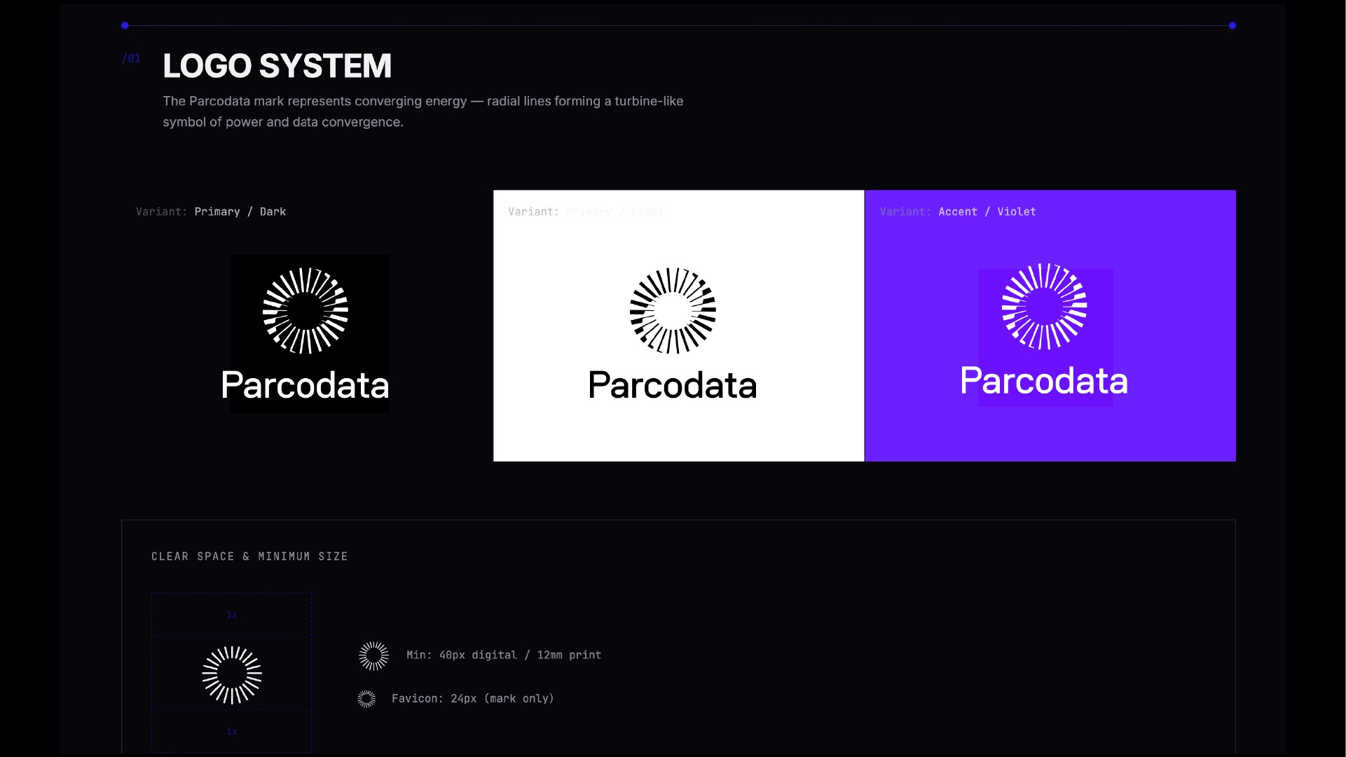
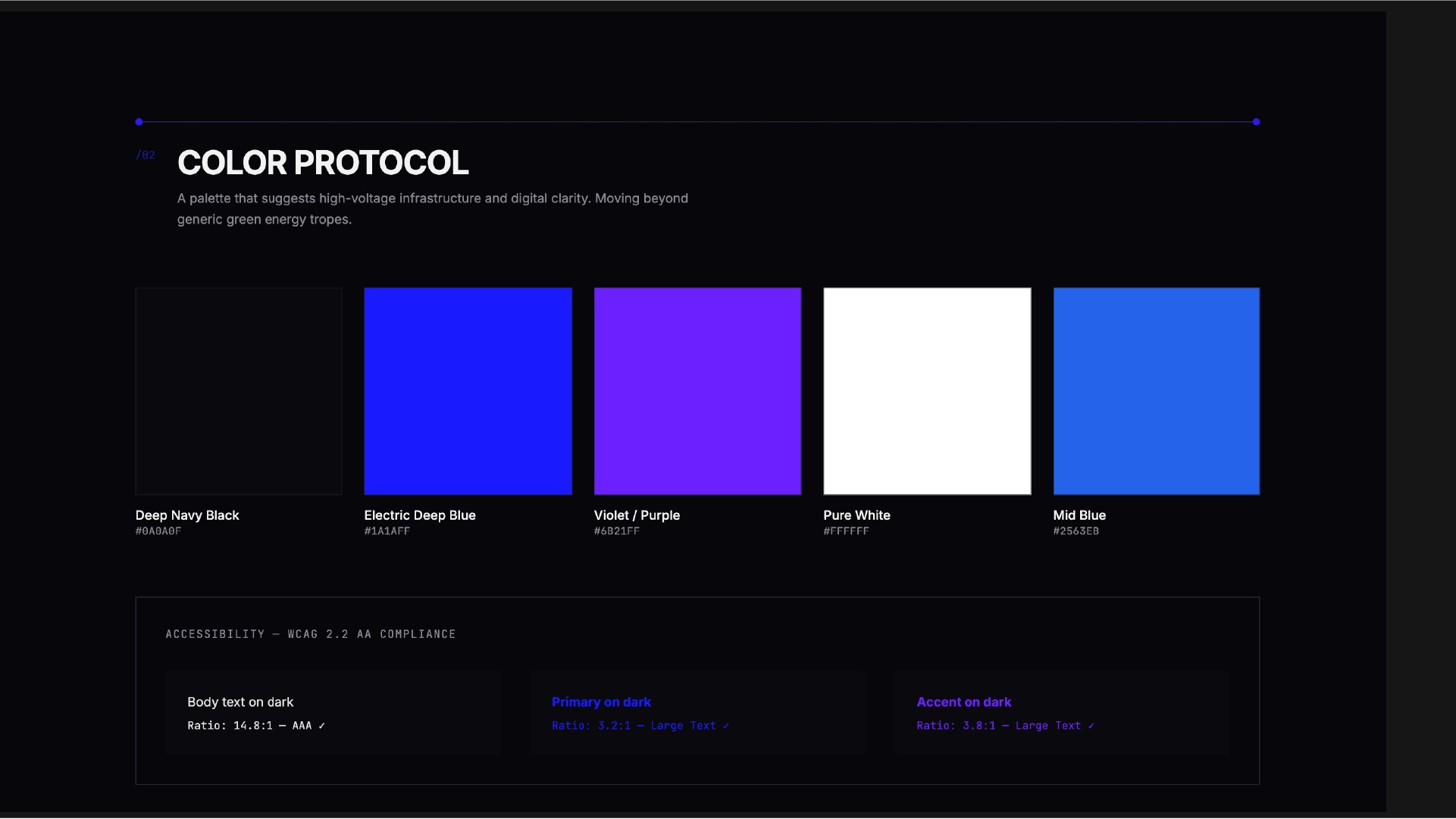
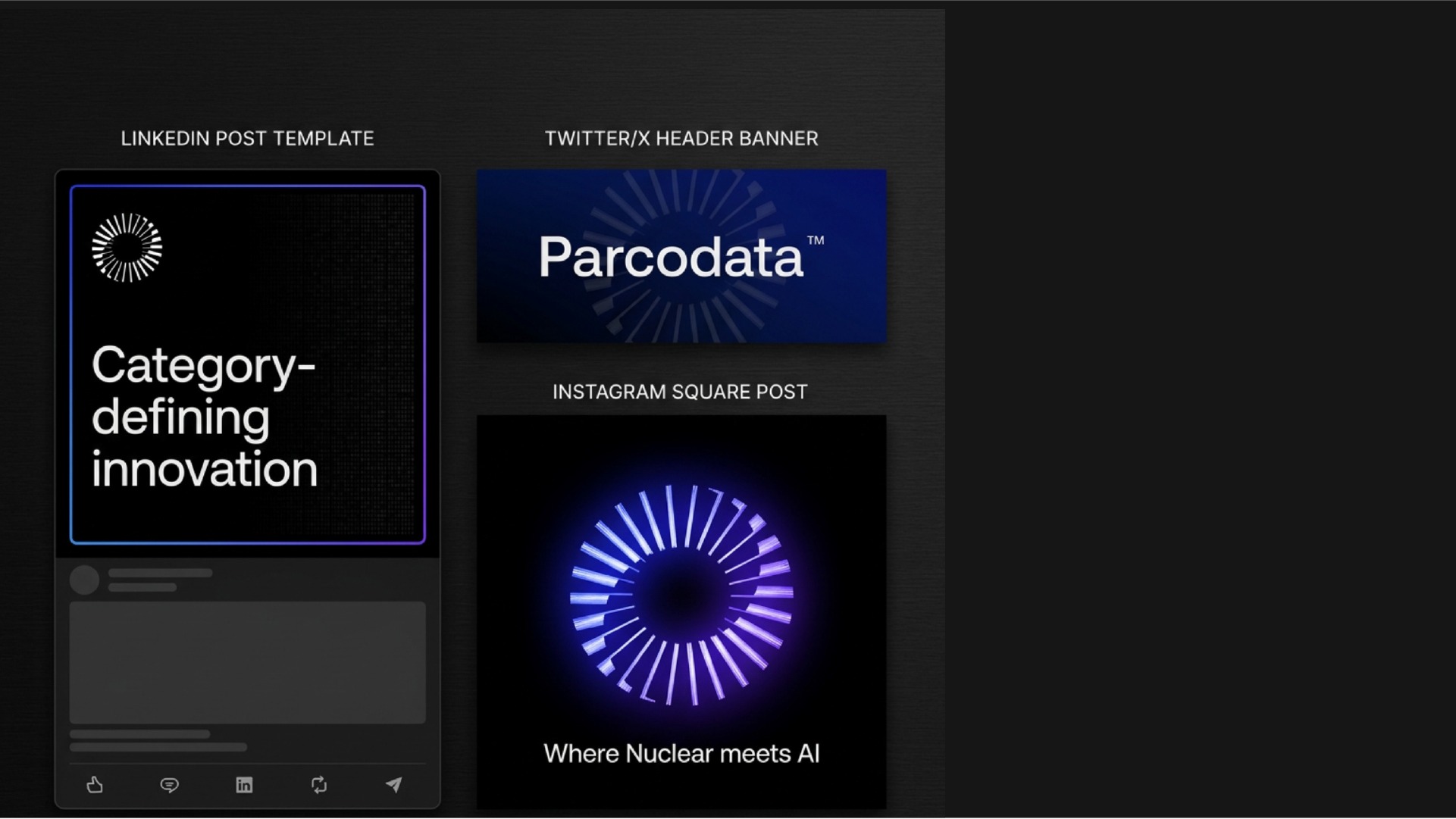
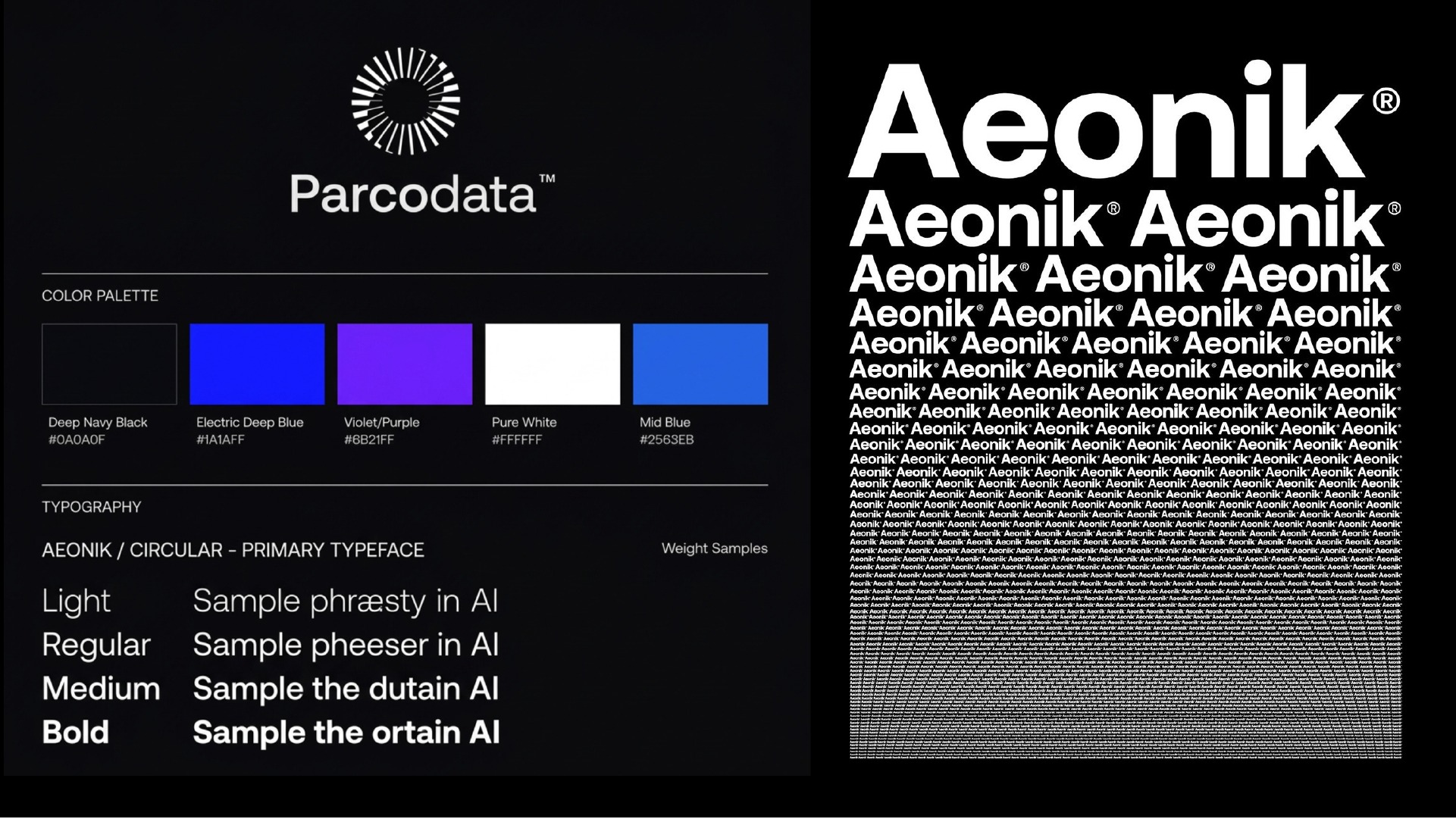
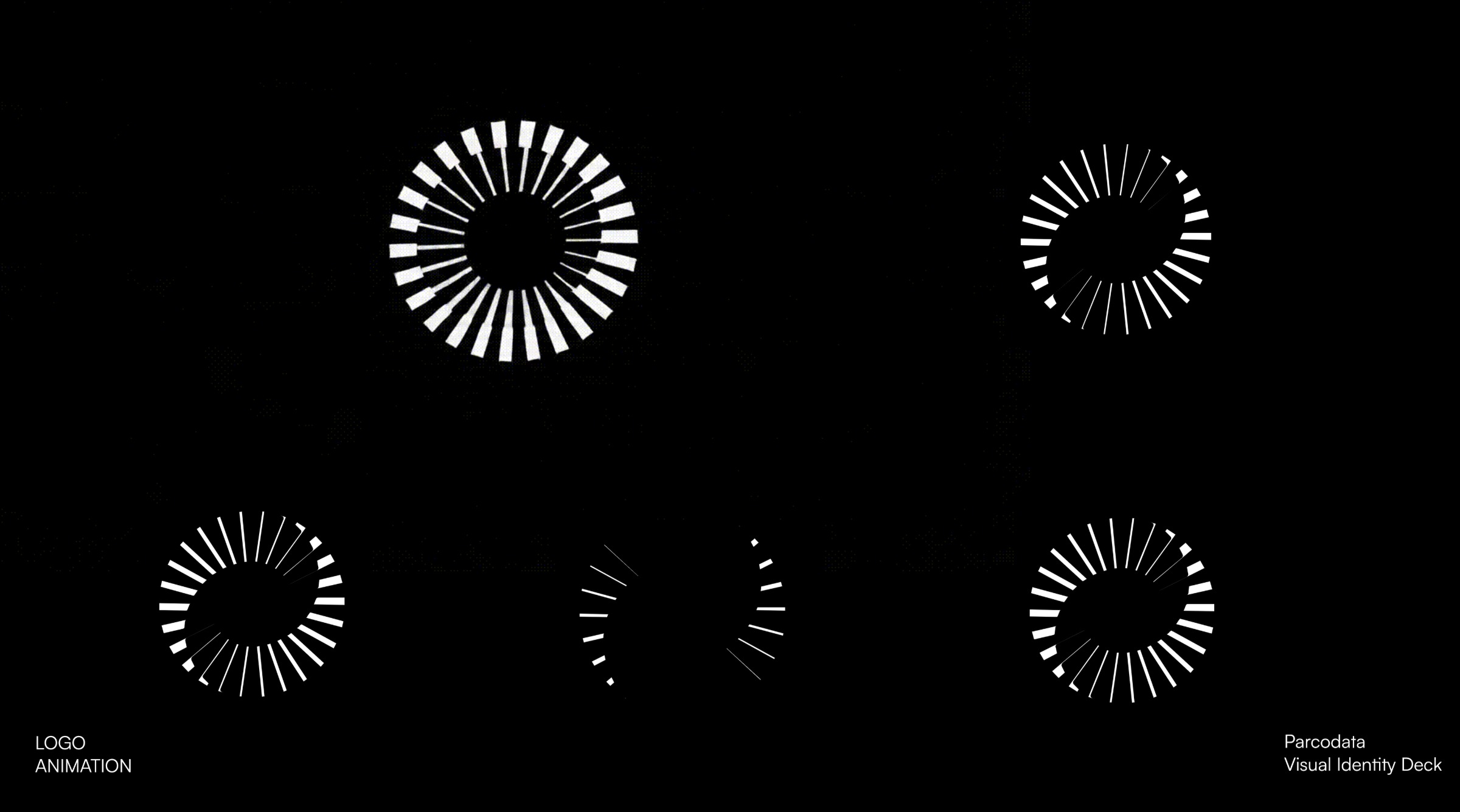
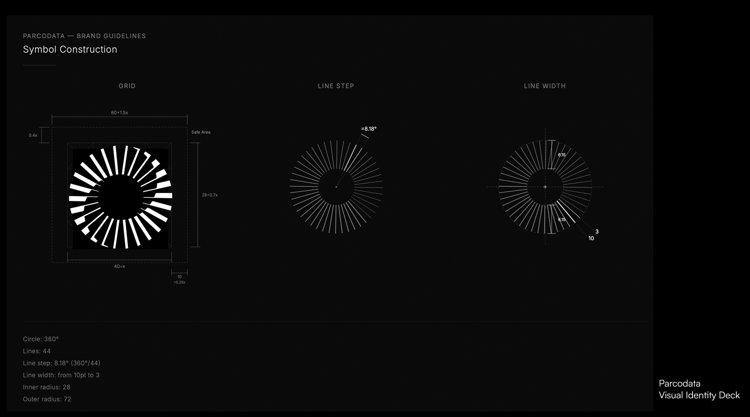
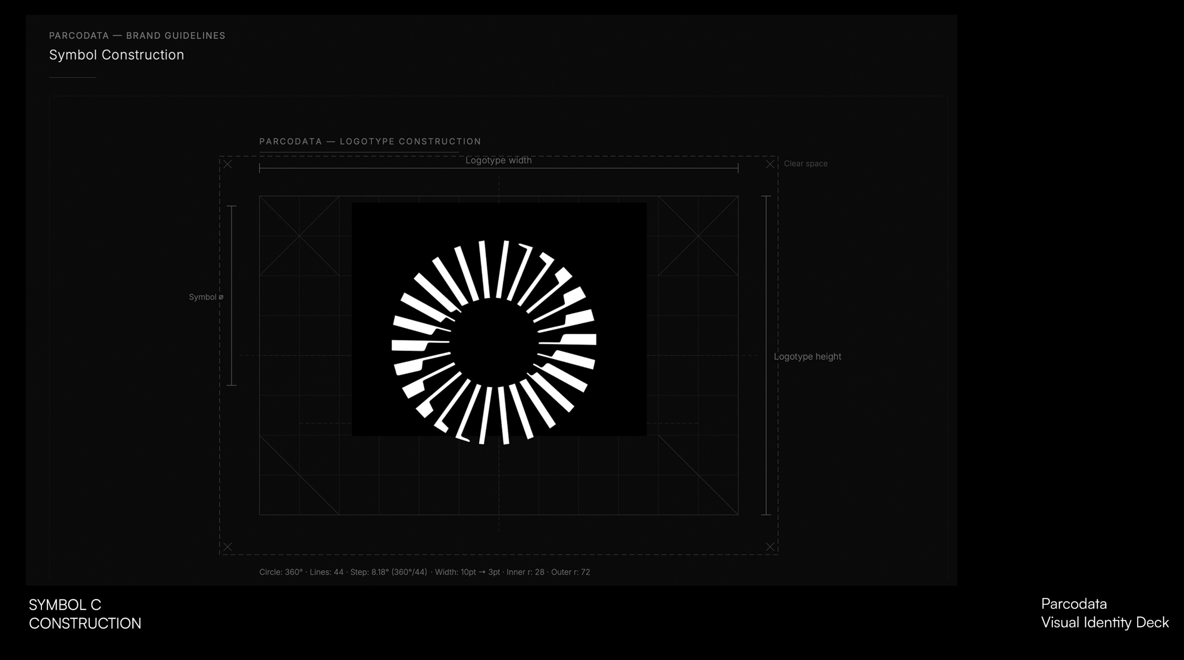
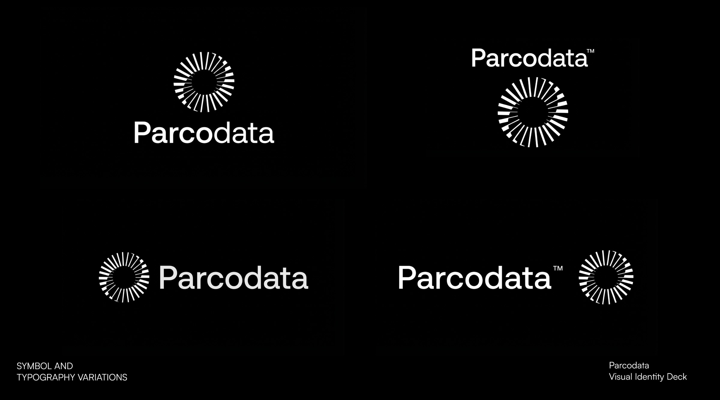
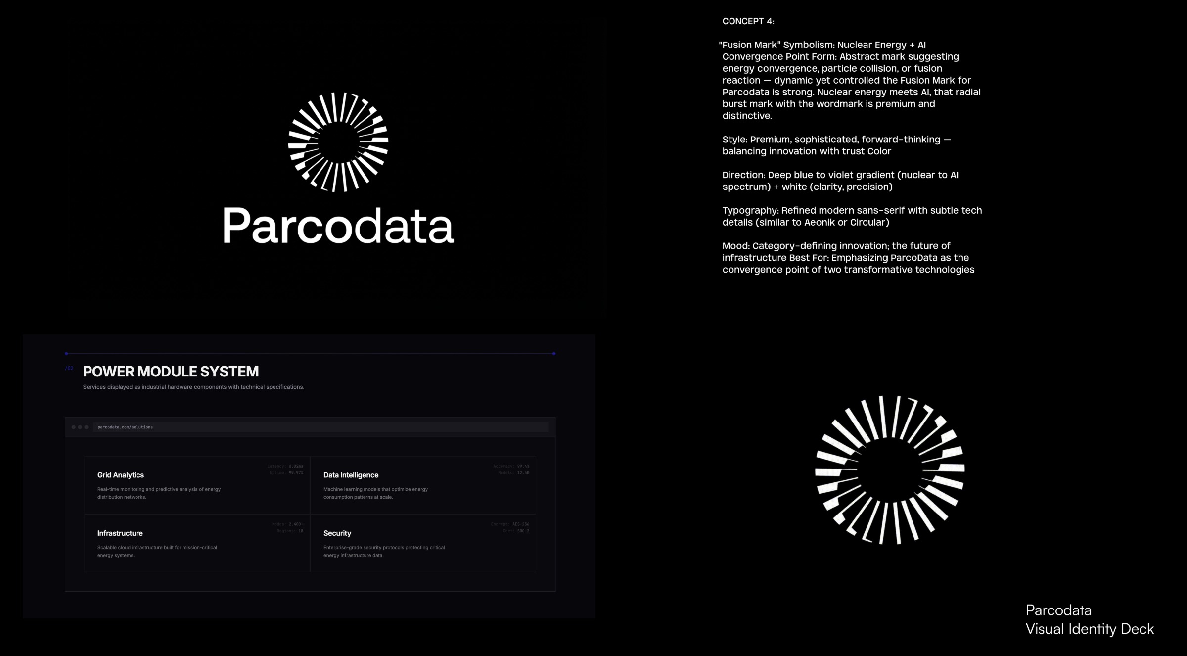
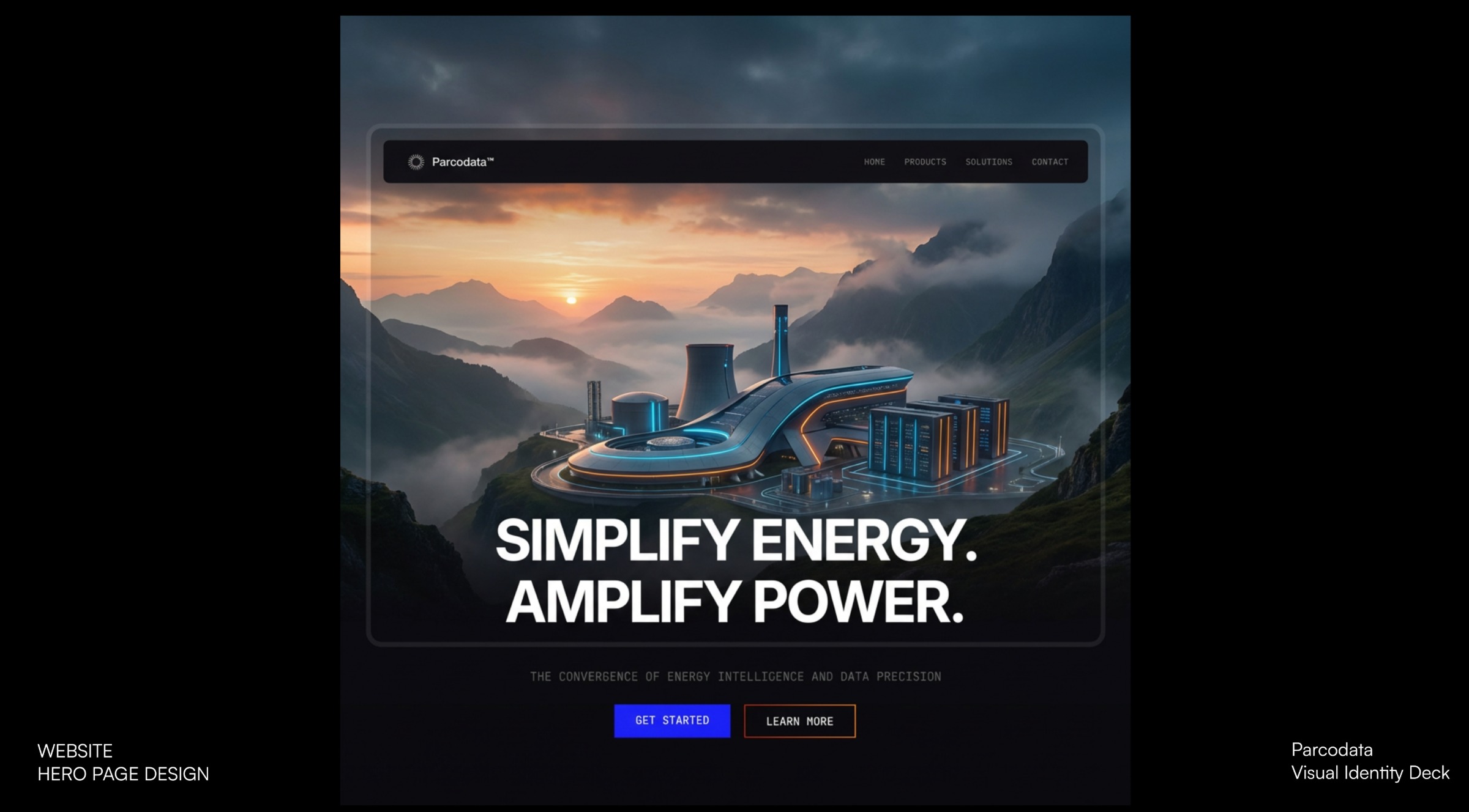
ParcoData Inc. — Brand Identity Creative Direction Based on the comprehensive client interview and competitive landscape analysis, I've developed a strategic creative direction that positions ParcoData as the category-defining leader in autonomous nuclear-powered AI infrastructure. Brand Challenge: ParcoData is entering a nascent market at the intersection of nuclear energy and AI infrastructure — a space requiring immediate credibility, institutional trust, and technological authority. The brand must appeal simultaneously to hyperscale cloud operators, government agencies, investors, and strategic partners ahead of a public market event. "Fusion Mark" Symbolism: Nuclear Energy + AI Convergence Point Form: Abstract mark suggesting energy convergence, particle collision, or fusion reaction — dynamic yet controlled the Fusion Mark for Parcodata is strong. Nuclear energy meets AI, that radial burst mark with the wordmark is premium and distinctive. Style: Premium, sophisticated, forward-thinking — balancing innovation with trust

Support this project
Upvote