Korn Bakery Brand Identity & Packaging — noma club

Project description
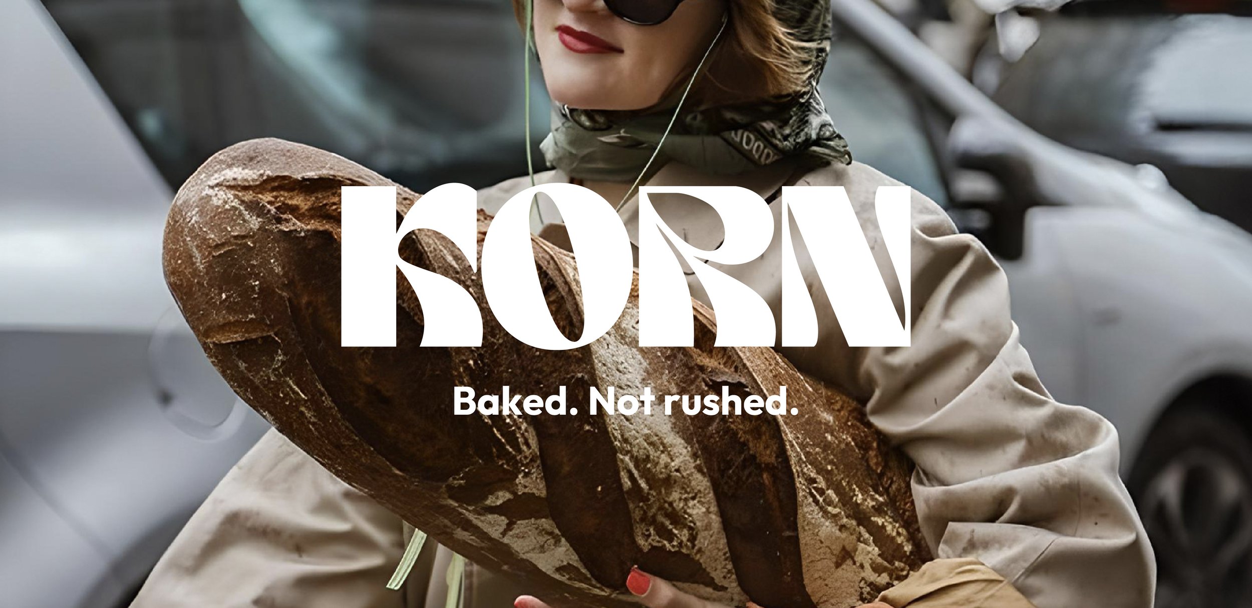
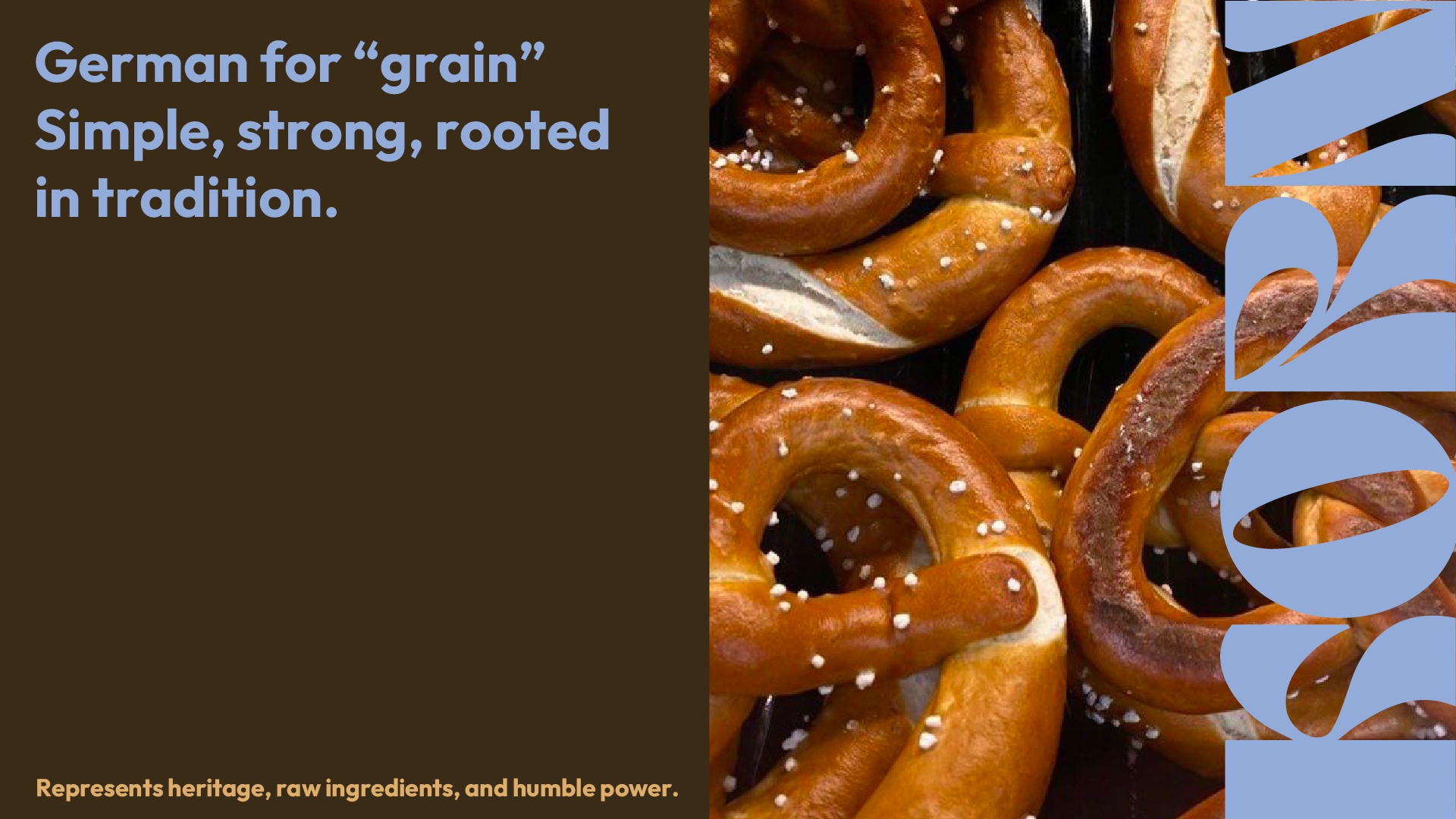
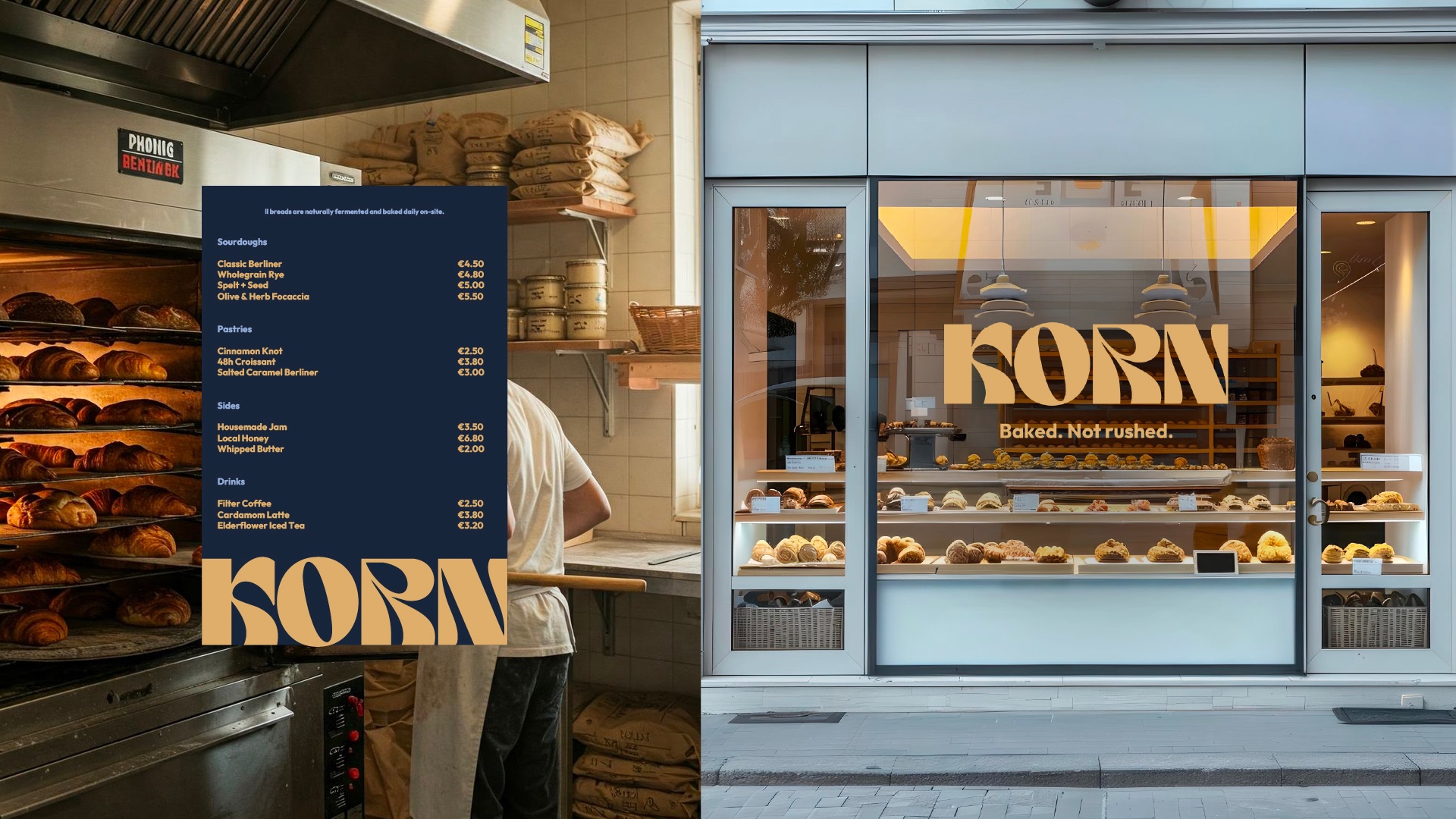
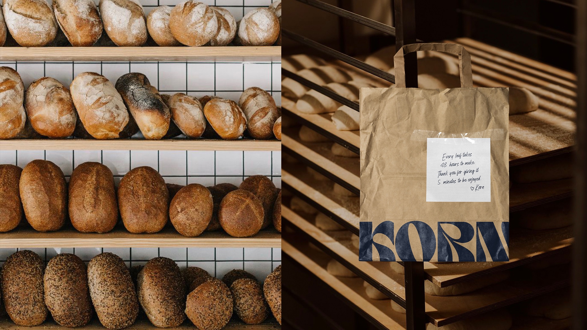
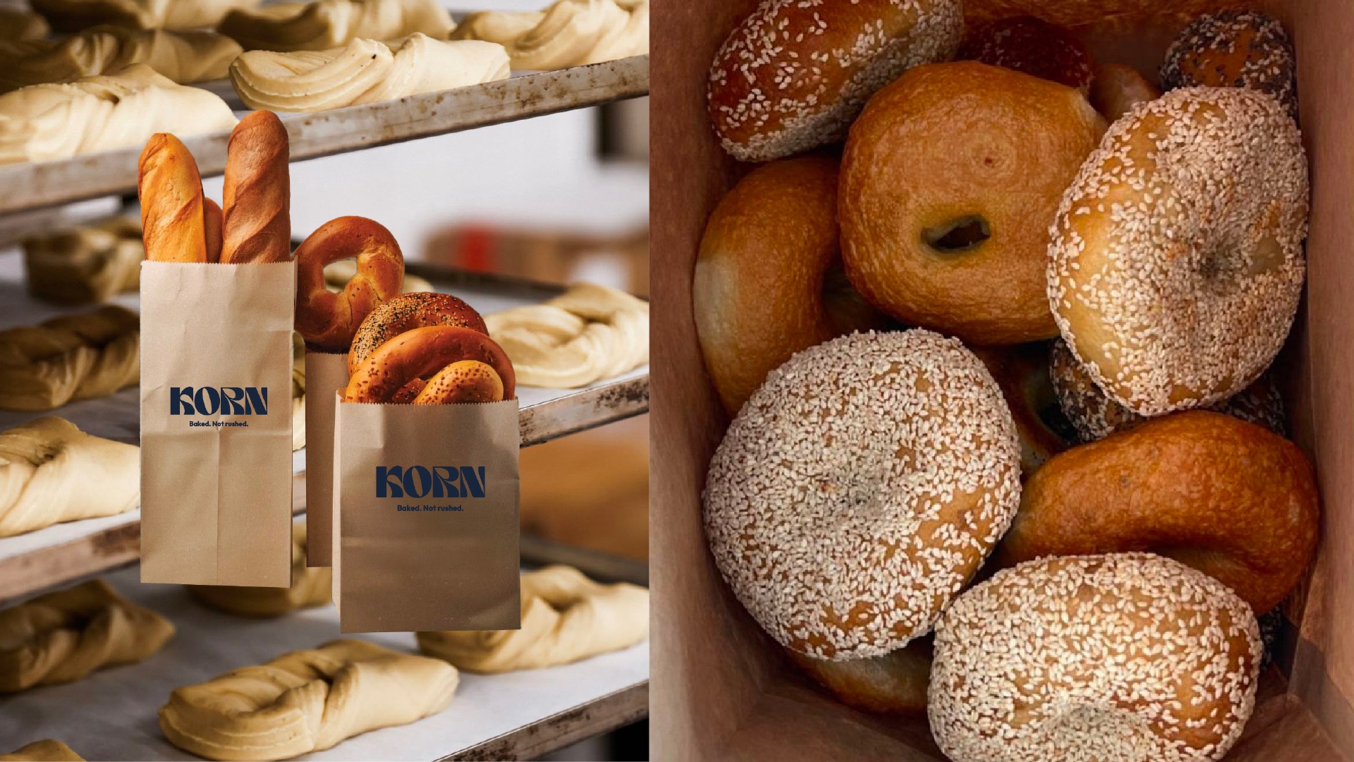
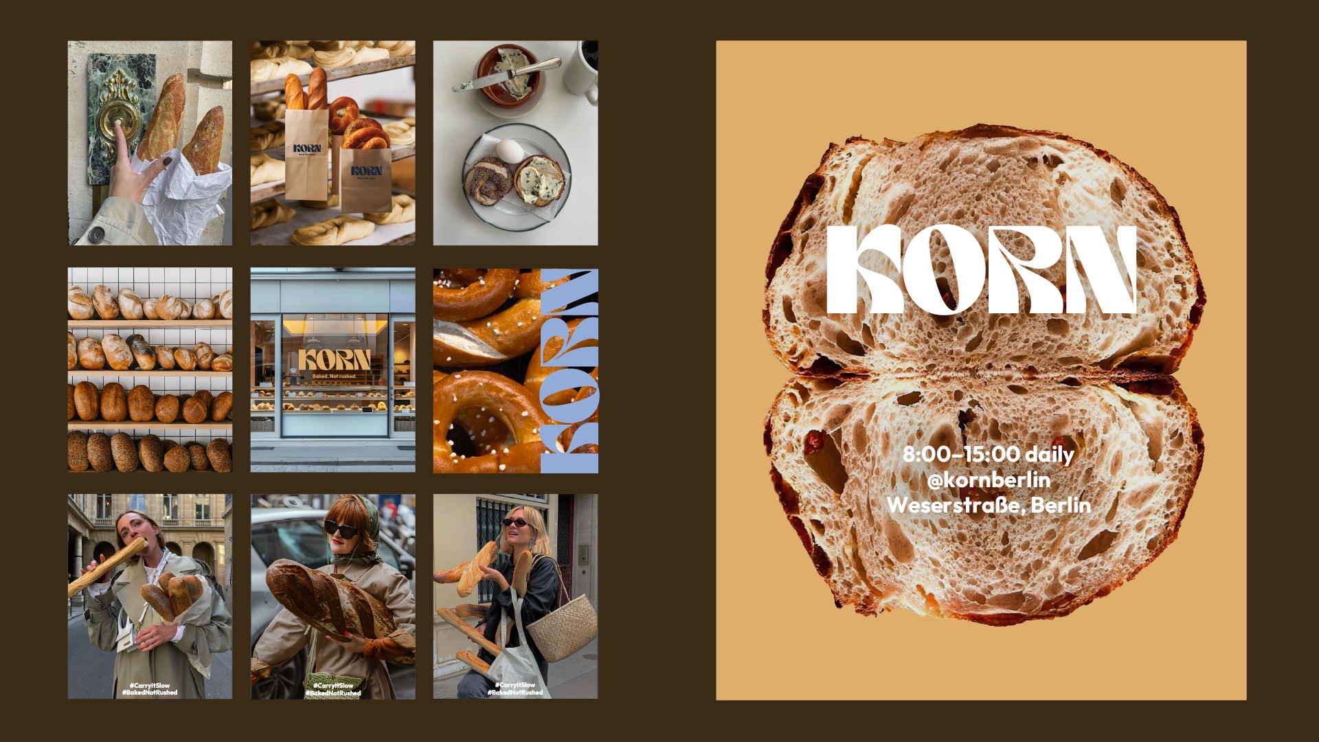
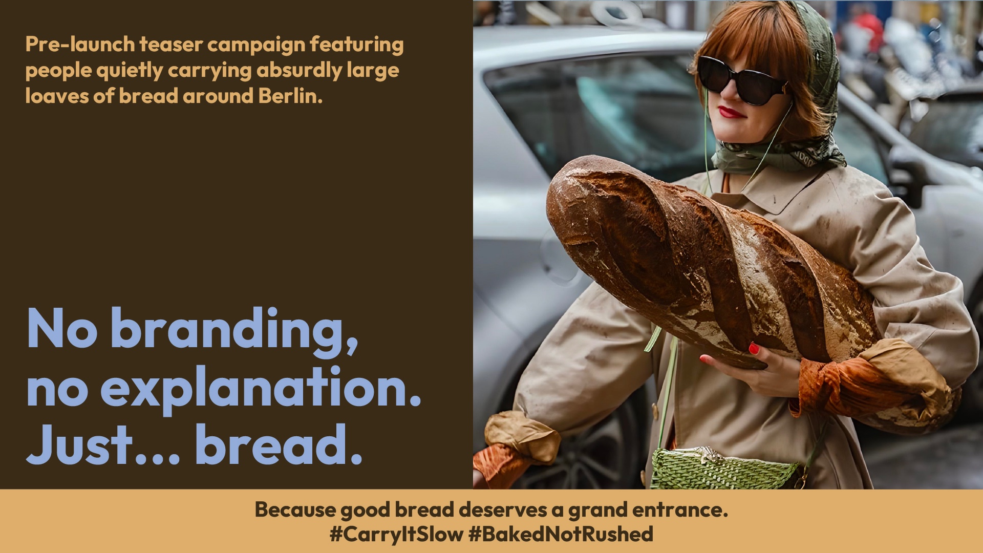
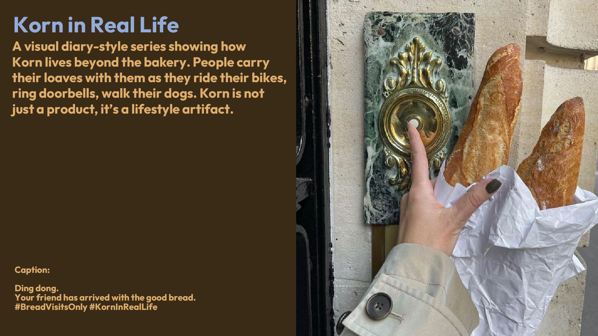
Simple, strong, rooted in tradition Korn embodies heritage, raw ingredients, and humble power. Before the bakery even launched, the brand let the city do the talking. In a quiet teaser campaign, people carried absurdly large loaves of bread through Berlin no logo, no explanation. Just bread. This bold act of minimalism turned everyday spaces into stage sets, inviting curiosity and connection without saying a word. Korn’s identity is stripped back yet potent. The visual language is grounded in natural textures, neutral tones, and elemental forms. The naming, typography and imagery reinforce the sense of rawness, authenticity, and timelessness. At its core, Korn is about honoring grain the most basic, honest ingredient and letting it speak for itself.
Support this project
Upvote