
DOTRIX · Interface Essentials · Part 2
Project description
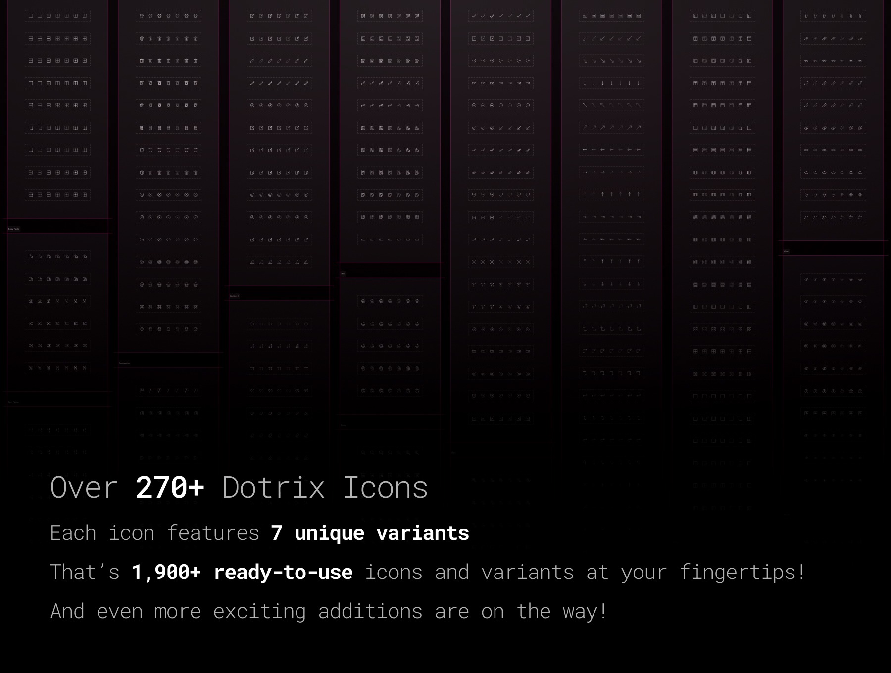
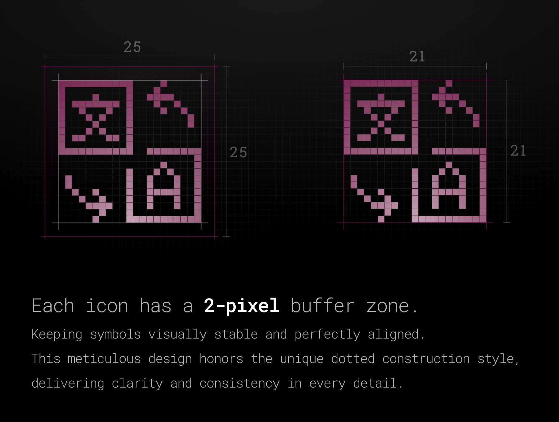
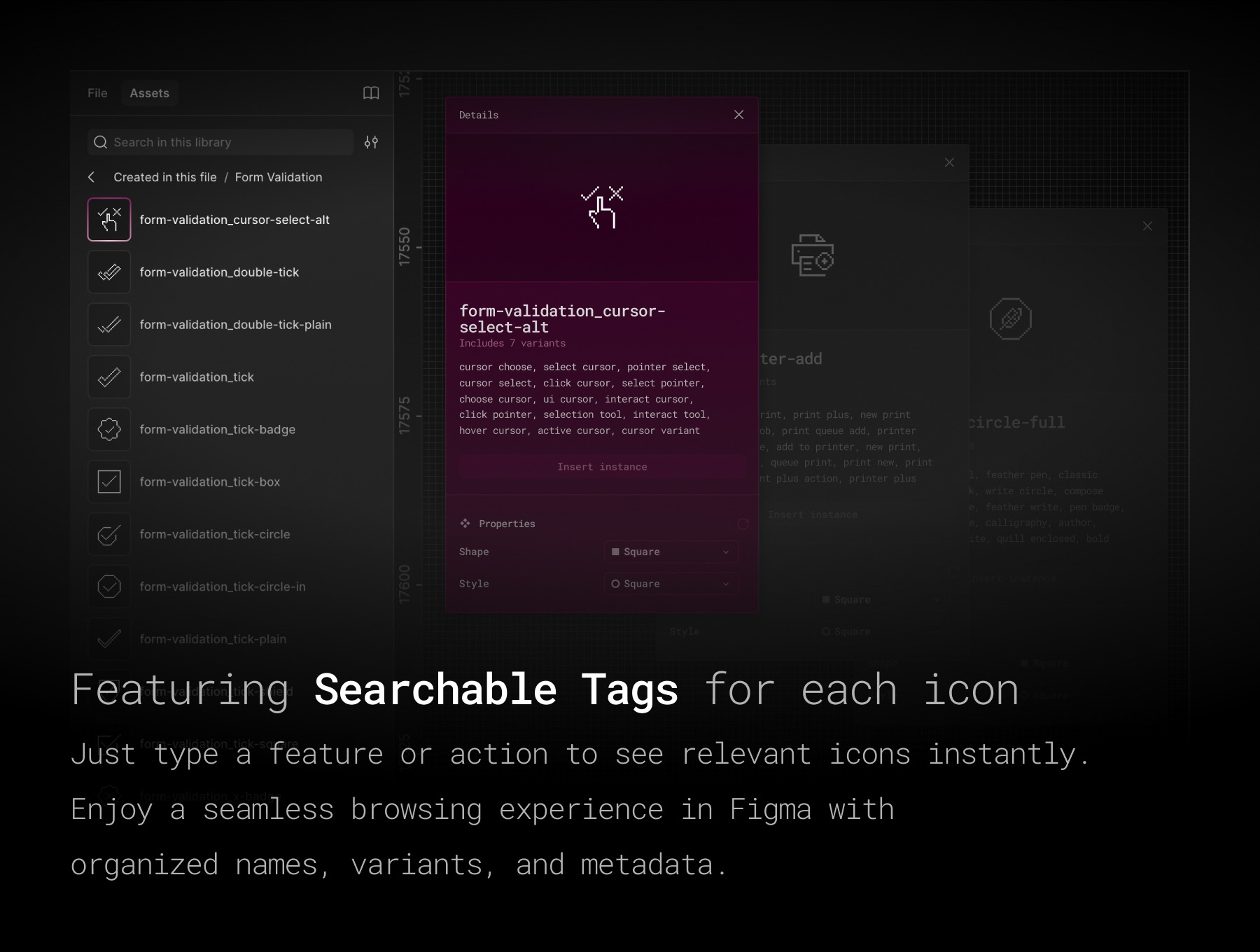
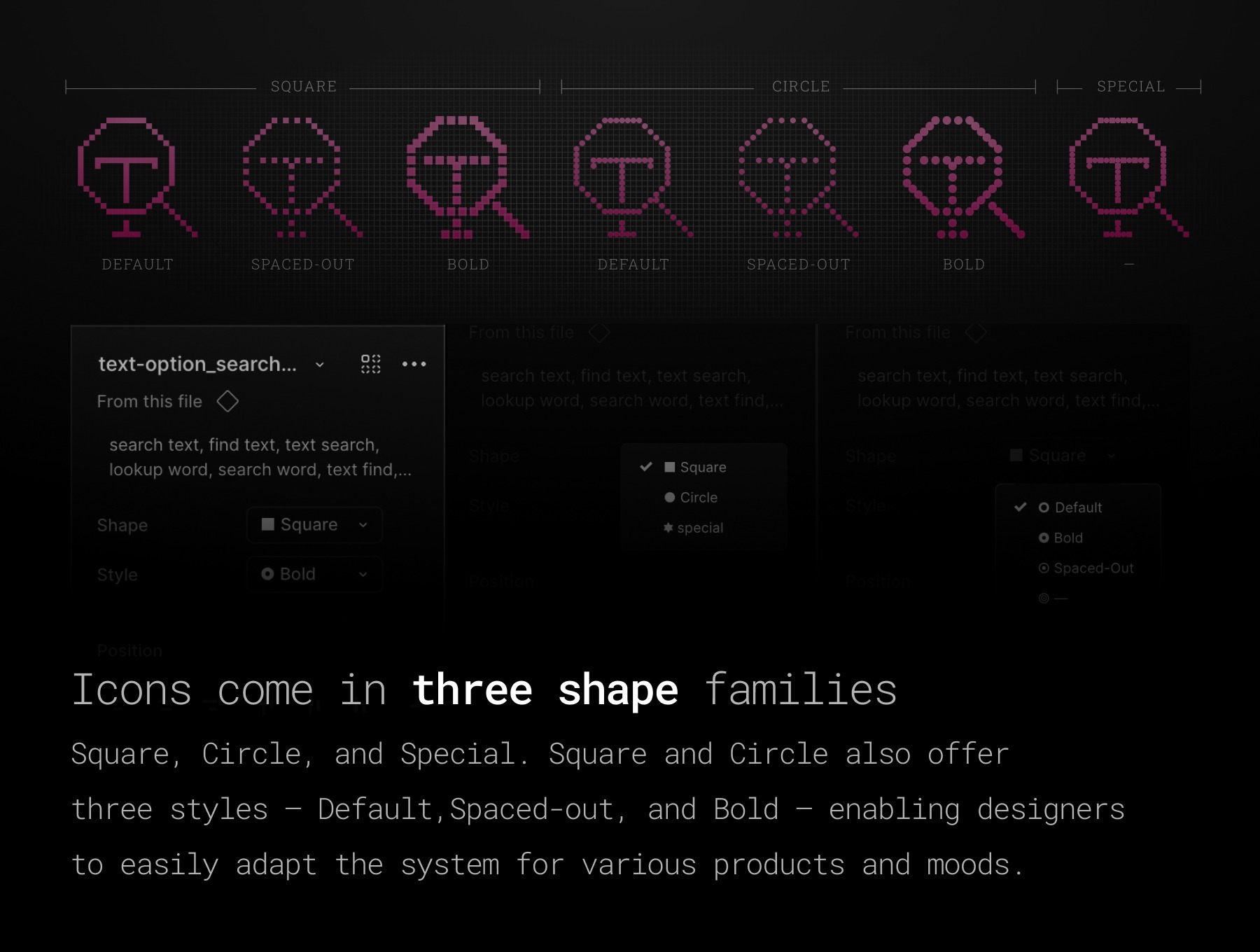
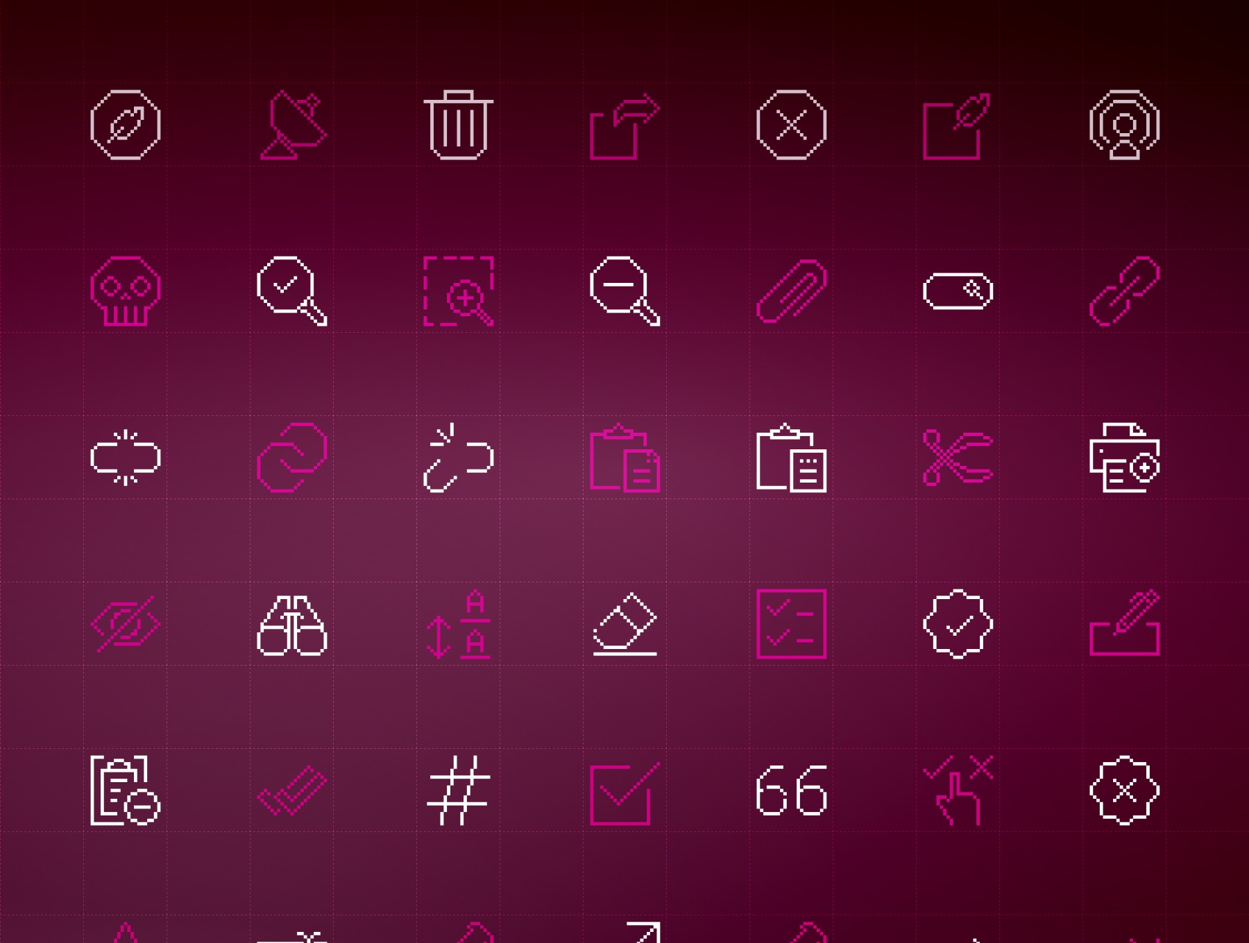
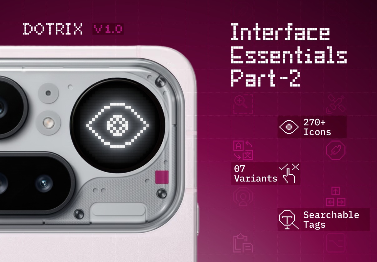
Most icon packs give you shapes. DOTRIX gives you a system. Interface Essentials · Part 2 is built around a single question: what does a user do inside a product? They write and edit. They search and zoom. They copy, paste, delete, share, validate, format, and navigate. Every one of those actions is now an icon — precision-drawn on a 25×25 dot-matrix grid, with a 2-pixel buffer on all sides, structured as a production-ready Figma component. 270+ icons. 1,900+ variants. 19 categories. Built to the same exacting standard as Part 1 — and designed to work alongside it without a single pixel out of place. ------------------------------------------------------------- What's inside 19 categories built around real product behaviour: • Edit — Pen, pencil, quill, and write variants across page, circle, and standalone containers • Delete — From soft removal to permanent purge: trash, bin, circle-x, disable, and skull states • Share — Megaphone, satellite dish, upload arrows, forward arrows, and network-node broadcast • Search — Round, compact, pill, bar, circle, and square magnifiers with check and cancel states • Zoom — In and out at standard and bold weights, with page-level and header-level variants • Link-Unlink — Paperclip, chain, infinity link, broken, and fully shattered states • View — Eye variants with hex, diamond, gear, and badge containers — plus binoculars and off • Copy-Paste — Clipboard copy, clipboard paste, and scissors in four directional cuts • Print — Printer in five functional states: image, document, add, remove, and preview • Text Formatting — Bold, italic, underline, strikethrough, caps, scale, eraser, cursor, and more • Form Edition — Checklists, task states, paper-write, page-pen, and typing • Form Validation — Tick and remove states across plain, circle, square, shield, badge, and pill • Pin — Pushpin angled, tack thin, and pushpin flat • Keyboard — Complete key set: directional arrows, returns, modifiers, asterisks, and special keys • Paragraphs — Alignment, indent, spacing, image-float, column split, and page orientation • Text Option — Sort ascending and descending, rotate in 8 directions, translate, and spell-check • Layouts — 23 structures from single-sidebar to full 3×3 module grids • Cell Formatting — All 9 spreadsheet border configurations • Lists — Add, remove, cancel, checkbox, bullet, star, numbered, check, and close states ------------------------------------------------------------- Variant architecture: Every icon ships with Shape and Style exposed as Figma component properties — giving teams the range to adapt the visual language without touching a single vector. ------------------------------------------------------------- Shape variants: • Square – sharp, technical, grid-faithful • Circle – approachable, compact, modern • Special – alternating square and circle dots for a distinctive hybrid rhythm ------------------------------------------------------------- Style variants: • Default – clean and balanced for everyday use • Spaced-out – open, airy, minimal weight • Bold – dense dot rhythm for high-contrast emphasis Square and Circle support all three style weights. Special is a fixed expressive treatment designed to stand out. ------------------------------------------------------------- Built for serious Figma workflows: Every component has a keyword-optimized description tag. Search broken link, tick shield, zoom page, outdent, scissors cut — the right icon surfaces immediately from the Assets panel. No scrolling. No folder-diving. Naming follows a consistent category_descriptor snake_case convention across all 270+ icons, making handoff to engineering clean and predictable from day one. ------------------------------------------------------------- This library is built for: • Product design systems at any scale • SaaS dashboards, admin panels, and content editors • Developer tools, terminal UIs, and data-dense interfaces • Text editors, form builders, and document platforms • Dot-matrix, pixel-grid, and retro-tech visual languages • Any product that takes what it does seriously ------------------------------------------------------------- One system. Two parts. More coming. Interface Essentials · Part 2 shares the exact same grid, variant architecture, and naming standard as Part 1. They are designed to work as a single library — not two separate purchases that happen to look similar. Future parts will expand the DOTRIX ecosystem into new domains: communication, media, commerce, data visualization, and beyond. Every part will ship on the same 25×25 grid. Every part will follow the same component structure. Every part will slot in without rebuilding anything. You are not buying an icon pack. You are adopting an icon language. Highlights: - 270+ dot-matrix icons across 19 interaction and content categories - 1,900+ Shape × Style variants — square, circle, special, default, spaced-out, bold - Keyword-tagged components — search by action, concept, or visual in the Assets panel - Consistent category_descriptor naming for clean dev handoff - Fully compatible with Part 1 — same grid, same system, same standard - Part of a growing ecosystem — more domains, more parts, one language,