Dunder Mifflin Website Redesign — Hero Section

Project description
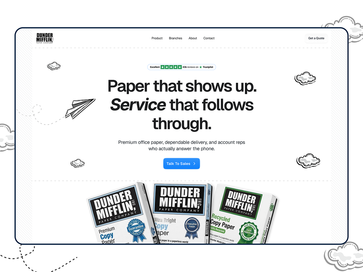
Introducing a landing page hero concept for Dunder Mifflin Paper Company from The Office — designed with a clean, bold headline and playful doodle-style elements to keep the experience friendly and memorable. The hero focuses on clarity and trust: a strong value proposition, a review badge for social proof, and a clear CTA to drive sales conversations. Product imagery anchors the brand, while subtle illustrations (clouds and paper planes) add personality without distracting from conversion. Design Focus: - Bold typography + strong hierarchy - Clean layout with lots of whitespace - Social proof placement (rating + reviews) - Conversion-focused CTA (“Talk to Sales”) - Playful doodle accents + branded product imagery - Minimal navigation with “Get a Quote” action

Support this project
Upvote