

Project: "The Father" – Label Design for Cabernet Franc
Project description
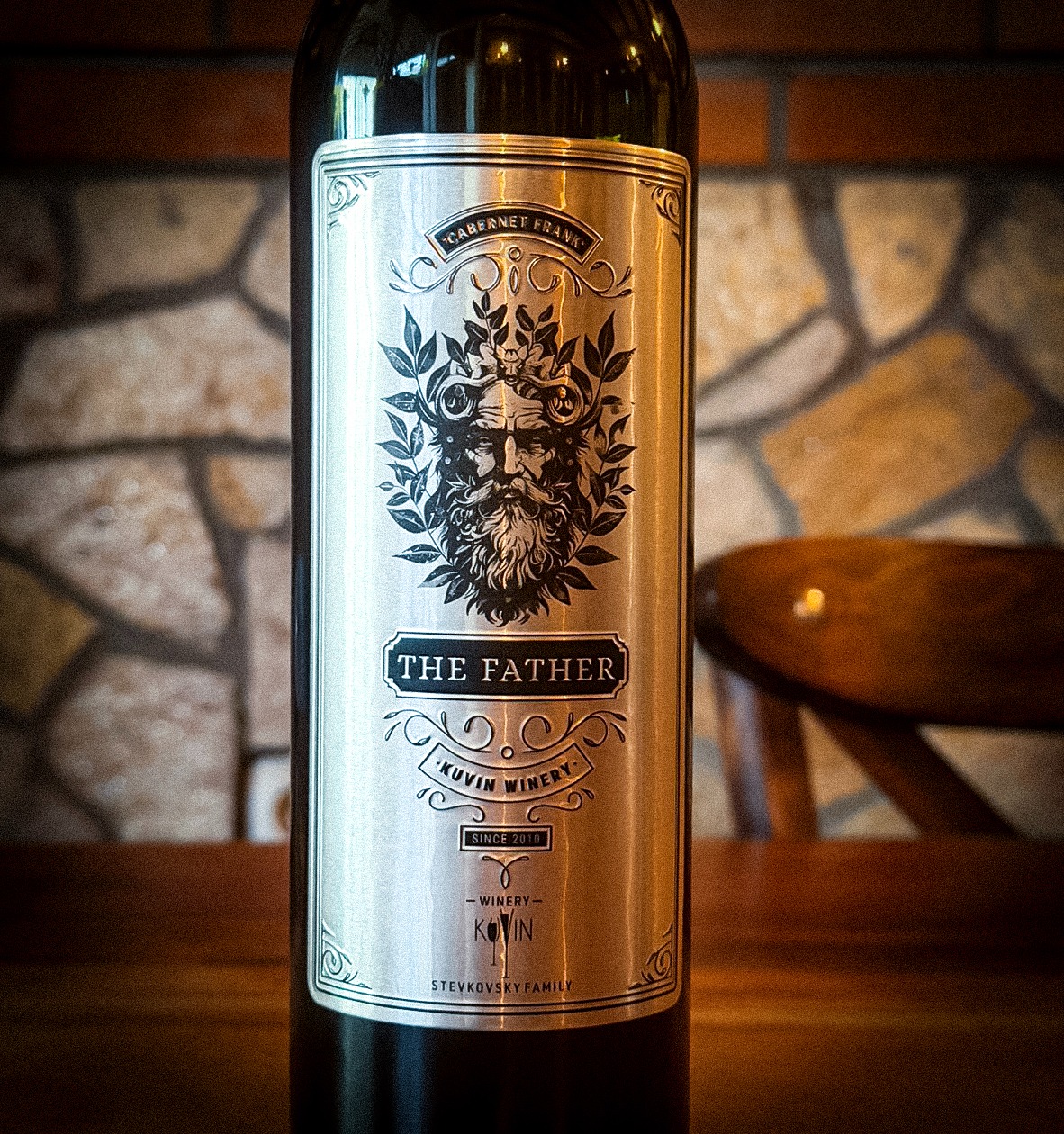
Project Overview** The objective of this project was to develop a powerful and commanding visual identity for the premium **Cabernet Franc** produced by **Kuvin Winery**. The inspiration stems from the variety's genetic lineage—widely recognized as the "father" of many modern cultivars (including Cabernet Sauvignon)—which dictated the conceptual direction for the name and symbolism: **"The Father". Concept & Symbolism** The central element of the design is the mythic figure of "The Father," depicted through a detailed illustration of a wise, bearded man reminiscent of ancient deities of nature and wine. His crown of vine leaves and branches symbolizes the unbreakable bond between the earth, the vine, and tradition. * **Typography:** A classic, serif typeface is utilized to convey authority, trust, and timelessness. * **Color Palette:** The label is executed on a metallic silver base with deep black contrasts, providing the product with a sophisticated, high-end aesthetic. * **Ornamentation:** The frame and decorative flourishes are inspired by classic engraving styles, highlighting the artisanal approach of the Stevkovski family. ### **Technical Details** * **Client:** Kuvin Winery * **Variety:** Cabernet Franc * **Title:** The Father * **Brand Elements:** Includes the Stevkovski Family name and the winery’s establishment year (Since 2010), reinforcing authenticity and family heritage. This design is more than just a label; it is a story of origins. **"The Father"** stands as an authority on the shelf, promising the connoisseur the complexity and character befitting a true pioneer of the wine world.
Support this project
Be the first to upvote