Fintech Service Website Home Page | Banking Platform UI/UX

Project description
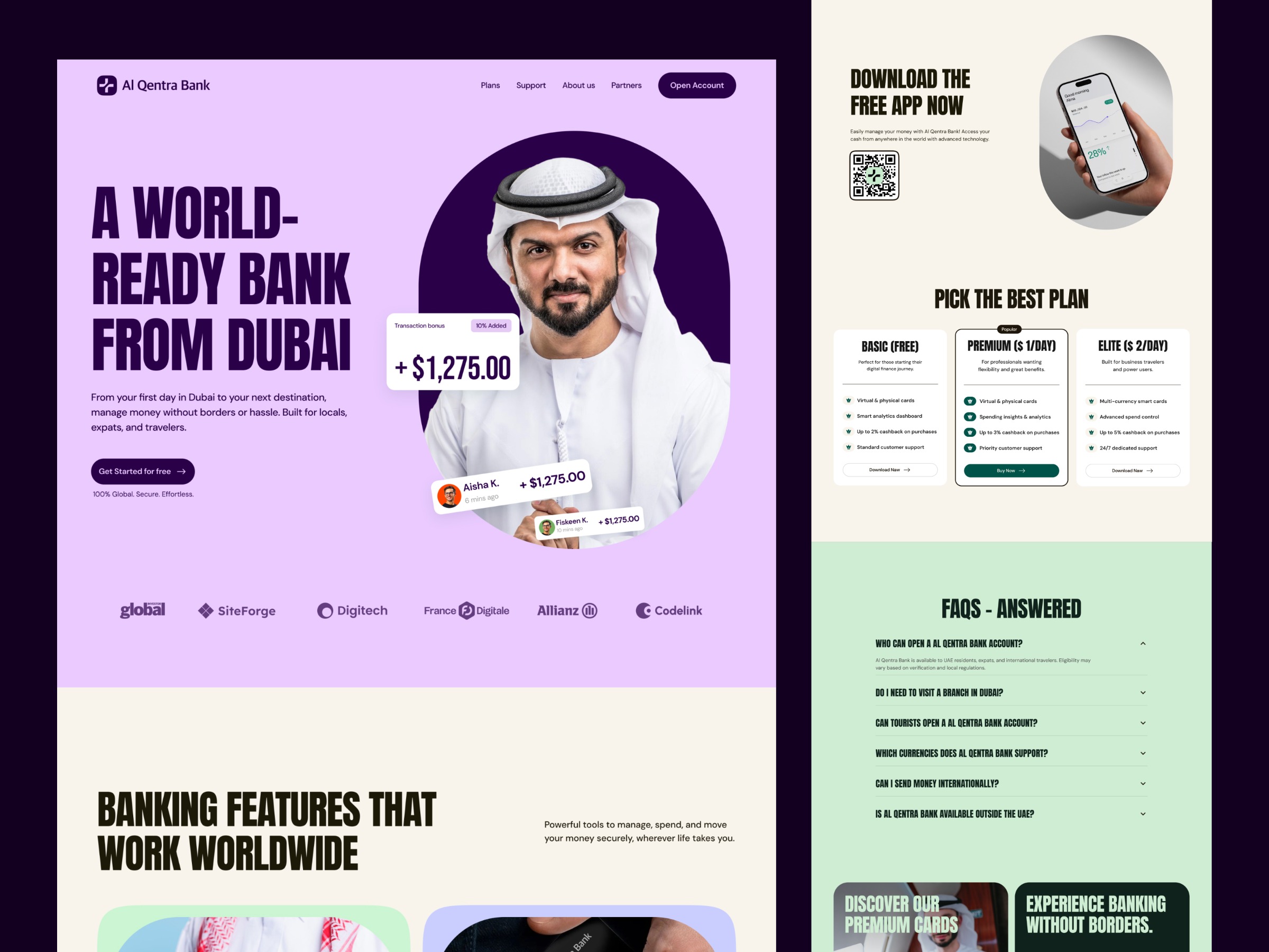
UX Problem The majority of fintech apps continue being confusing, daunting, and information-saturated. They have difficulties with value propositions that are not well explained, strange words, and clumsy interfaces that leave users overwhelmed when it comes to performing such simple tasks as opening an account or learning how to do something. Distrust is another significant obstacle as financial platforms cannot portray security, ease, and credibility visually. UX Solution The landing page of Al Qentra Bank is made with a clear and trusted design. The use of a clean layout, bold typography and organised messages makes people know immediately what the bank is offering. Security, global access and major features are brought out in the hero section using simple direct content. Whitespace, high hierarchy, and a narrowed CTA can make the user navigate the experience with ease and ease, whereas lifestyle images make the brand seem more human and create emotional trust. Result Heavy trust, conversion-ready Fintech experience that is easy to understand, modern and confident. The value is easily understood by users in a few seconds, they can easily navigate, and they do not fear exploring or creating an account. The sleek look is less overwhelming, more credible, and more effective in getting attraction to a worldwide financial group.
Support this project
Upvote