Mobile Real Estate UX — Eastalio App Architecture

Project description
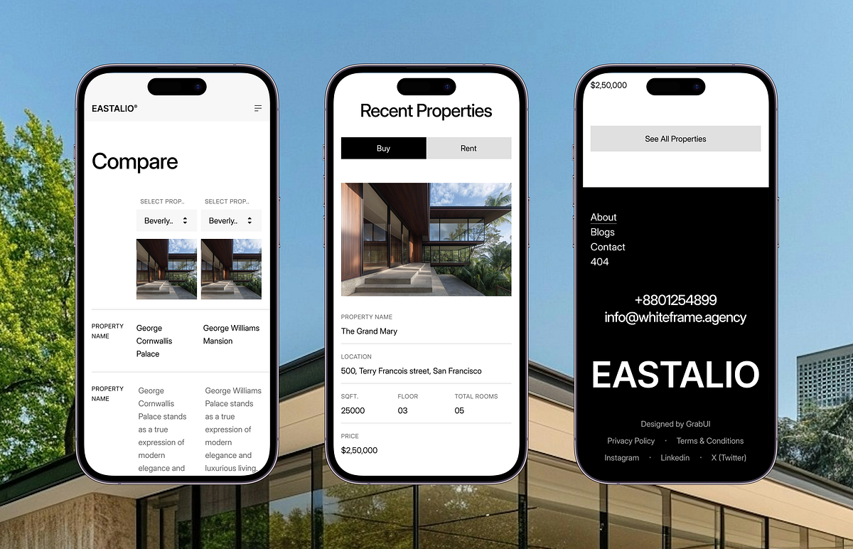
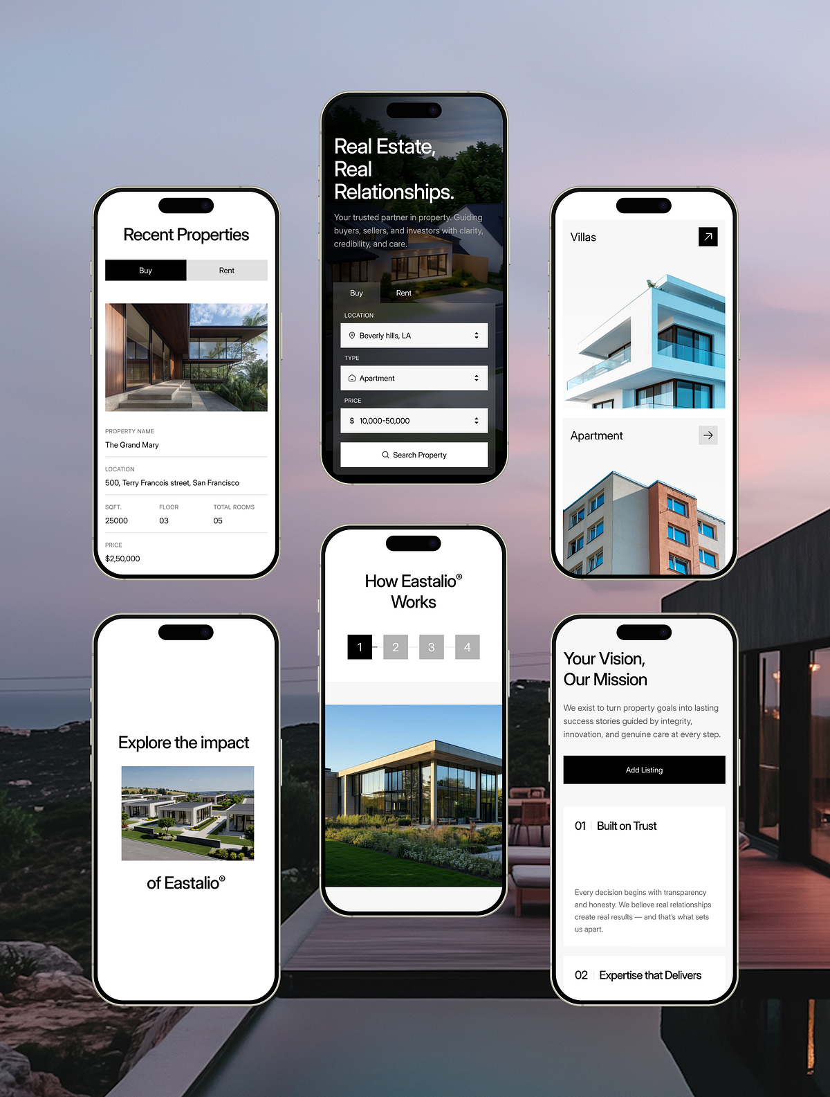
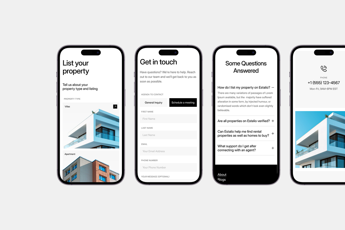
We often build for desktop first, but the data tells a different story. With over 58% of real estate search traffic coming from mobile devices, we knew the Eastalio project couldn't just shrink—it had to adapt. This shot breaks down the responsive architecture we engineered for Eastalio. Instead of just stacking elements vertically, we re-engineered the mobile experience to feel like a native app. 📱 UX Engineering Highlights: Touch-First Navigation: We swapped standard menus for thumb-friendly navigation bars and expansive touch targets, reducing friction for on-the-go browsing. Adaptive Grids: The property listings don't just compress; they transform from grid views to swipeable carousels on smaller screens to maximize screen real estate. Performance Optimization: Mobile loads are lighter, ensuring high-res property images don't slow down the user journey on cellular data. Contextual UI: Filters and search bars are collapsible and pinned for easy access without cluttering the viewport. Whether users are browsing on a 27" monitor or an iPhone mini, the luxury feel remains consistent.
Support this project
Upvote