Mobile Responsive UX/UI for E-Learning Platform

by Grabui Library · Feb 2026
web
Project description
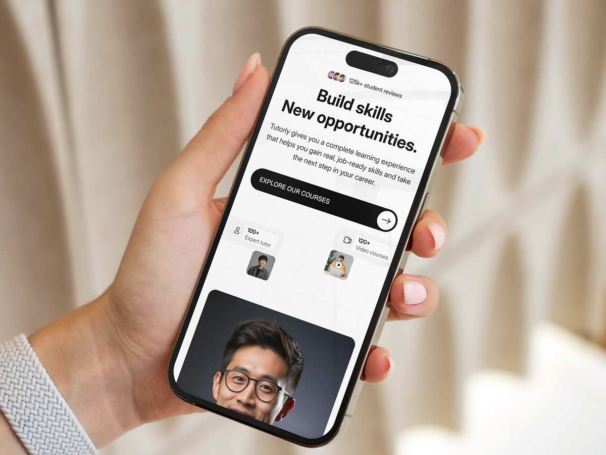
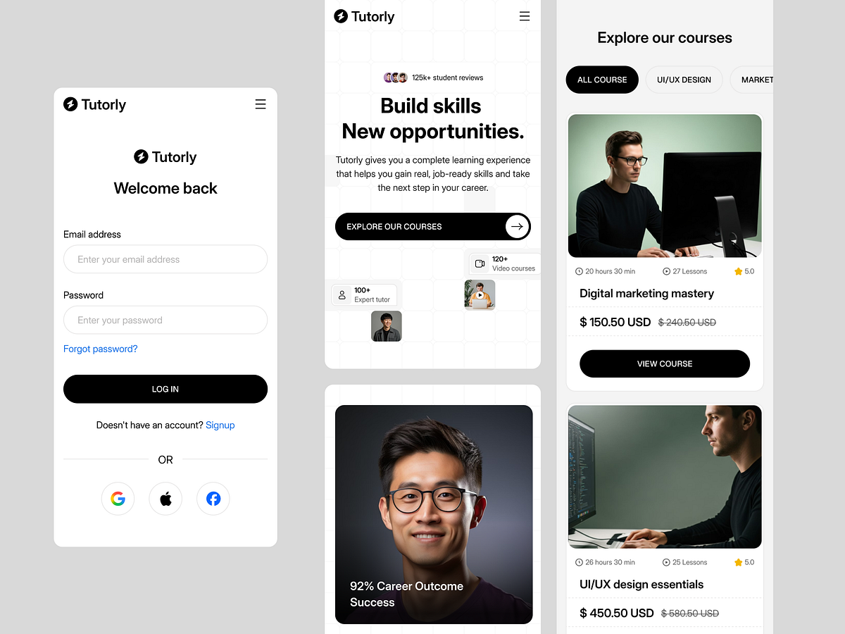
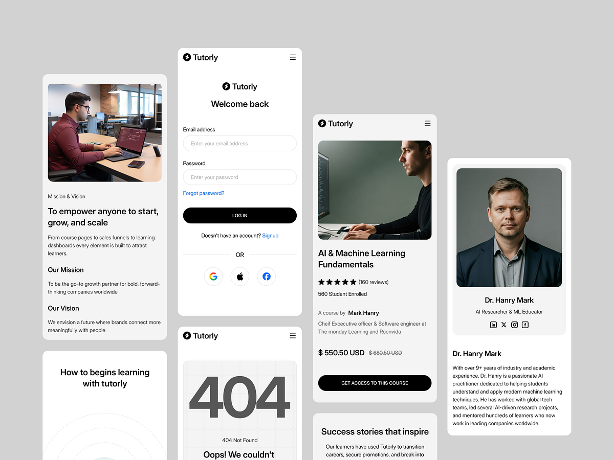
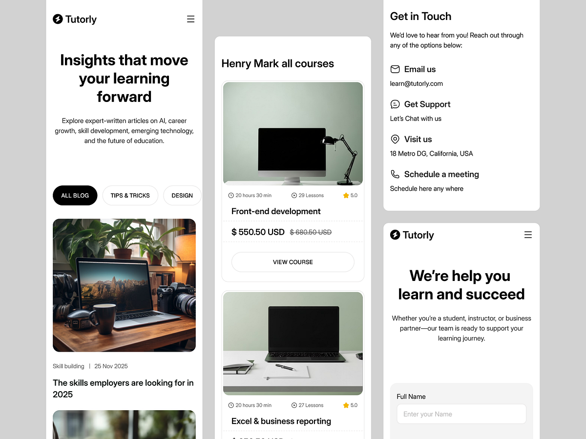
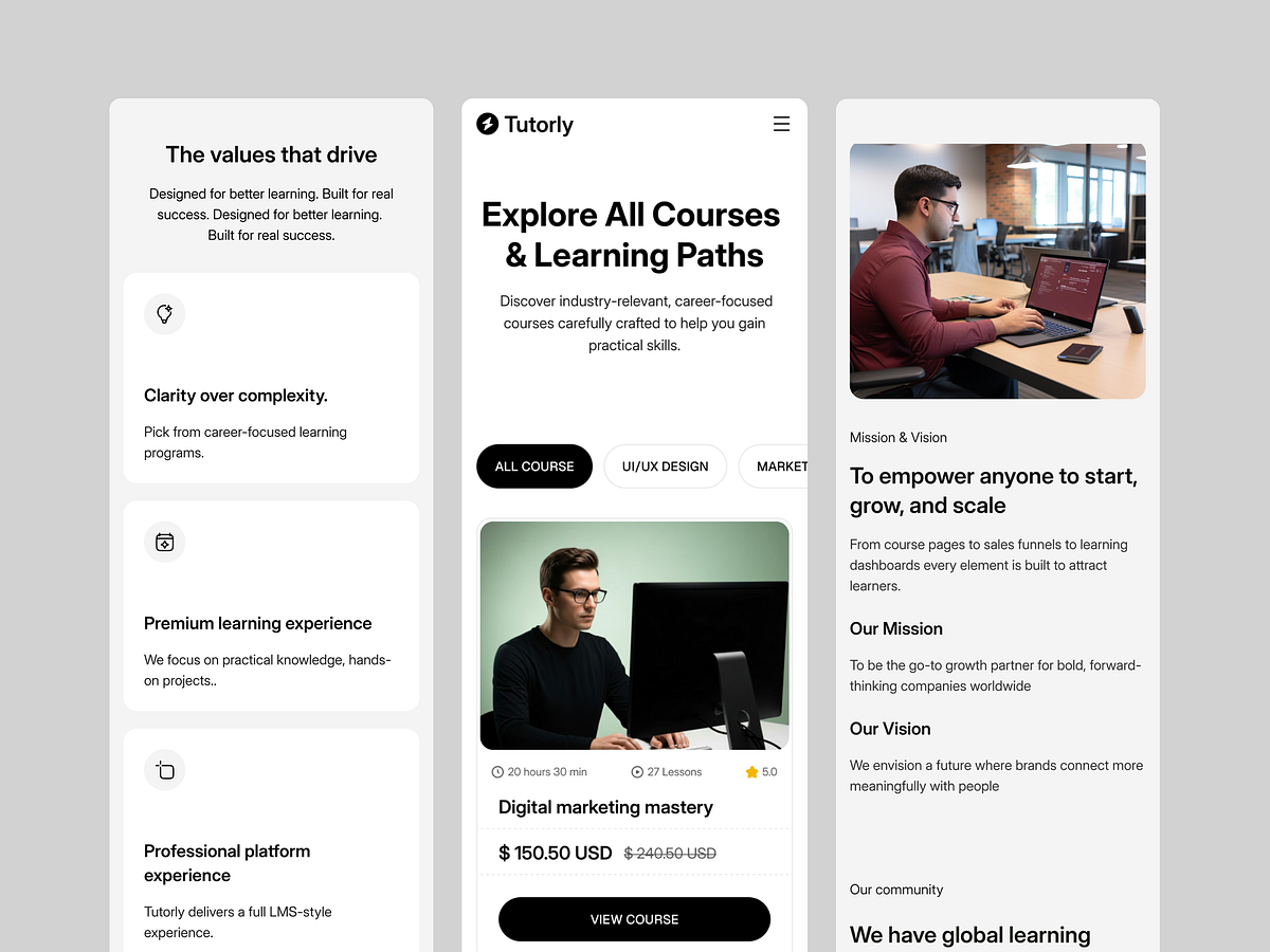
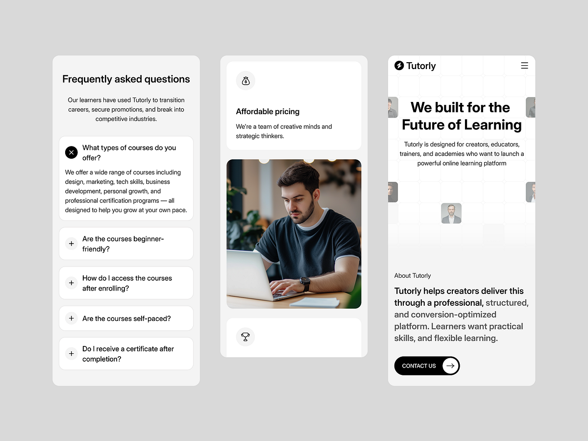
With over 65% of digital learning occurring on mobile devices, a desktop-first approach wasn't an option for the Tutorly project. Our Responsive Strategy: We treated the mobile viewport as the primary interaction point, not just a shrunken version of the desktop site. Touch Targets: Buttons and interactive elements are expanded for thumb-zone accessibility. Stacked Typography: Header hierarchy was recalibrated to ensure readability without endless scrolling. Adaptive Navigation: The complex mega-menu transforms into a streamlined drawer navigation for rapid access to course content. We ensured that the learning experience remains seamless, whether the user is on a 27-inch monitor or a 6-inch screen.

Support this project
Upvote