Reimagining Trust in a Developer-First World — SafeDep Branding

Project description
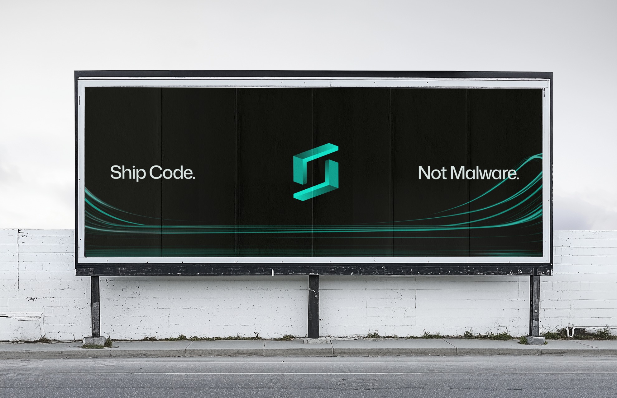
I got a chance to give SafeDep a new home and reimagine what trust looks like in a developer-first world. When the team first reached out, one thing was clear — most security products look the same: full of shields, locks, and warnings. Everyone tries too hard to look secure, but few feel trustworthy. So we asked ourselves: what does trust look like when it’s built for developers? The result is a brand that feels structured, calm, and quietly confident — built on geometry, precision, and systems thinking. At its core is a cube — symbolizing stability, containment, and integrity — with an “S” subtly formed in its negative space. The angled edges nod to code brackets — a small detail that grounds SafeDep in its true context: developer-first security. We then expanded the identity into a dynamic visual system — motion beams representing SafeDep’s real-time code scanning — a metaphor for protection in motion. This project was about designing something that doesn’t scream “secure,” but earns trust through clarity and intent. → safedep.io
Support this project
Upvote