Why Grayscale Designs Are Important

Project description
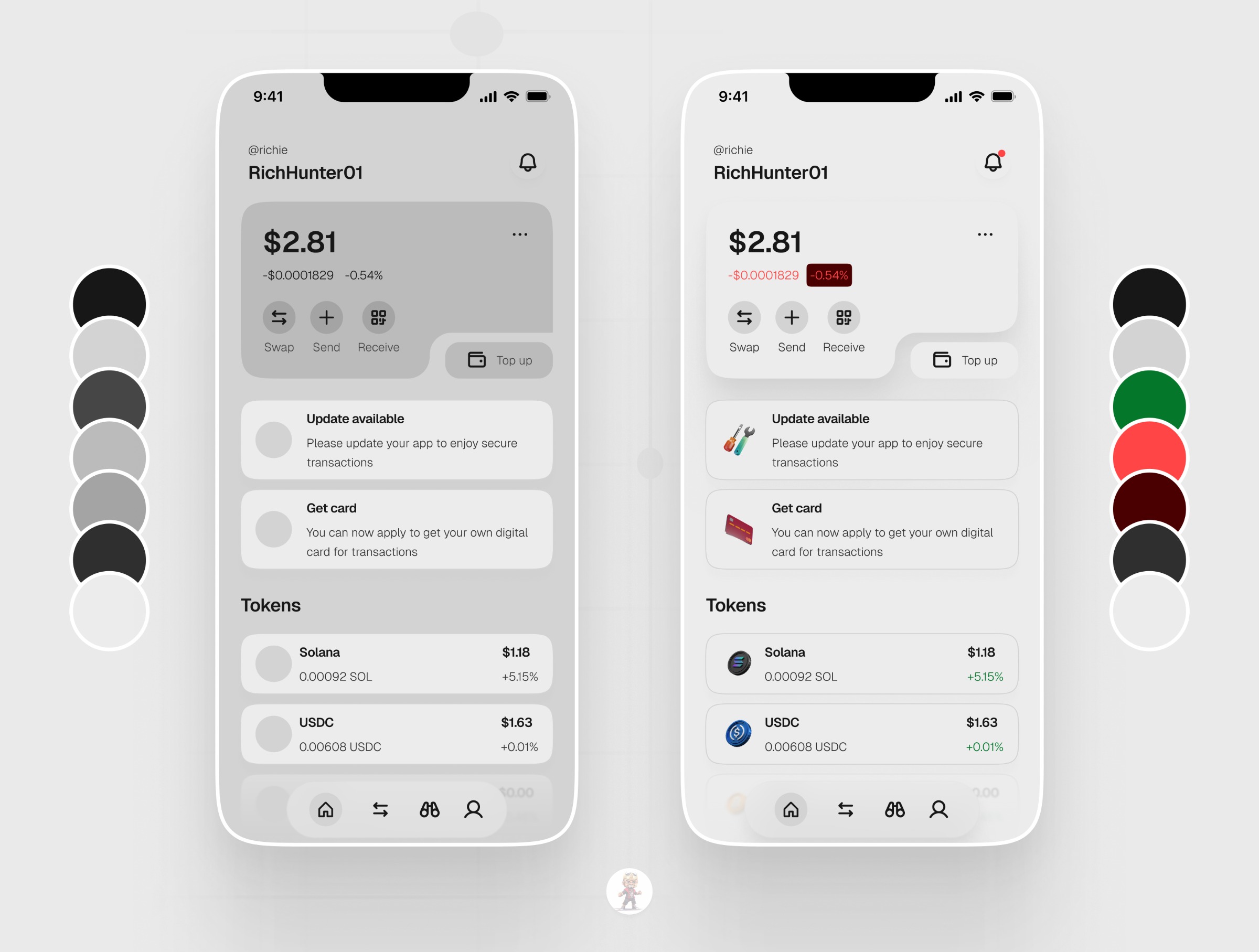
This is an excerpt from a project i did sometime back. And if you ask me, i'll always tell you it's best practice to design first in grayscale (most may call it wireframing). Here's how @UIUXADRIAN (on X) puts it: "Grayscale design is an efficient and focused approach to creating user interfaces for apps and websites. When designing in grayscale, the main focus is on the app or website's overall layout, structure, and functionality. This helps ensure a solid foundation before adding visual elements like color, which can be distracting and time-consuming at the start. By doing so, designers can avoid the potential distractions and time-consuming revisions that often accompany early color decisions. This methodical progression from grayscale to color enables a more deliberate, effective design process, ensuring that when colors are finally introduced, they enhance and complement the carefully constructed layout and functionality already in place. Grayscale design can help identify potential usability and accessibility issues. By working in grayscale, you can concentrate on the visual hierarchy, contrast, and legibility of text and interface elements. Grayscale designs enable faster iteration and decision-making, as less time is spent selecting colors and creating color schemes. This can lead to quicker design revisions and more efficient design processes overall. Once the grayscale design is finalized, it becomes easier to introduce color. You can now apply a color scheme that aligns with the brand and enhances the user experience without impacting the layout and structure. Colors can sometimes create visual clutter and make it difficult for users to focus on essential design elements. Incorporating grayscale early in the design process facilitates a deeper focus on the functionality and usability of the interface. By temporarily removing color, designers are forced to prioritize the layout and interface structure, so that when color is eventually added, it complements and enhances the user experience without compromising on its clarity and ease of use." You need this type of clarity in your projects!!! Hope this helps you. If you need clarity about your ideas, you should book a call and let's talk. See you at the top!
Support this project
Upvote