FÈVE — Artisan Chocolate Packaging Direction
Project description
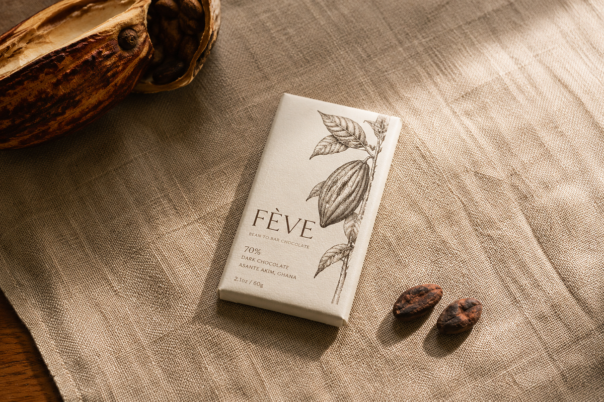
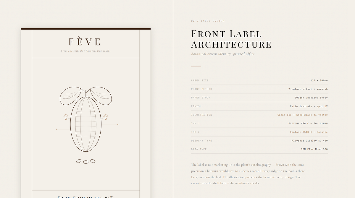
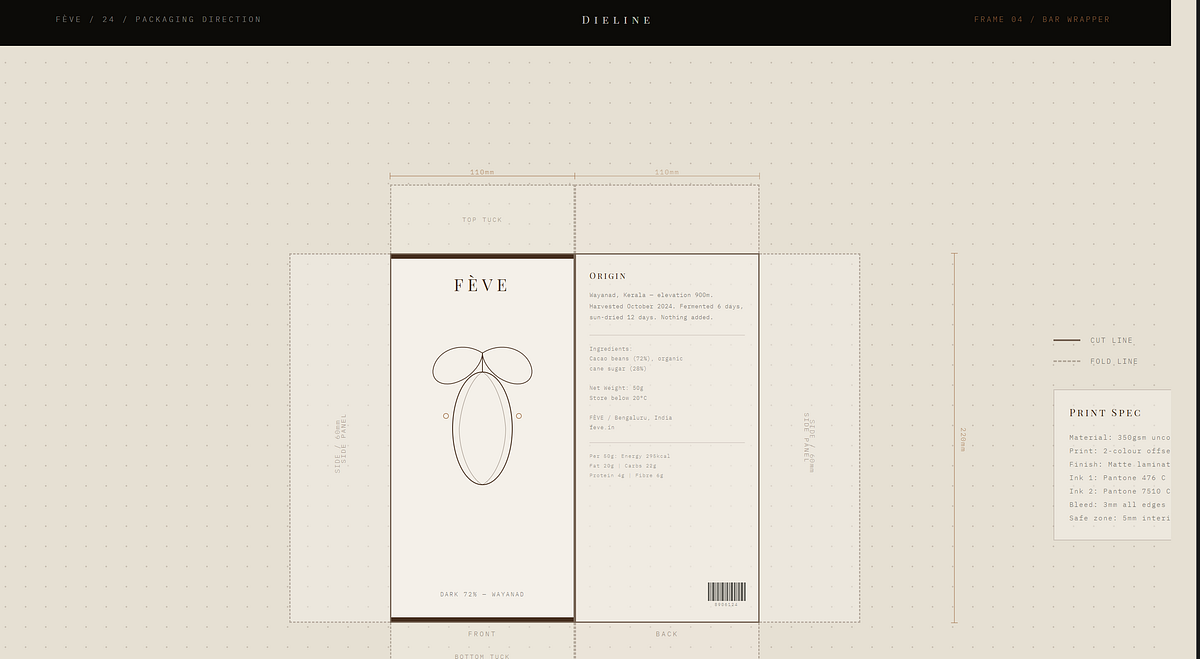
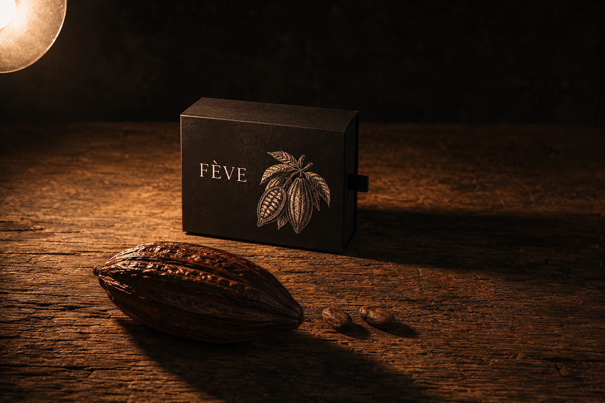
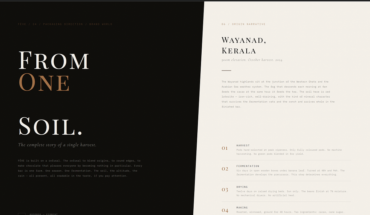
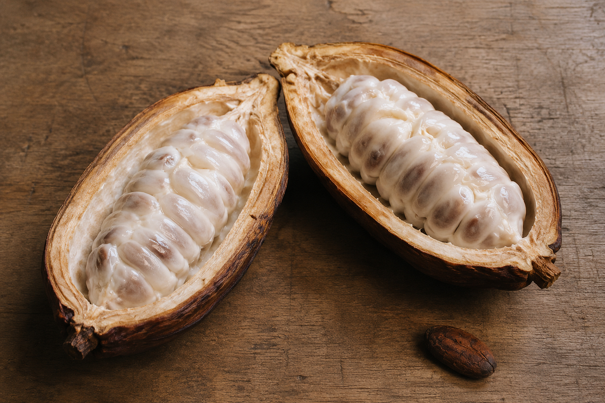
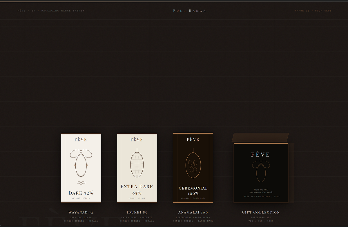
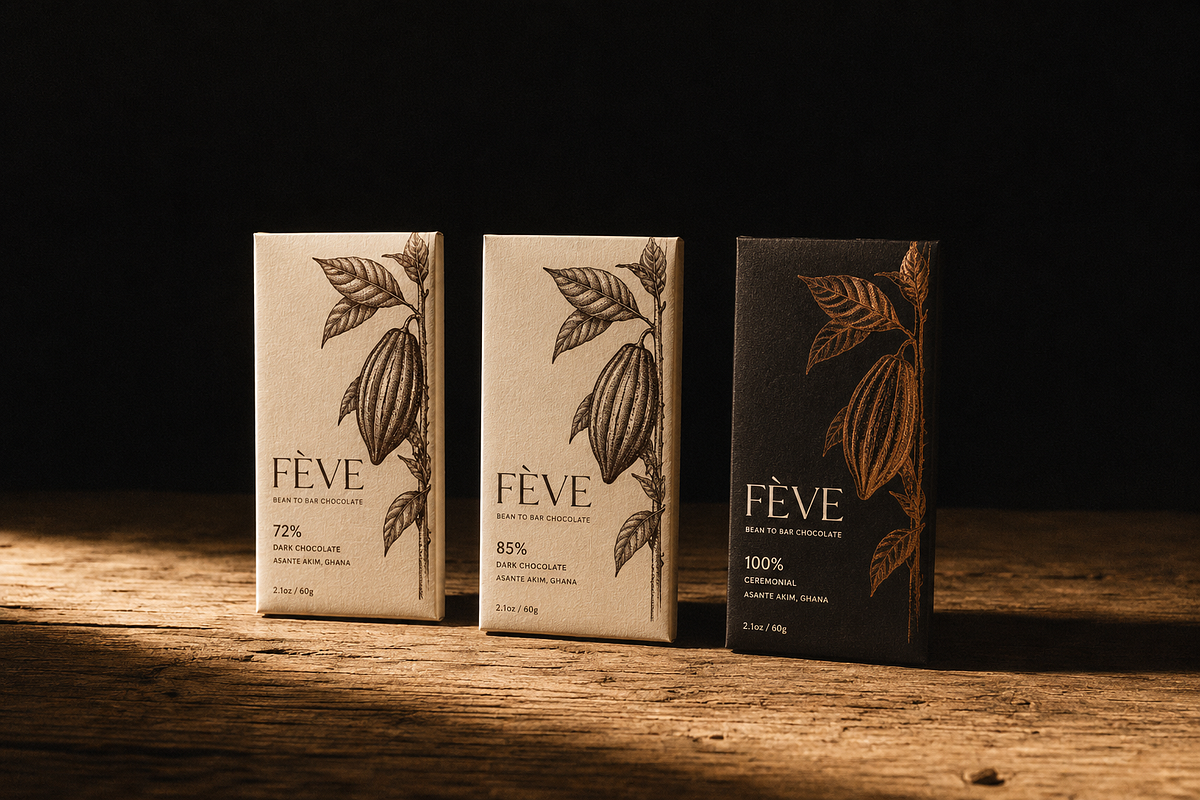
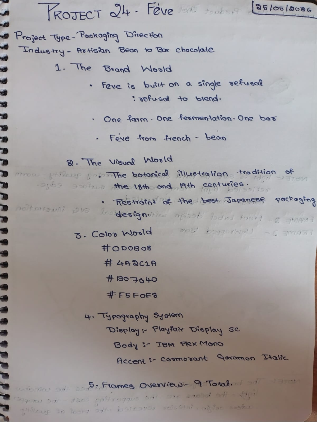
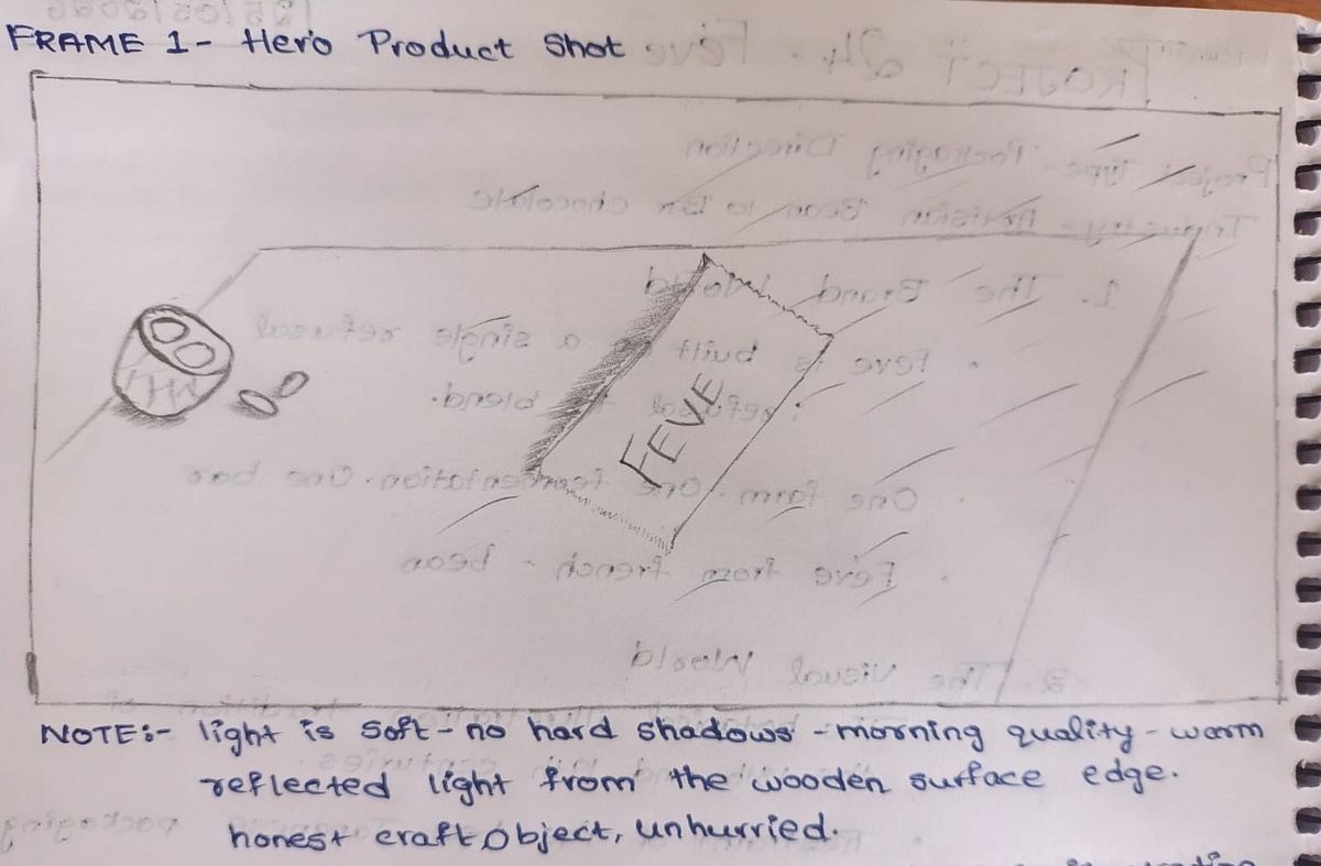
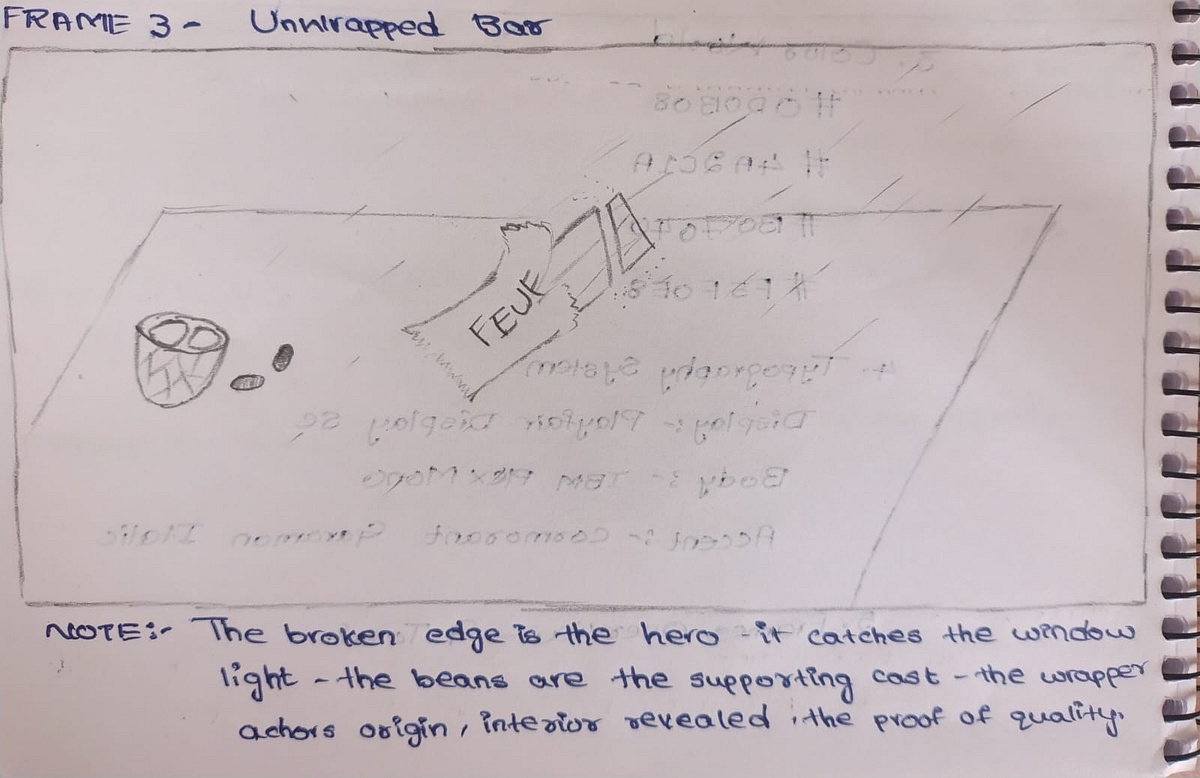
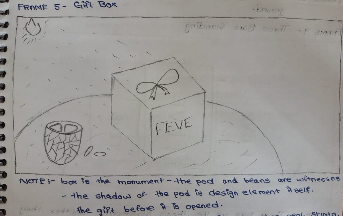
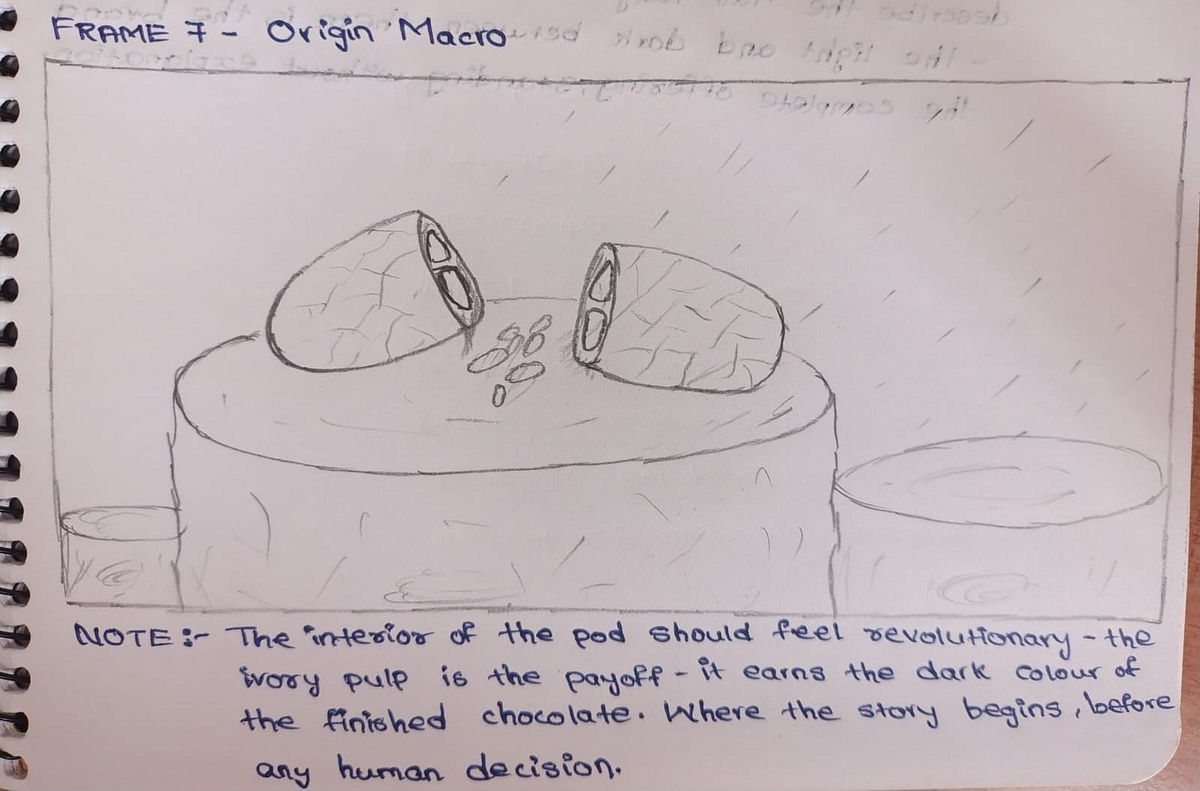
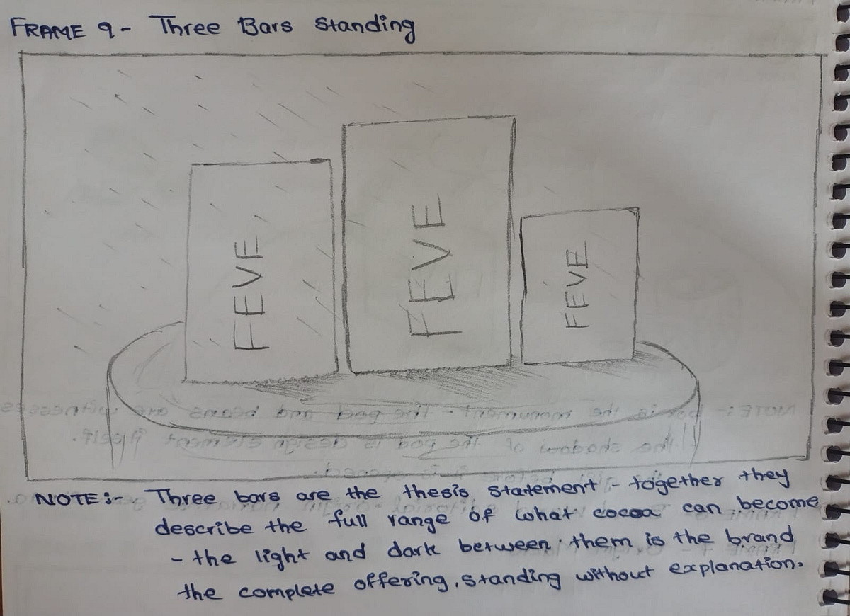
FÈVE is a packaging direction for a bean-to-bar chocolate brand built on a single refusal: to blend. One farm. One fermentation. One bar. The brief required packaging that could hold that integrity without performing it — design that is honest rather than clever.The mark is a botanical illustration of the cacao pod, drawn with the precision of an 18th-century natural history atlas. It is not decorative. It is a species record. The plant earns the shelf before the wordmark speaks.The Atmosphere Lock across all five AI frames: Kodak Portra 400 in medium format, diffuse window light from the upper right, Karl Blossfeldt's specimen dignity married to Wolfgang Tillmans' material intimacy. The packaging materials — uncoated 300gsm ivory paper, two-colour offset in Pod brown and Coppice amber — are chosen because they age like the product they contain. They accumulate time honestly.The color world runs on four tones extracted directly from the pod's lifecycle: Ferment black for the transformation, Pod brown for the fruit's exterior, Coppice amber for the dried and processed, Ivory for the pulp that started everything.M N LOKESHWAR REDDY, Creative Director.
Support this project
Upvote