EPSILON ENERGY DRINK

Project description
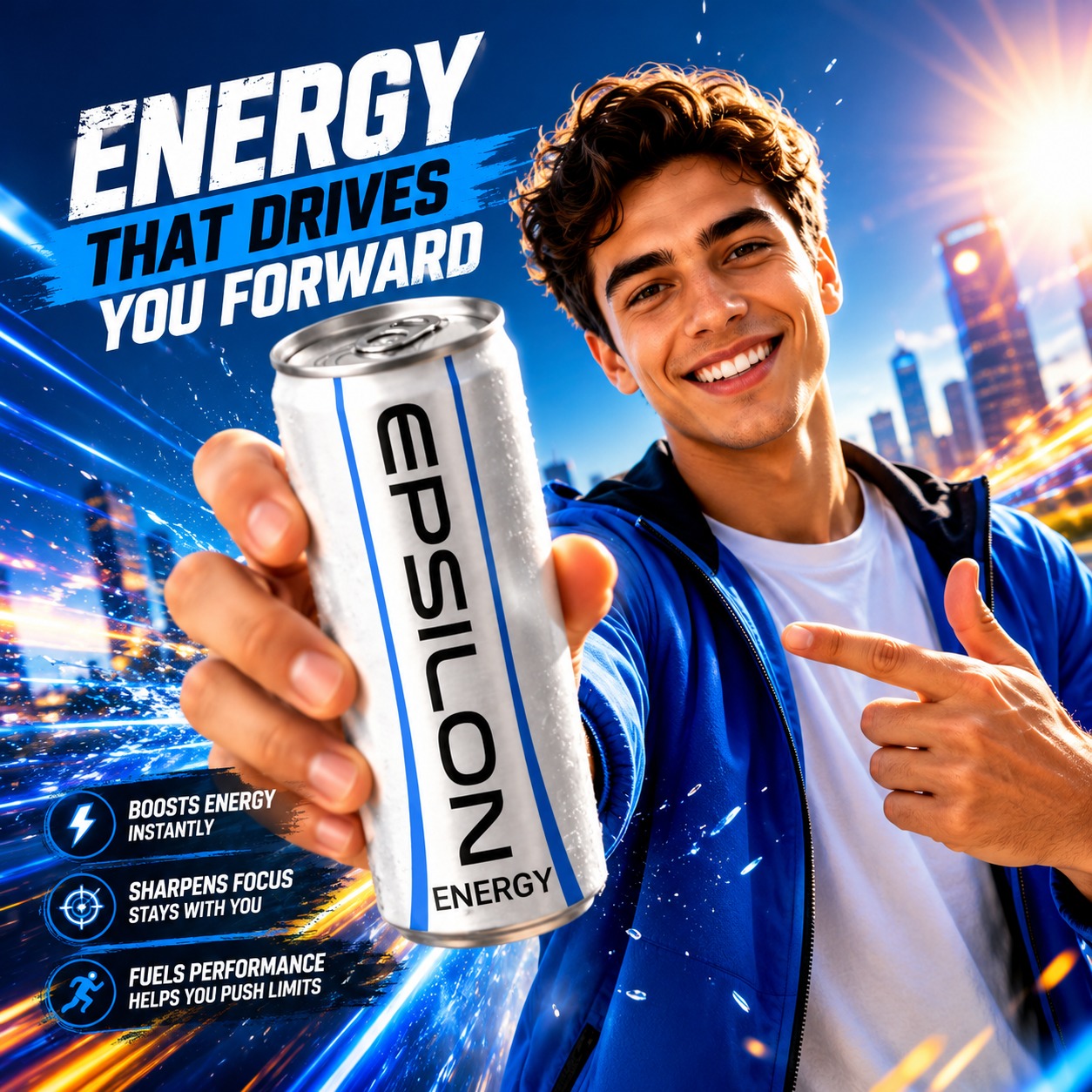
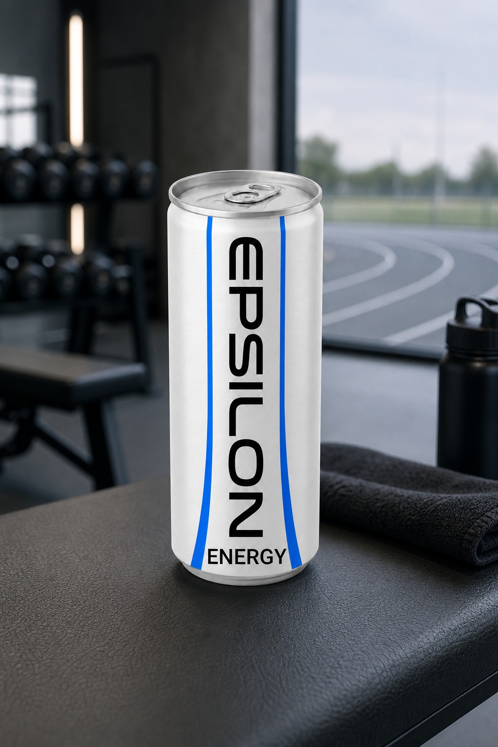
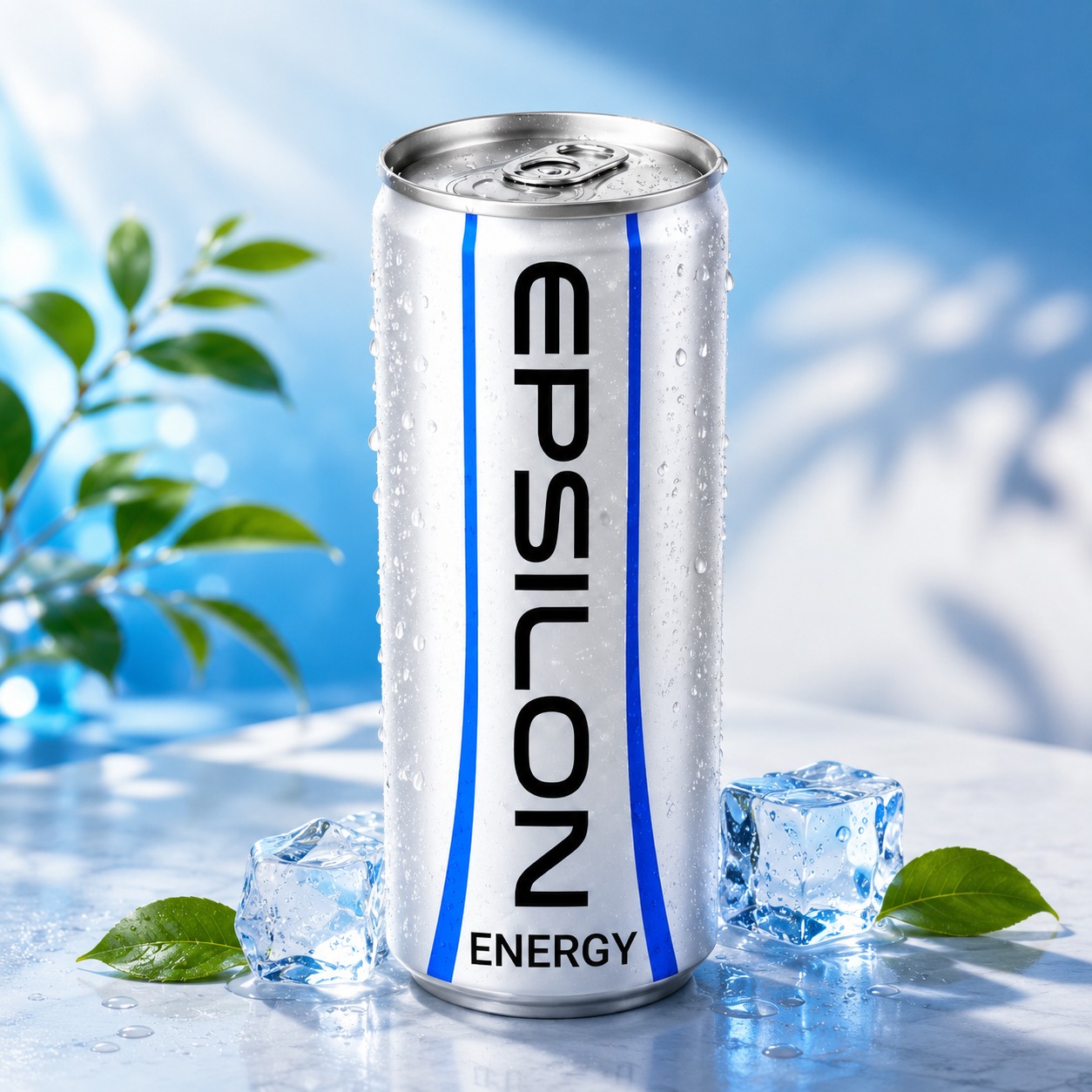
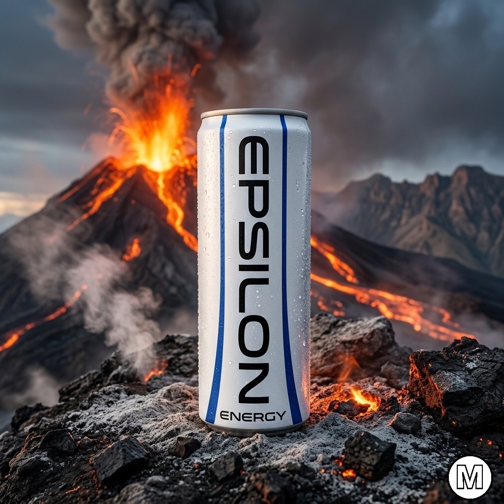
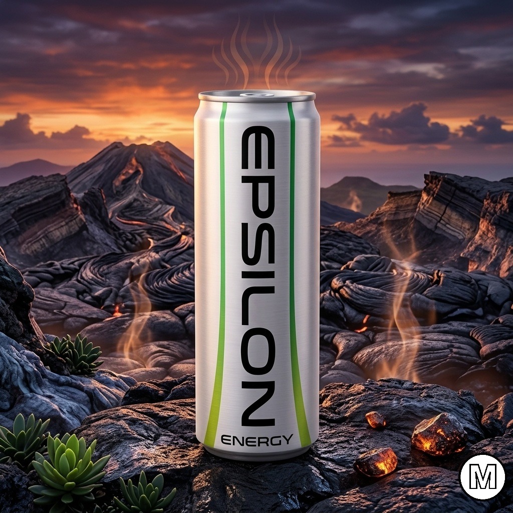
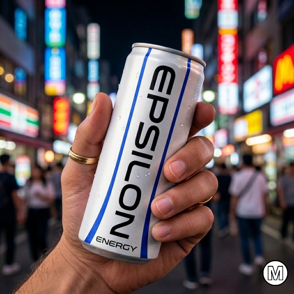
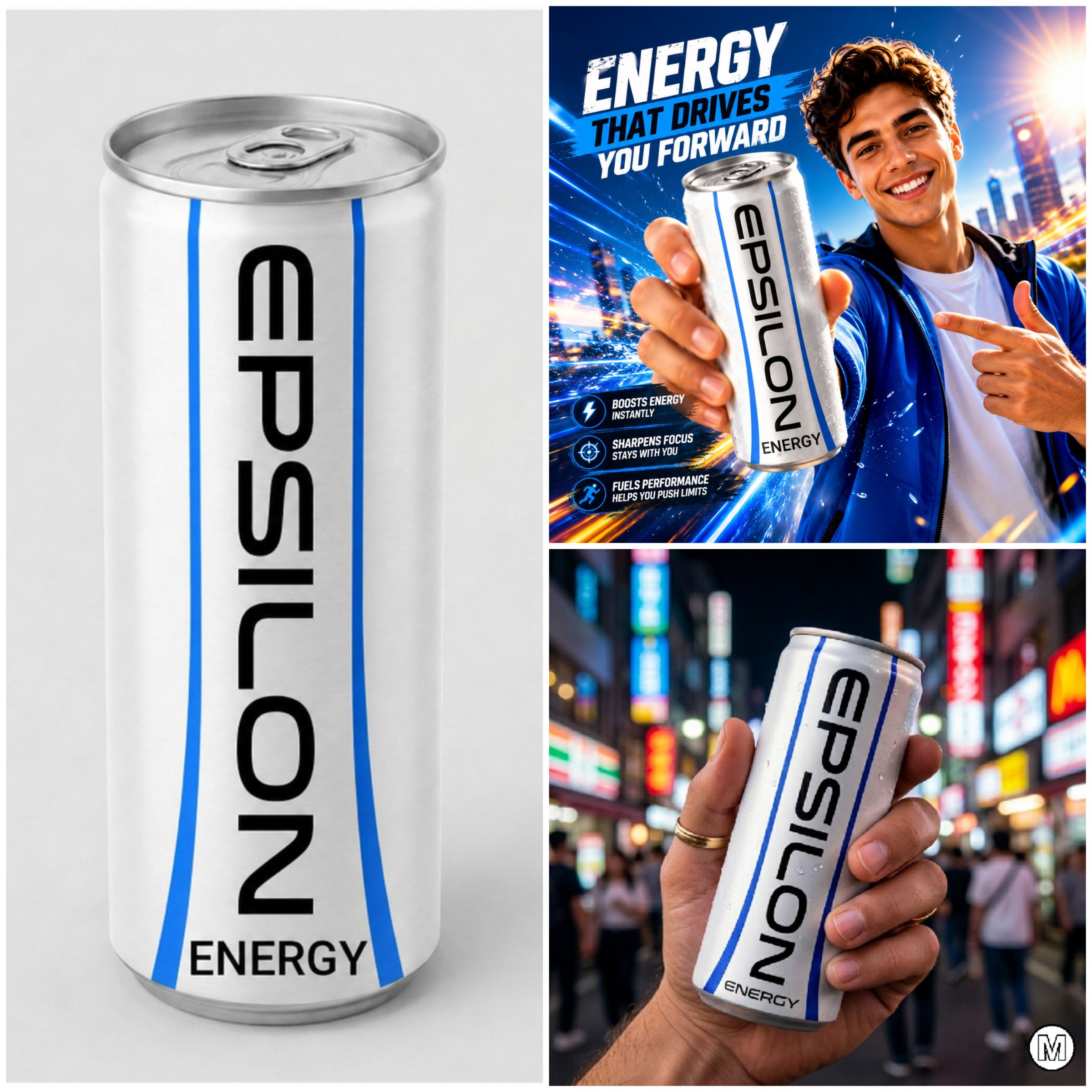
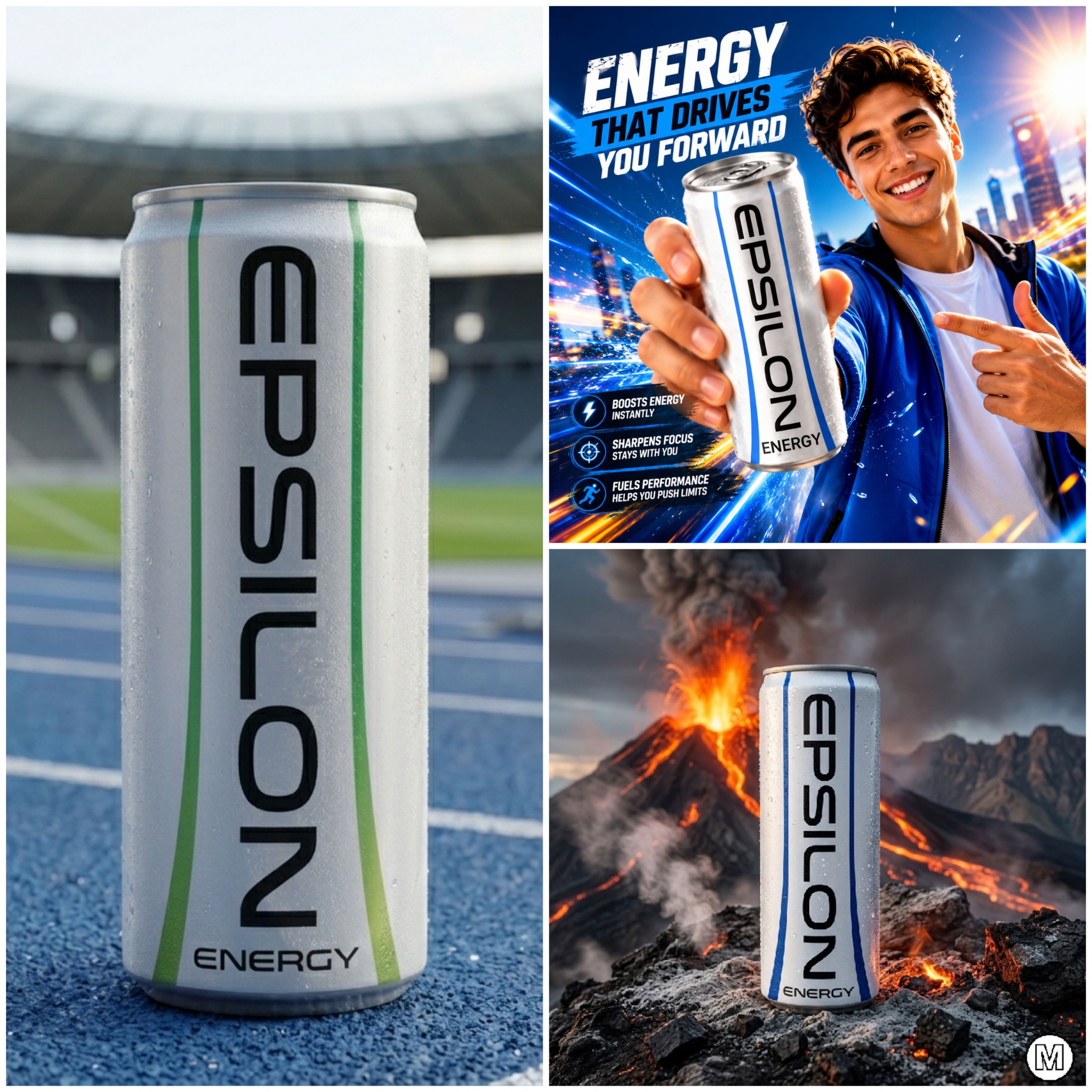
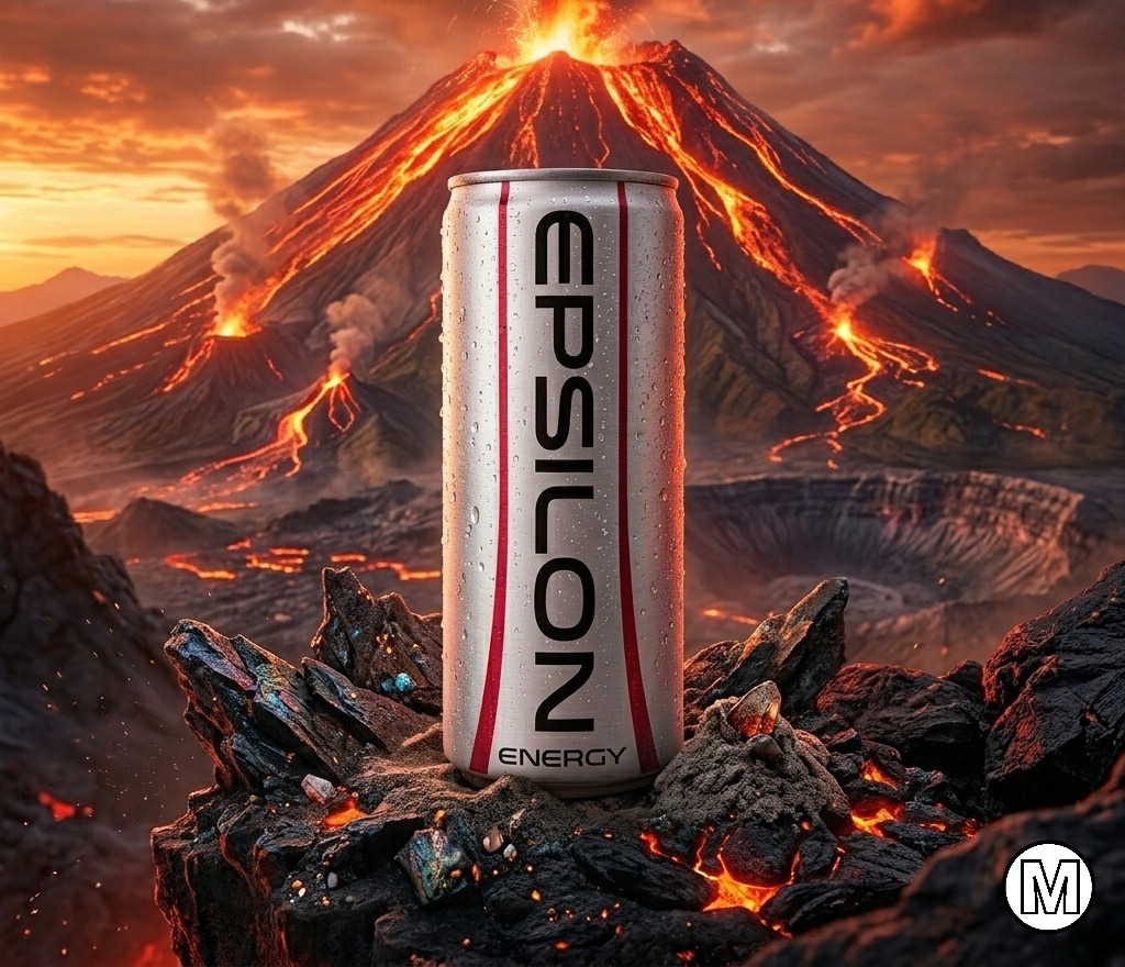
EPSILON Energy is a contemporary energy drink concept built around the idea that power does not need visual noise to be noticed. In a category often dominated by aggressive graphics, complex patterns, and overstated messaging, EPSILON introduces a refined alternative that communicates energy through clarity, confidence, and precision. The visual identity is centered on a minimalist white can accented with clean blue vertical lines that create a sense of movement, balance, and upward momentum. The vertically oriented logotype transforms the package into a distinctive visual object, maximizing shelf recognition while reinforcing the brand's modern and progressive character. Inspired by athletic performance, focus, and everyday achievement, the design language combines premium aesthetics with functional simplicity. The restrained color palette evokes freshness, hydration, and vitality, while the sleek typography emphasizes efficiency and confidence. Every design element was intentionally reduced to its essential form, creating a product that feels both contemporary and timeless. Beyond the package itself, the brand extends naturally into advertising and lifestyle applications. Hero visuals place the product within energetic, aspirational environments that connect with active consumers while maintaining a clean and sophisticated visual tone. This balance allows EPSILON to appeal to a broad audience seeking energy, performance, and a modern brand experience. EPSILON demonstrates how strategic minimalism can create strong differentiation in a crowded beverage market. The result is a packaging system that feels fresh, premium, and instantly recognizable—proving that simplicity can be one of the most powerful tools in branding.
Support this project
Upvote