LokaLuly Protein Snacks - Zero Sugar

Project description
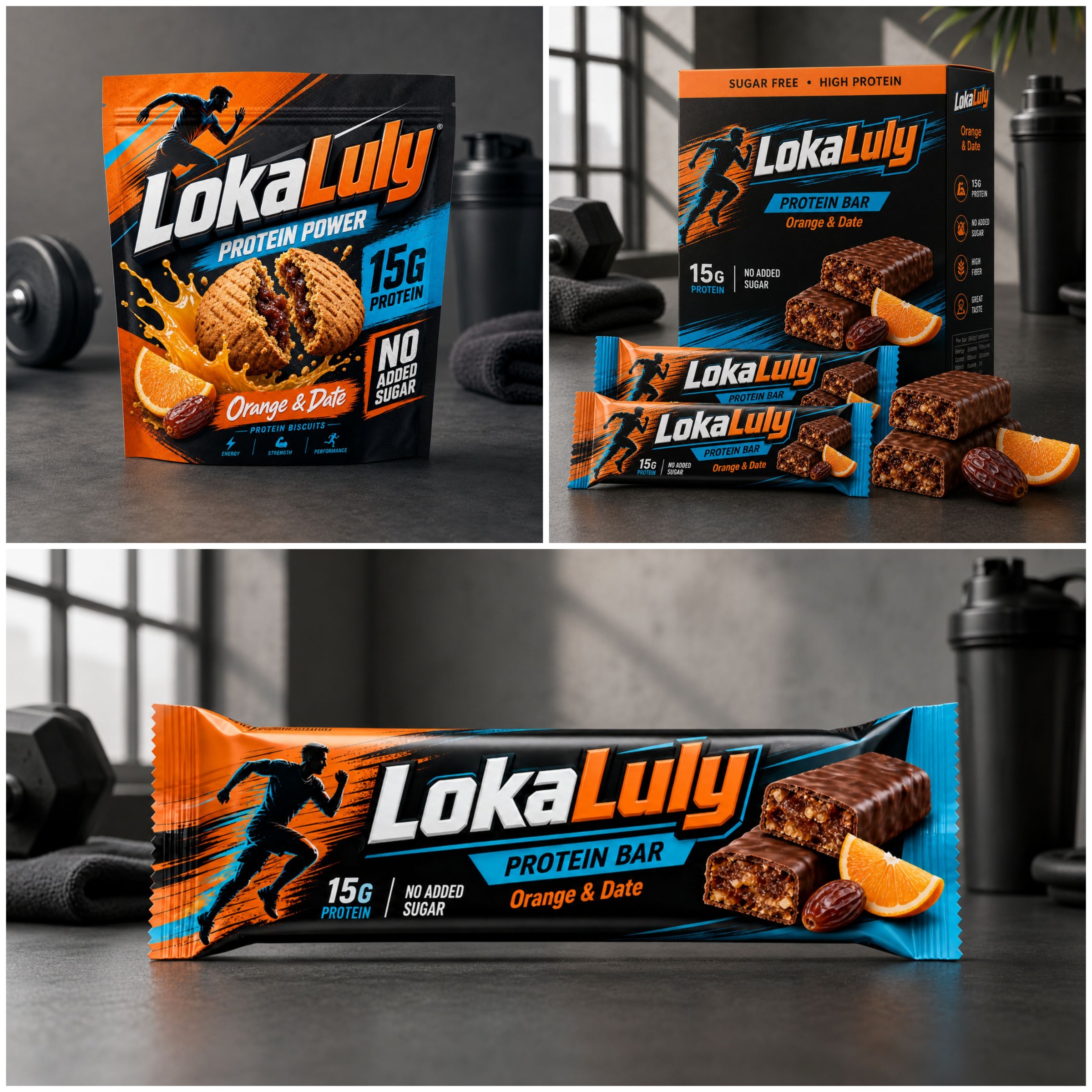
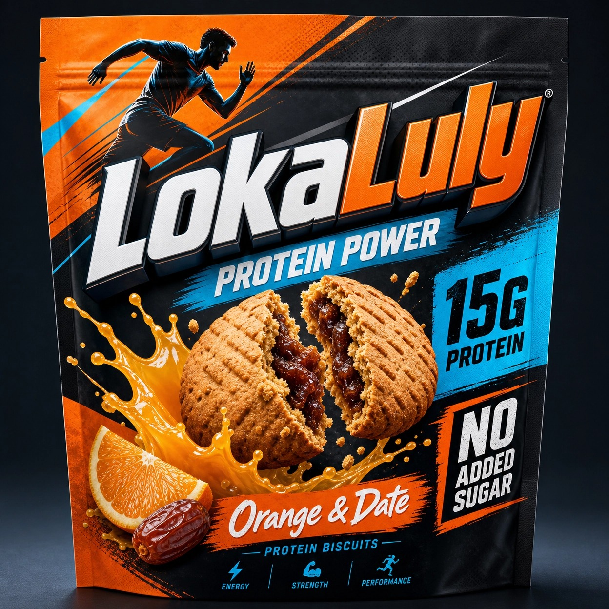
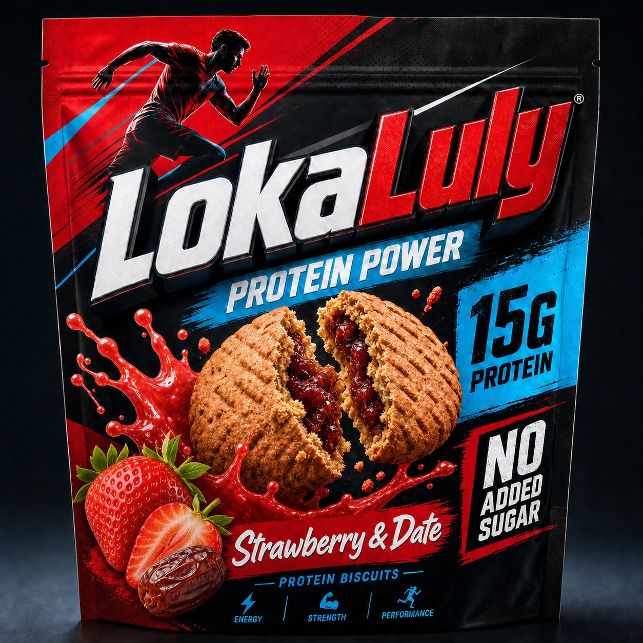
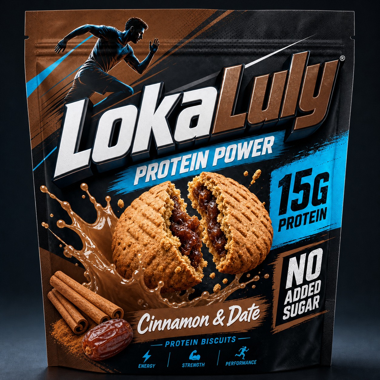
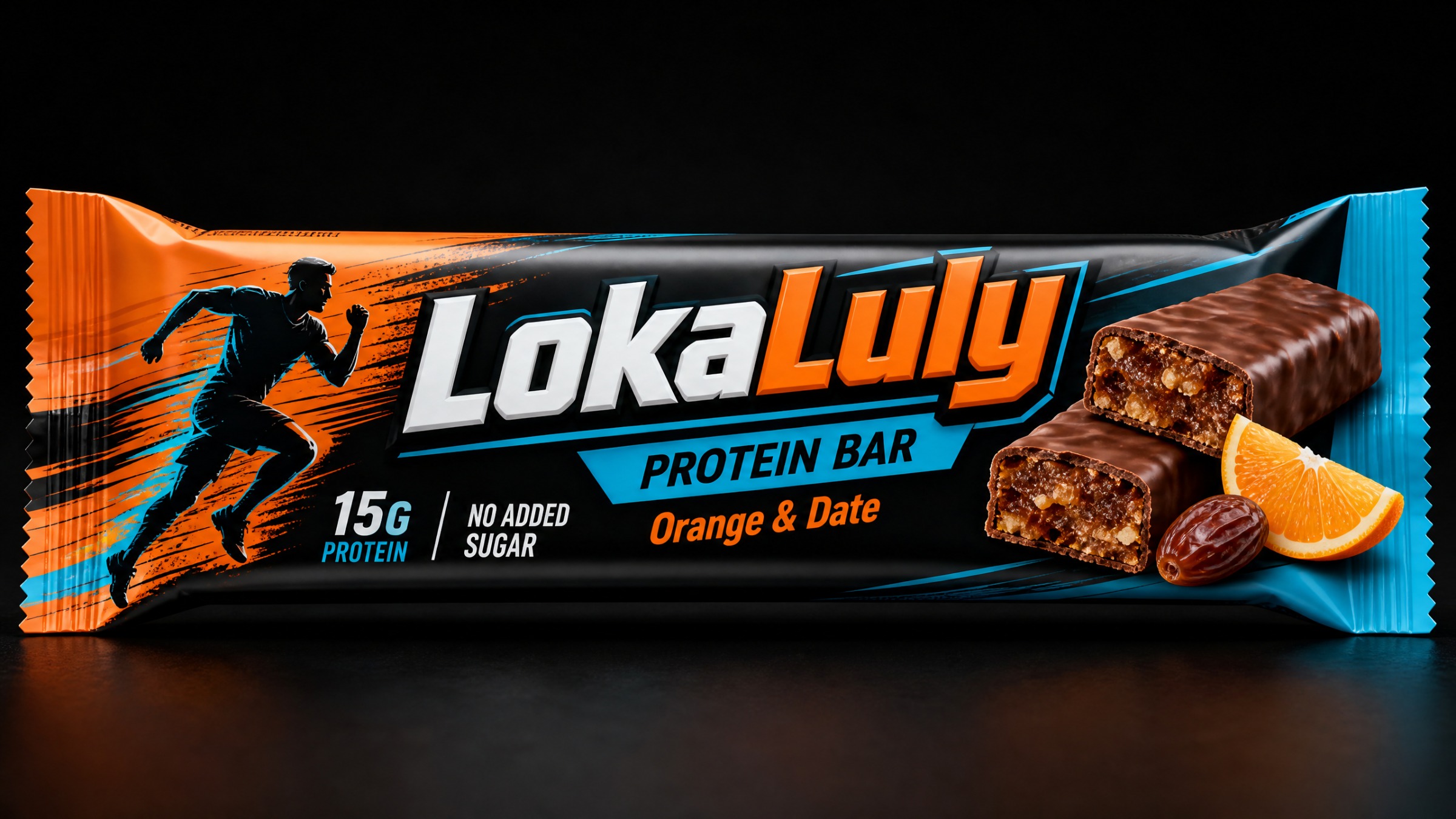
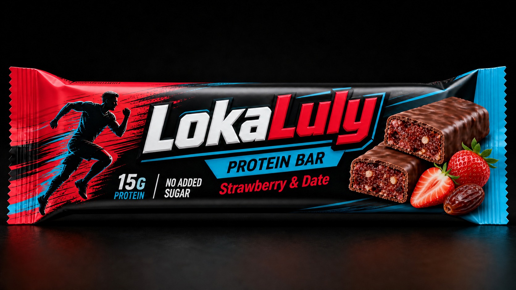
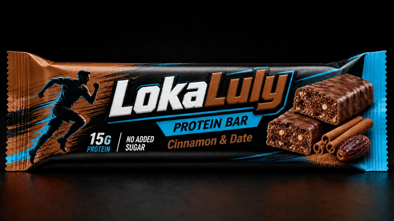
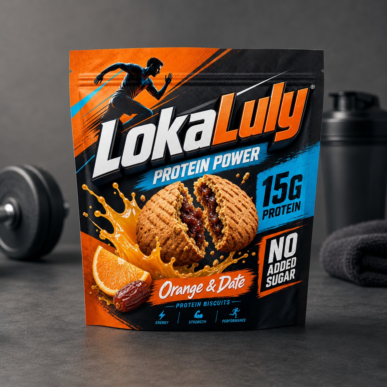
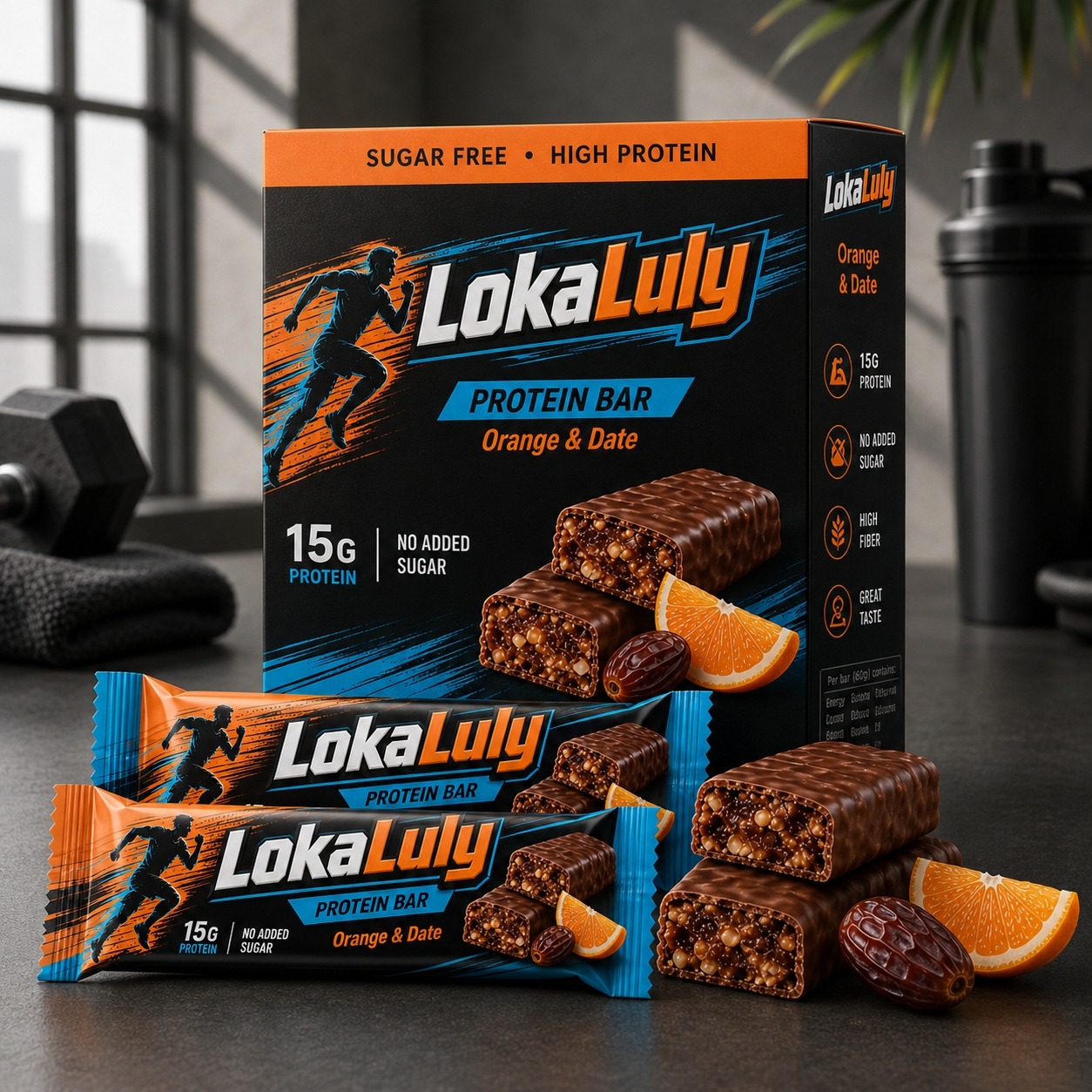
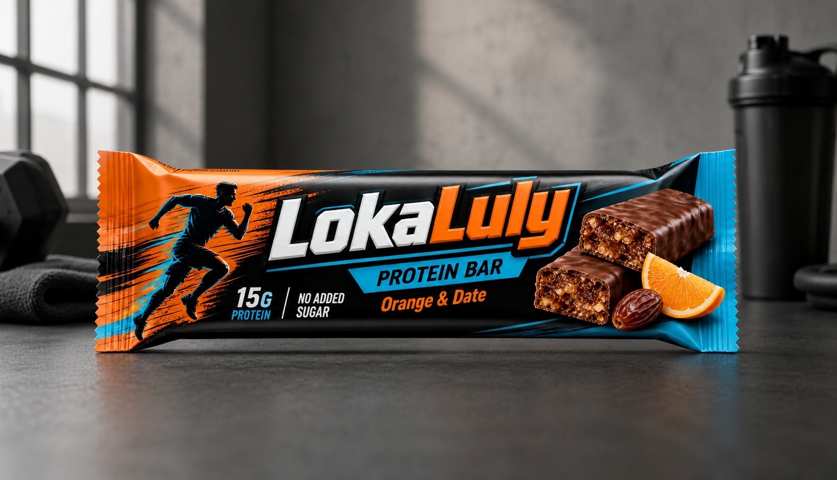
LokaLuly is a groundbreaking performance nutrition brand designed to bridge the gap between high-intensity athletic fuels and the crave-able experience of artisanal treats. In a market often saturated with chalky protein bars and standardized supplements, LokaLuly stands apart by harnessing the natural energy density of premium dates and fruits, offering athletes 15g of high-quality protein in a "no added sugar" formula that performs as well as it tastes. Challenge & Vision: The core design objective was to elevate a product rooted in wholesome, natural ingredients into the dynamic, masculine, and high-energy world of fitness nutrition. The packaging needed to project strength, resilience, and intensity, while simultaneously highlighting the gourmet, natural, and indulgent nature of the product. The final design language speaks to serious athletes who demand peak performance without compromising on flavor quality. Packaging & Design Strategy: Our strategy centered on "Kinetic Contrast." We paired a deeply textured, tactical black background—representing power—with aggressive, vibrant color coding that uniquely defines each flavor profile. Key Design Elements: The Kinetic Athlete Motif: A dynamic, vectorized silhouette of a runner in full stride bursts across the upper segment of all packaging. The energetic color trails left by the athlete serve as the primary visual indicator for each flavor, creating a cohesive family identity that is instantly recognizable on the shelf. The LokaLuly Identity: The brand name is rendered in a dominating, industrial, beveled metallic 3D font. The stylized 'L' features a sharp, upward-sweeping arrow, symbolizing progress and athletic advancement. The forged metallic texture of the logo reinforces the brand's commitment to strength. Indulgence Visualized: The centerpiece of each package features stunning, macro-style product photography. For the protein biscuits, the imagery captures the product at the precise moment of indulgence—split to reveal the rich, date-based filling, complemented by immersive, liquid splash effects that amplify the sensory experience. Performance Validation: A bold, high-contrast block clearly communicates the "15G PROTEIN" content and the "NO ADDED SUGAR" claim, ensuring that the primary nutritional benefits are immediately visible to the consumer. Flavor & Format Integration: The cohesive design language extends seamlessly across the entire product range, including the protein biscuit pouches and the streamlined protein bar wrappers. Whether on a single bar or a large pouch, the design maintains maximum impact. The flavor-specific color palettes—ranging from vibrant orange to deep strawberry red and earthy cinnamon tones—are strategically used to differentiate the line while maintaining a unified, professional brand presence. Retail & Digital Context: We engineered this packaging to maintain strong visual dominance in both crowded physical retail aisles and competitive e-commerce grids. Through dramatic 3D lighting, bold typography, and strategic composition, the design ensures that LokaLuly stands out as a premium, high-performance option. The inclusion of fitness-inspired lifestyle contexts—such as dumbbells and shakers—further reinforces the product's place within an active, health-conscious lifestyle.
Support this project
Upvote