MANHATTAN 1978 / 2015: A Typographic Time Capsule

Project description
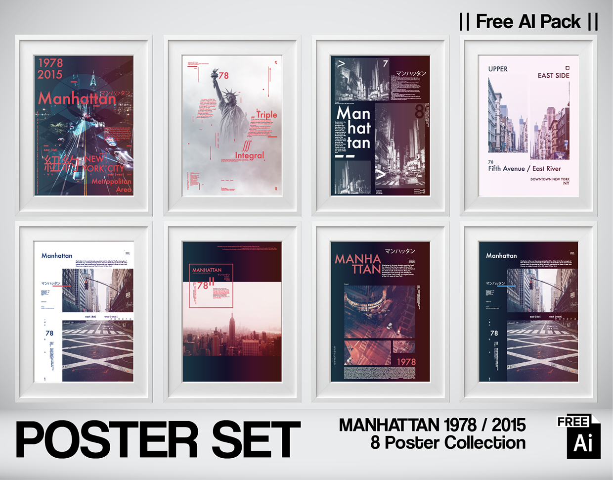
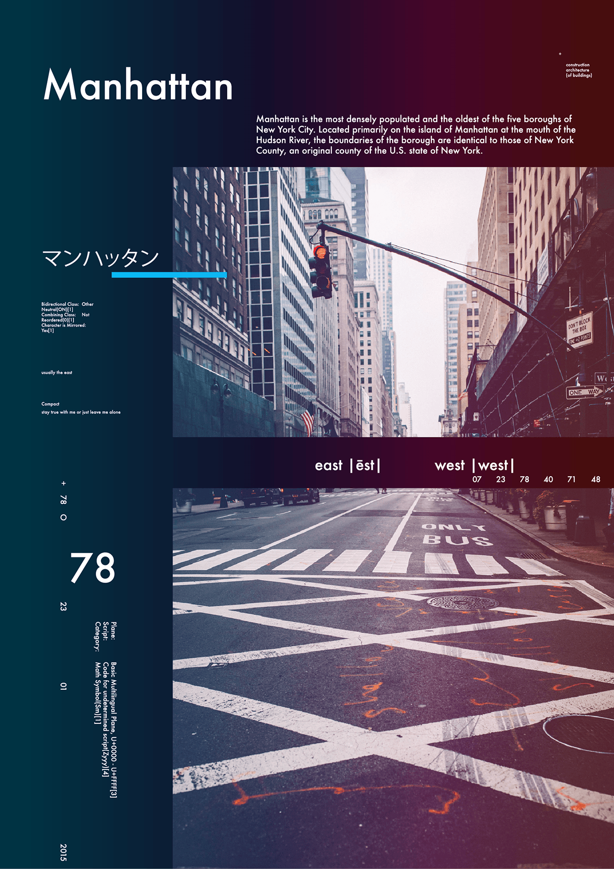
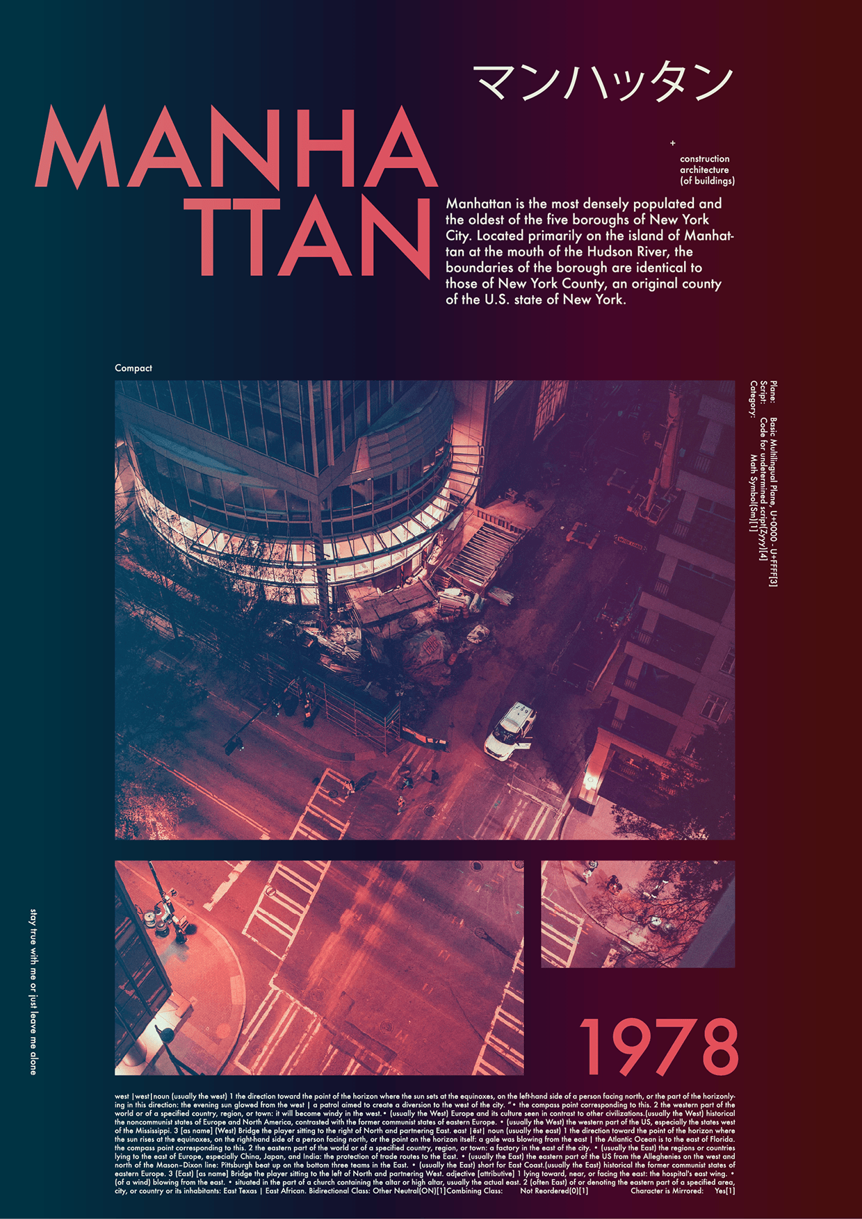
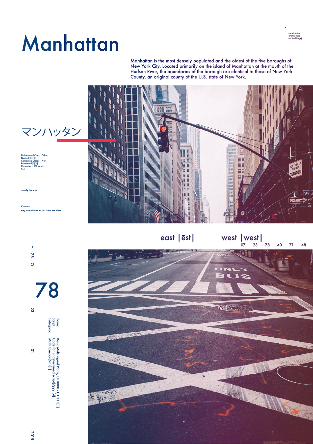
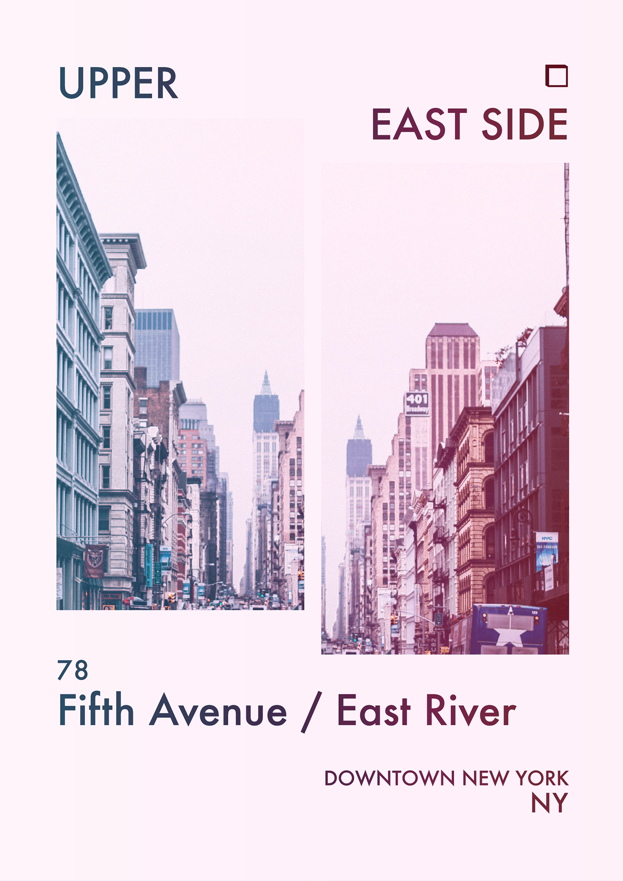
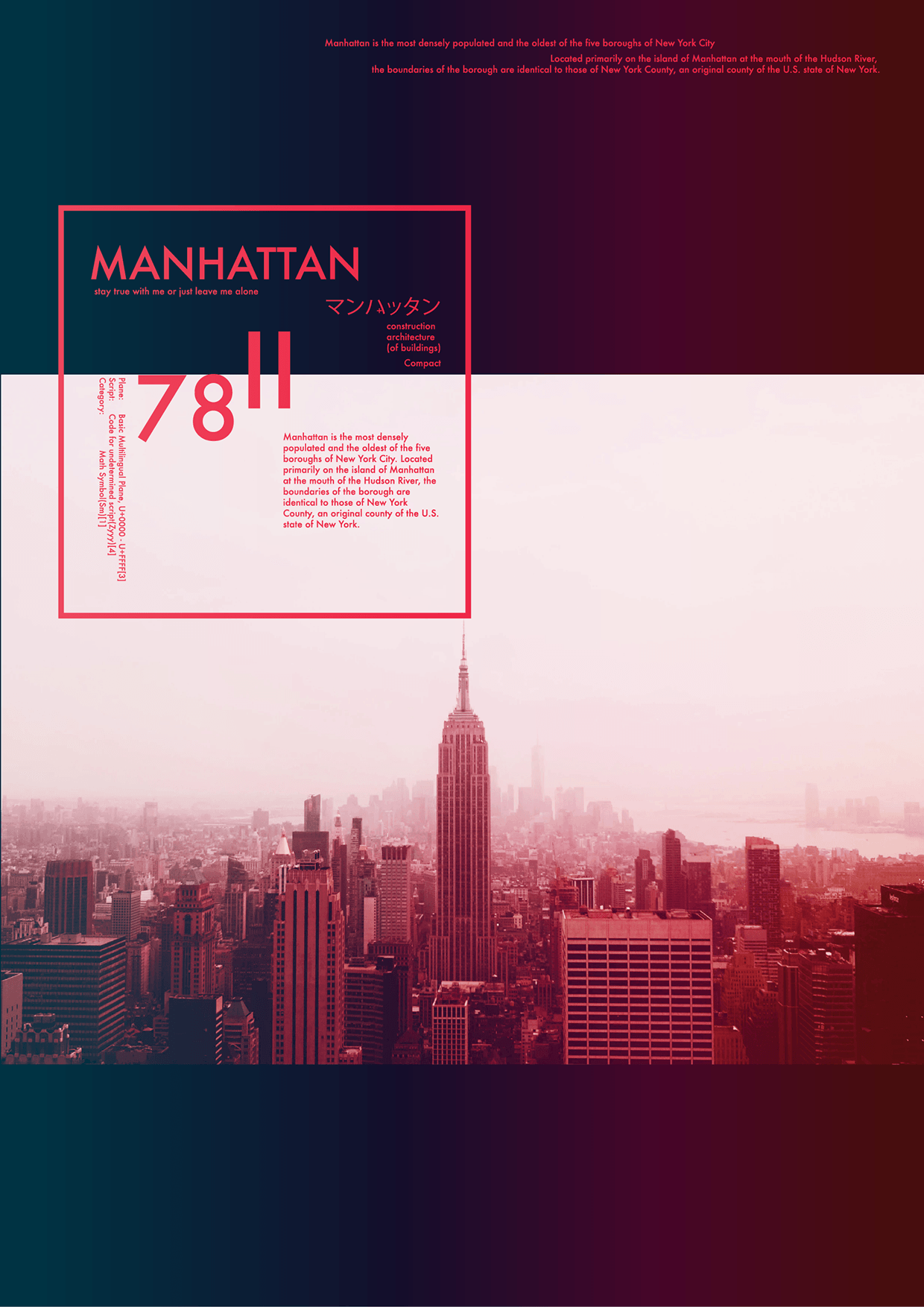
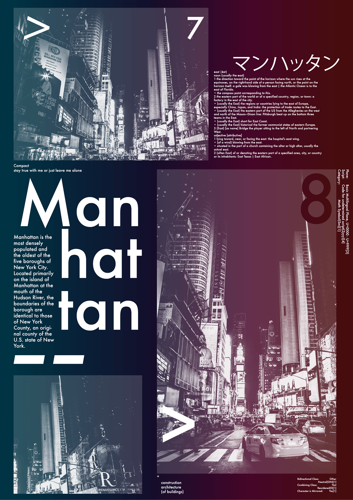
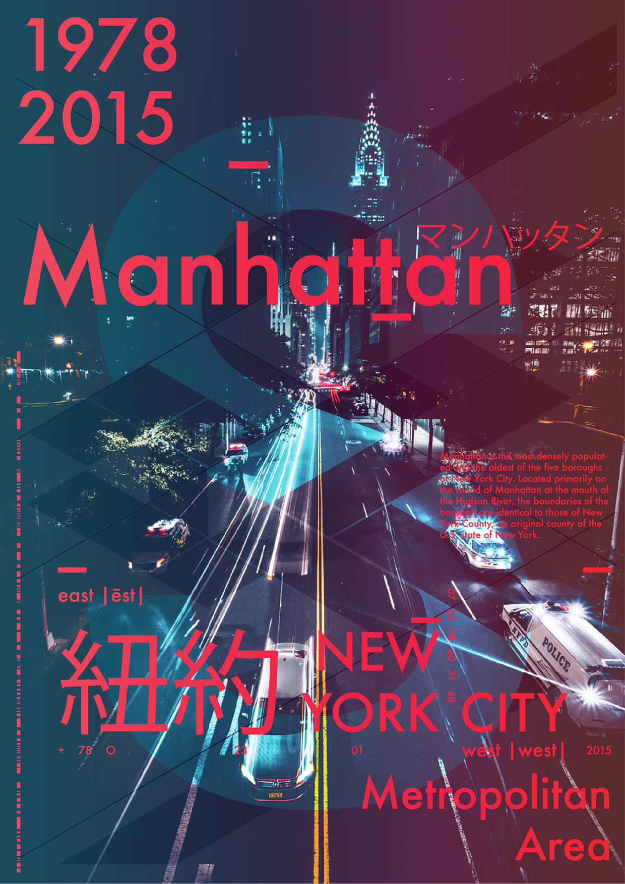
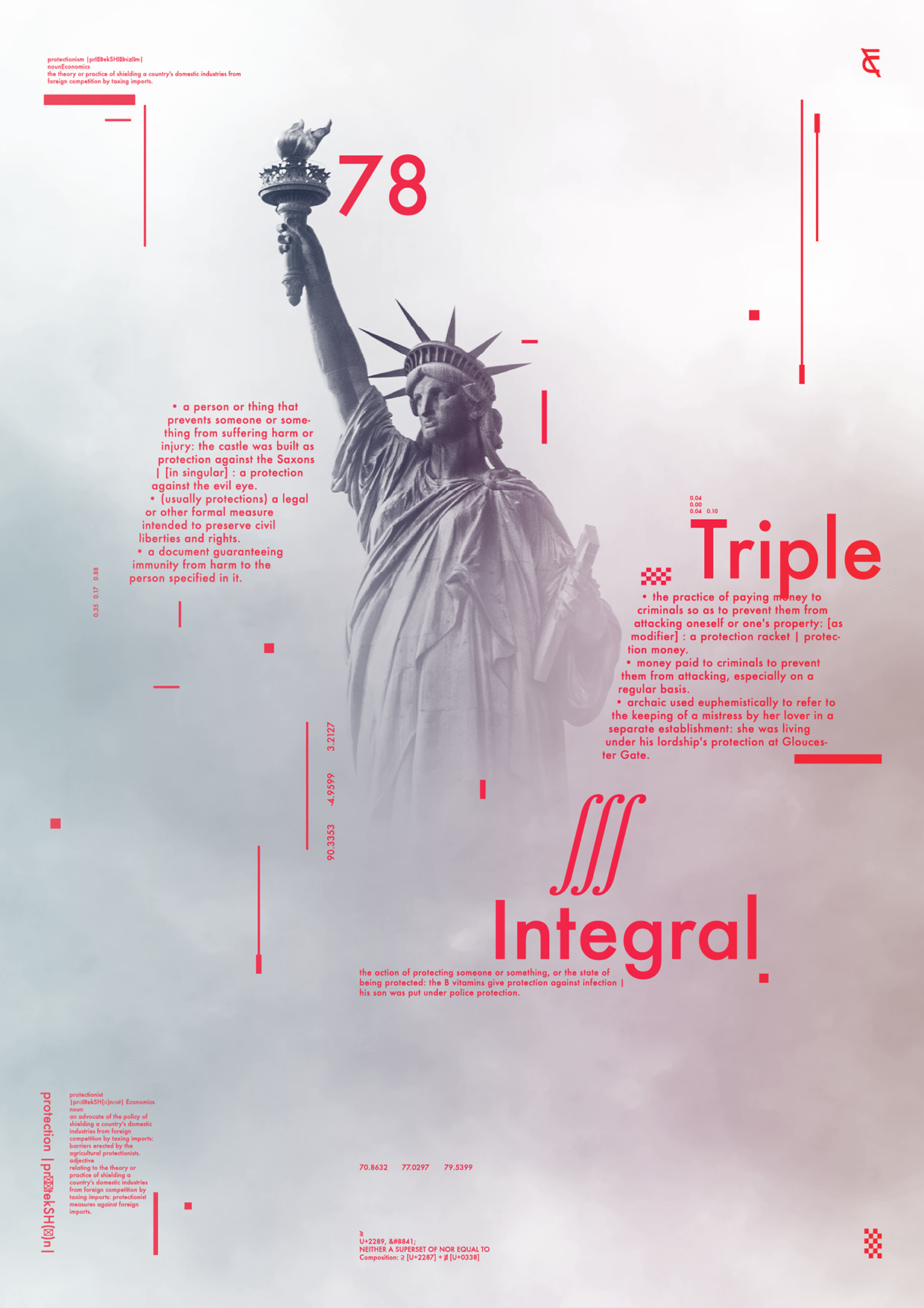
Dive into a 20-year career retrospective with this experimental poster series: "Manhattan 1978 / 2015." This collection of 8 posters is a visual exploration of how typography, light, and geometry can capture the contrasting moods of a single, iconic city across four decades. The Concept: Using bold typographic structures and a limited color palette (deep reds, cool blues, stark white), I aimed to fuse the vintage, chaotic energy of late 70s urban life with the sleek, organized rhythm of the modern metropolis. Each poster uses a unique grid system, born from my long experience in high-volume textile pattern design, bringing order to the urban sprawl. Serkan Kösemek is a Graphic Designer and Creative Technologist. He is the founder of Nospoon Visual Lab, a studio dedicated to exploring the boundaries of textile design, brutalist typography, and urban aesthetics.
Support this project
Upvote