DAZE - Coffee Brand Identity

by Orbix Studio · Jul 2026
shot
Project description
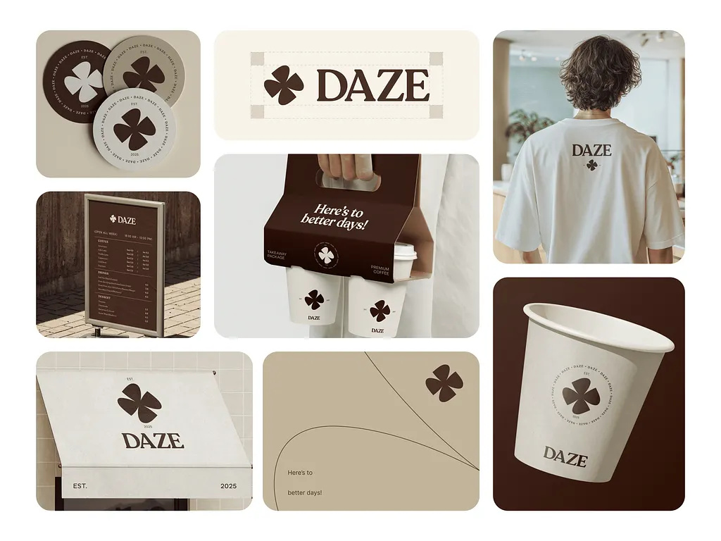
DAZE is a modern coffee brand identity designed around warmth, simplicity, and everyday rituals. The visual system combines a timeless serif wordmark with a distinctive four-petal symbol, creating a memorable identity that feels both premium and approachable. A rich palette of espresso brown and soft cream reinforces comfort, craftsmanship, and quality across every touchpoint. From takeaway cups and packaging to café signage, apparel, and print materials, every application was designed to deliver a cohesive brand experience that customers instantly recognise. A branding system created for cafés and lifestyle businesses that believe great design should feel as comforting as the coffee itself. Designed by Orbix Studio. ☕
Support this project
Upvote