Liminal Studio - Minimal Architecture Brand Identity

Project description
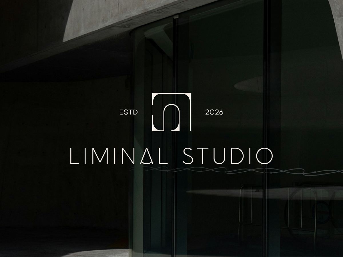
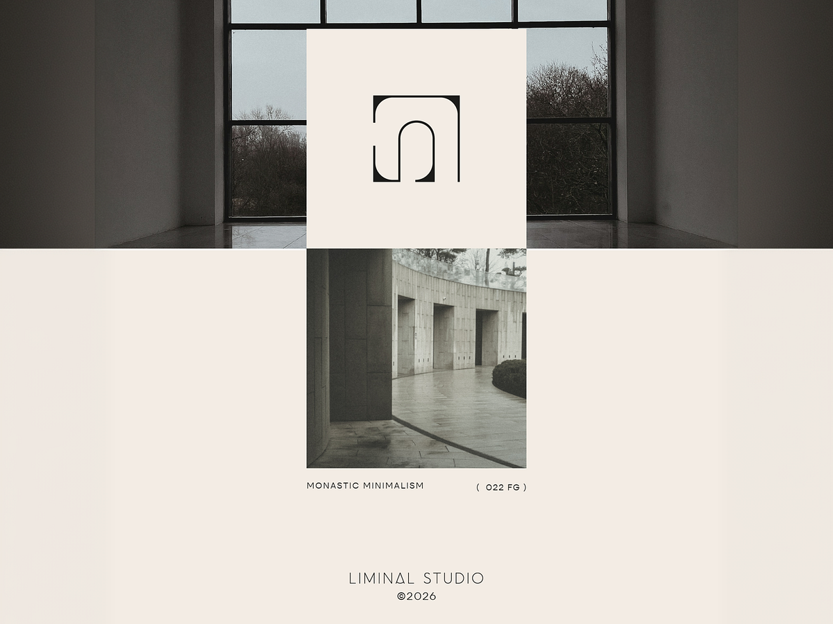
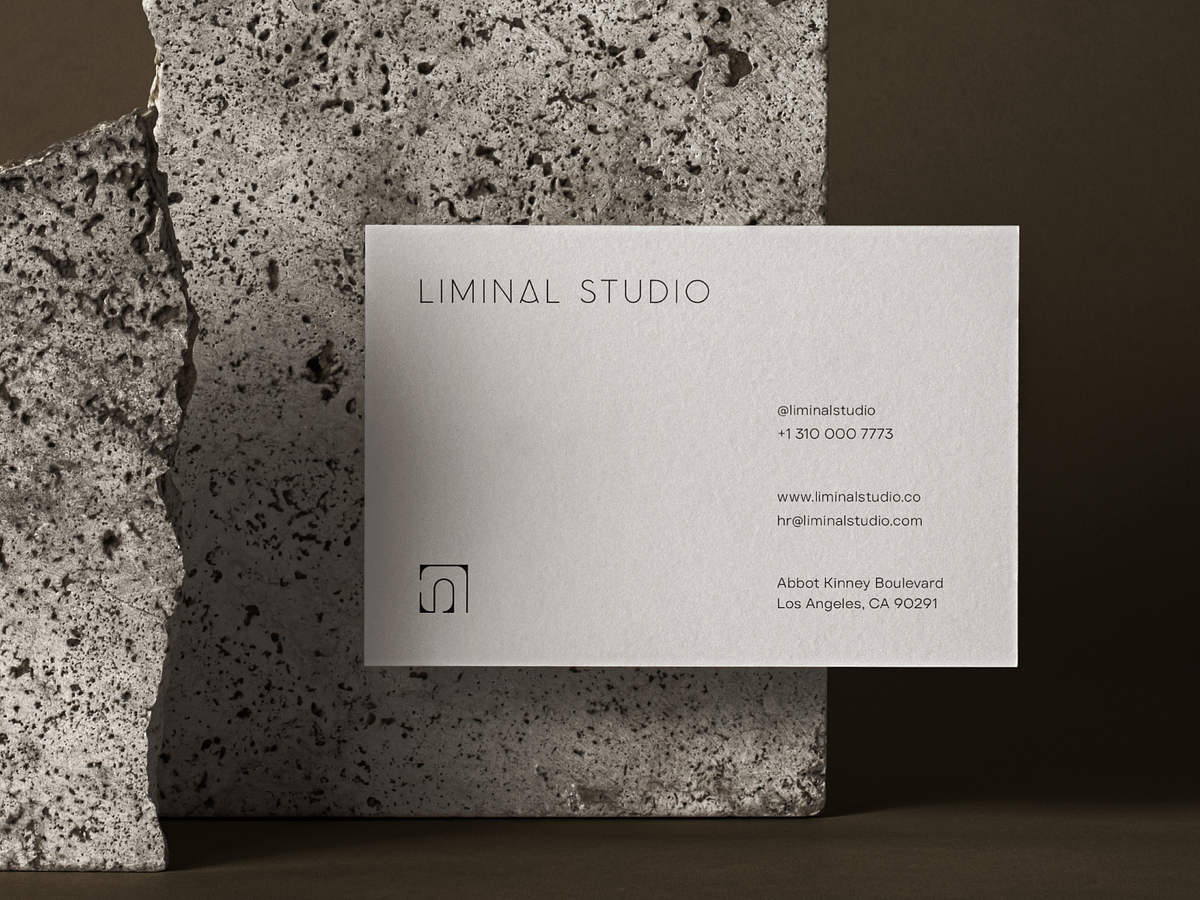
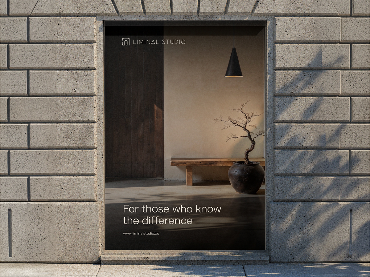
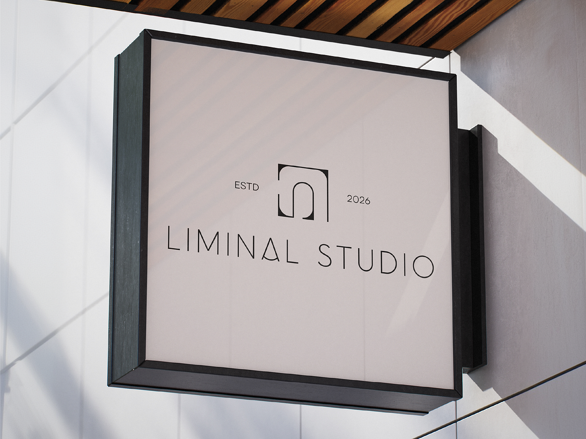
Turns the noise of visual identity into something you can hear in a quiet room. Most studio brands try to say everything at once bold gradients, layered textures, competing typefaces. The result is loud but forgettable. You scroll past it. It doesn't land. We designed a single-mark system where every decision earns its place or doesn't exist. The logo is an arch and a negative space living in the same stroke. The palette is two values. The grid is one column. - One mark, one glyph, zero decoration - Off-white field with ink-black — the whole palette - Wide-tracked capitals, no weight variation - Photography that reads flat, grey, documentary - Every element is centred, nothing is competing One rule carried across every surface: if it doesn't need to be there, it isn't. Turns a studio brand from background noise into a room you want to stay in.


Support this project
Upvote