Ondine Jewelry Brand Identity & Packaging Design

Project description
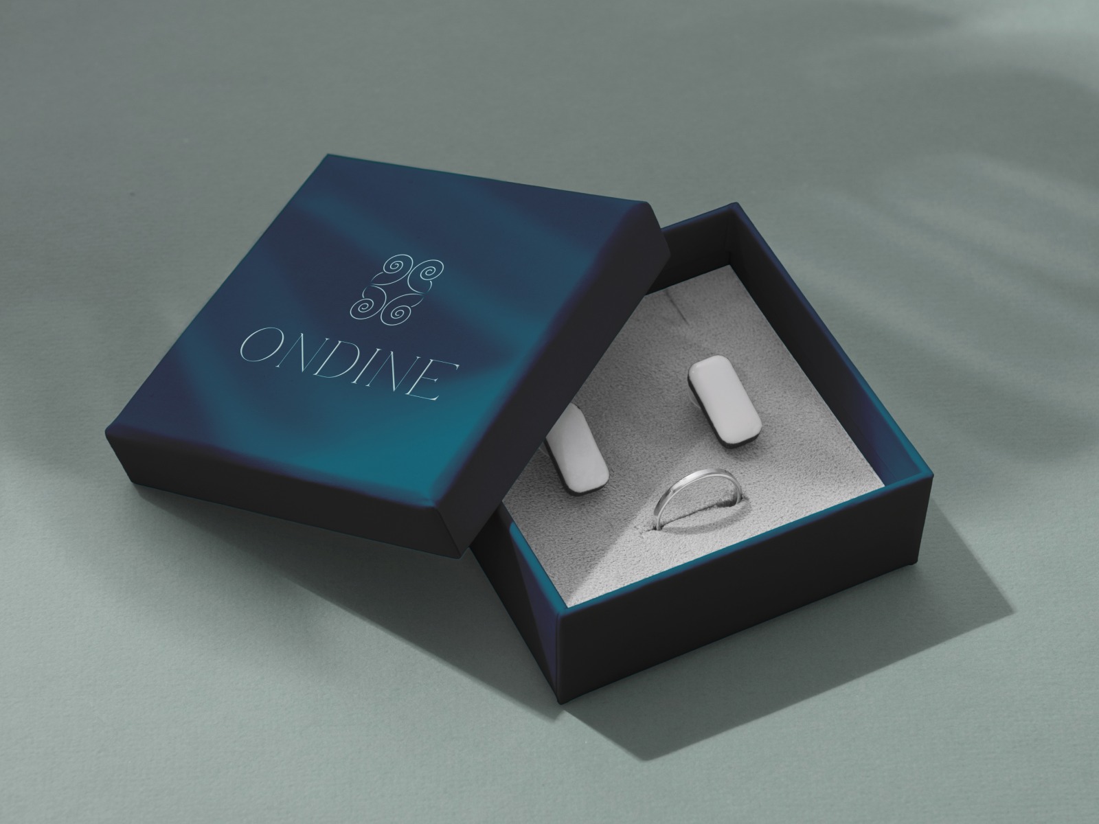
Luxury packaging often tries too hard. Too many patterns, loud finishes, and excessive ornament can make premium products feel less valuable instead of more. This concept takes the opposite approach by using restraint as the main design tool. A deep navy gradient lid creates a calm, elevated presence, while the silver embossed logo and Celtic-inspired symbol add identity without noise. Inside, the grey suede lining softens the experience and frames the jewelry with intention. What makes it effective: • Deep navy gradient instead of flat black for softer luxury • Silver foil mark used sparingly for premium contrast • Suede interior creates texture and tactile value • Clean layout keeps focus on the jewelry itself • Lighting and shadows enhance mood without added graphics The result is a packaging system that feels expensive, thoughtful, and emotionally memorable before the box is even opened.
Support this project
Upvote