SaaS Finance Mobile App Design | Money Tracker Design

Project description
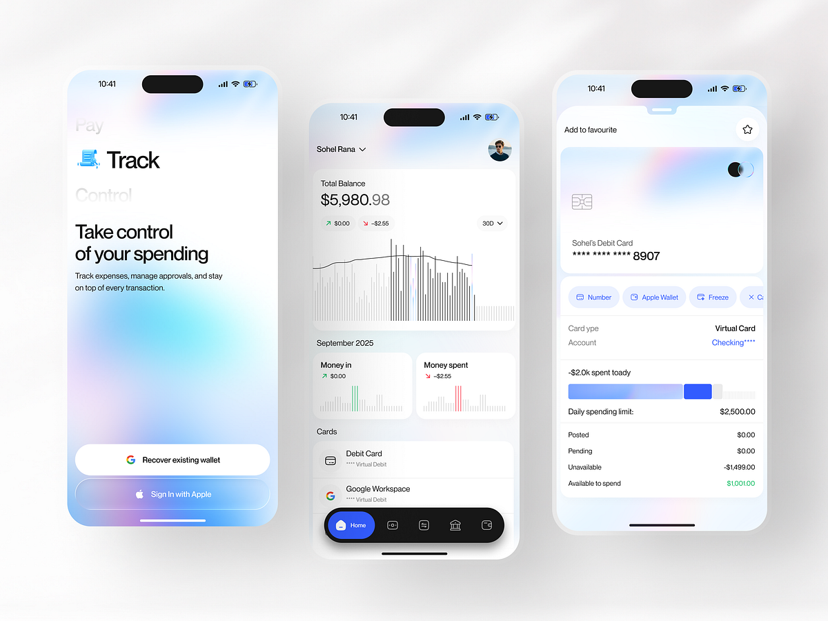
This finance app is designed to shift the focus from confusing numbers to feeling in control. Most money apps are too busy. They show tiny text, messy charts, and too many buttons at once. It feels like a math test and makes it hard to see what is actually happening with your money. We designed a cleaner, simpler system where the screen guides your eyes instead of distracting them. The layout uses clear, big text, simple cards, and bright colours to reduce stress and create a clear path to understanding your money: • Big balance displays instead of tiny, confusing numbers • Cards for spending to keep things safe and organised • Easy buttons to see where your cash goes • Simple steps to move from checking your balance to spending Each screen is designed to show one thing at a time, helping you understand your money, your limits, and your savings without getting overwhelmed. This approach turns a scary banking app into a fun, focused, and easy experience.
Support this project
Upvote