AI Tool Mobile App - All Conversations Screen Design

Project description
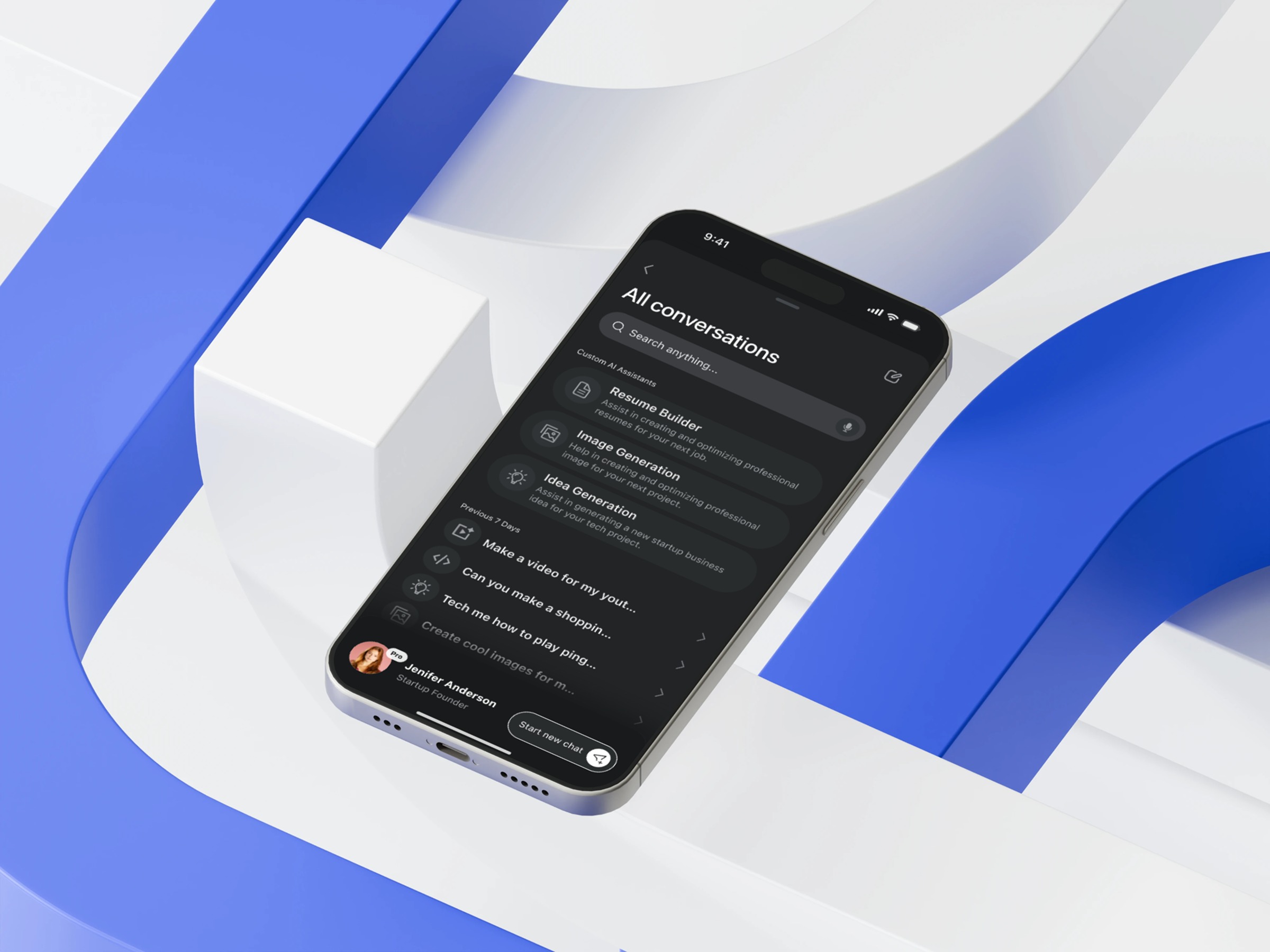
For this All Conversations screen design, I wanted to solve a common challenge: users often struggle to reconnect with older AI chats when the volume grows. Instead of adding more features, I focused on simplifying cognitive pathways. The hierarchy starts with clear titles, structured grouping, and subtle visual cues that help users distinguish between custom AI models and general conversation threads. The search bar is intentionally placed as the first actionable element, creating a seamless starting point for retrieval tasks. Dark mode enhances both comfort and contrast. It reduces visual noise and allows micro-details—spacing, iconography, and typography—to stand out in a calm, controlled way. Each decision aims to reduce friction and build confidence as users navigate complex AI workflows. This design asks an important question: how can we create order without overwhelming users with options? Which principle do you rely on most when simplifying complex user journeys?
Support this project
Upvote