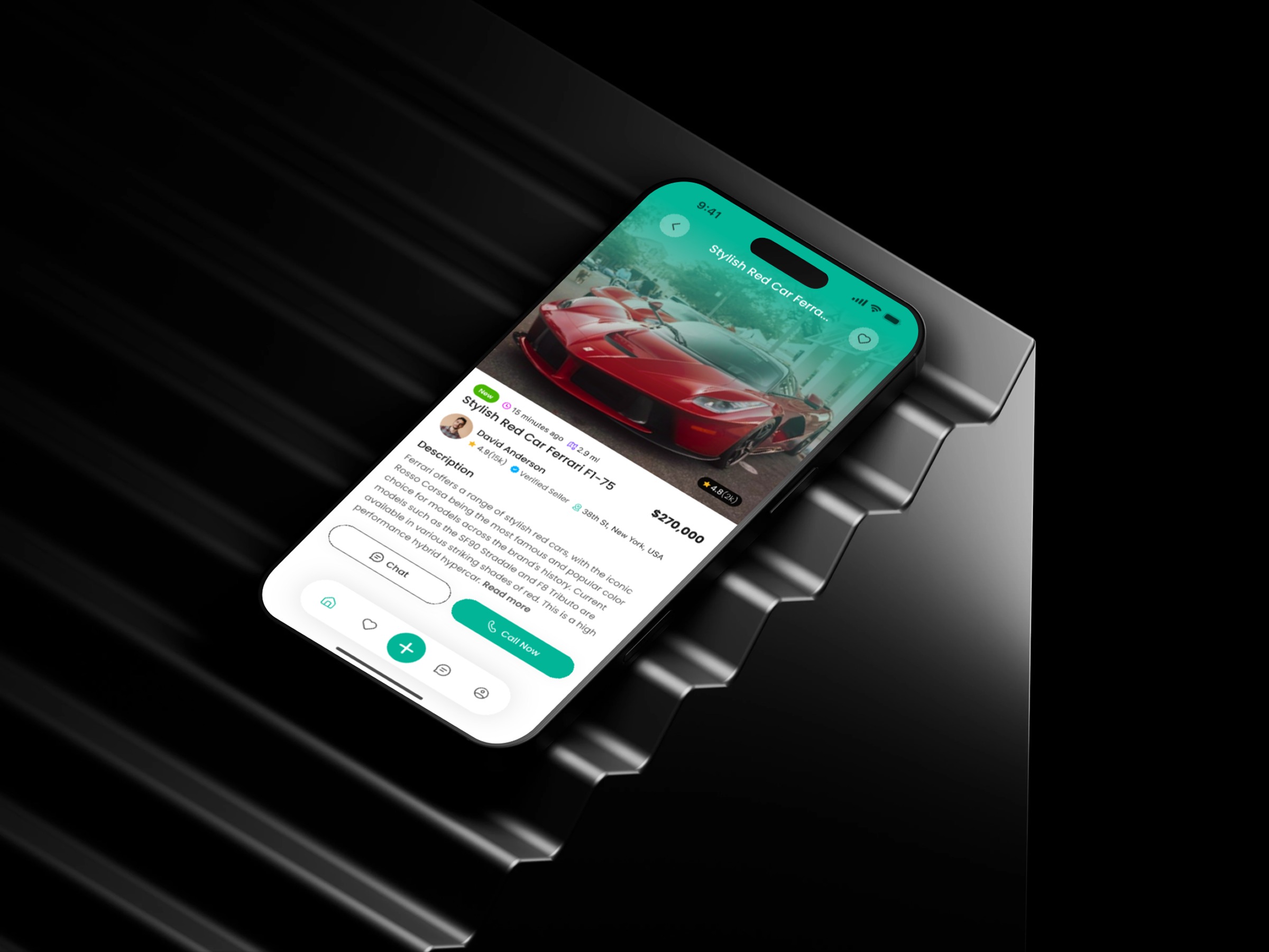
Classified Marketplace Mobile App - Product Details Screen
Project description
What makes a product details screen truly decision-ready? That question guided my process for this Product Details Screen design for a Classified Marketplace Mobile App. I started by mapping the buyer’s cognitive flow — what they look for first, what they worry about, and what triggers action. The layout places the product image at the top to create instant emotional engagement. Below it, I structured the critical information cluster: price, condition, and listing details. These markers help users validate the listing quickly, reducing drop-offs. Next came behavioral optimization. Marketplace users need fast communication options, so I positioned Chat and Call Now where the thumb naturally rests. This small ergonomic decision significantly increases interaction rates. I also simplified the visual density. Clear spacing, gentle shadows, and consistent typography remove friction and improve scan-ability. The goal was to help users understand the item in seconds — not minutes. In your experience, which UI UX detail influences your trust in online product listings the most?
Support this project
Upvote
