eCommerce Fashion and Apparel Mobile App - My Cart Screen Design

Project description
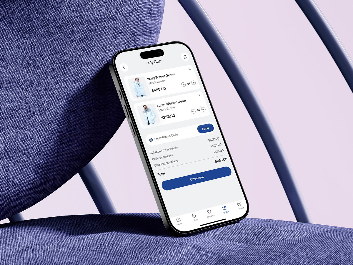
This Cart screen for an eCommerce Fashion and Apparel Mobile App was designed with one core UX goal: remove friction at the most sensitive stage of the buying journey. In fashion eCommerce, carts often become decision bottlenecks. Users review prices, second-guess quantities, and reconsider delivery costs. To address this, I focused on clarity, control, and reassurance. Each product card clearly shows the item, price, and quantity controls—allowing fast edits without leaving the screen. This reduces cognitive load and keeps users in a decision-ready state. The price breakdown is intentionally transparent. Subtotal, delivery fee, discounts, and total are visually separated to avoid surprise costs, which is a major cause of cart abandonment. The promo code entry is placed before the final total to reinforce savings at the right moment. The Checkout CTA is anchored and visually dominant, ensuring the primary action is always visible. This isn’t about pushing users—it’s about guiding them when they’re ready. What’s the biggest reason users abandon carts in your product today?
Support this project
Upvote