eCommerce Fashion & Apparel Mobile App - Home Screen Design

Project description
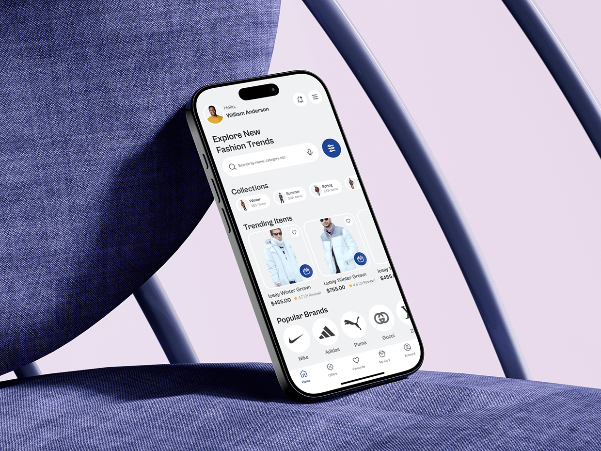
This eCommerce Fashion App home screen was designed by starting with user intent, not UI trends. From research, one insight stood out: most users don’t know exactly what they want—they want to discover. That insight shaped the entire structure of this screen. Instead of pushing filters upfront, the design leads with curated collections and trending items to reduce friction and decision paralysis. The hierarchy is intentional. Personal greeting builds trust, search remains accessible but secondary, and collections act as guided entry points. Each product card balances visual appeal with essential decision data—price, ratings, and quick actions—without overwhelming the user. Brand logos are placed lower in the flow to reinforce credibility after interest is established, not before. Spacing, contrast, and tap targets were optimized for mobile ergonomics to support one-handed use. This design focuses on clarity over complexity and momentum over noise, helping users move naturally from browsing to purchase. From your perspective, what’s the hardest UX challenge in fashion eCommerce—discovery, trust, or conversion?
Support this project
Upvote