eCommerce Fashion & Apparel Mobile App - Product Details Screen

Project description
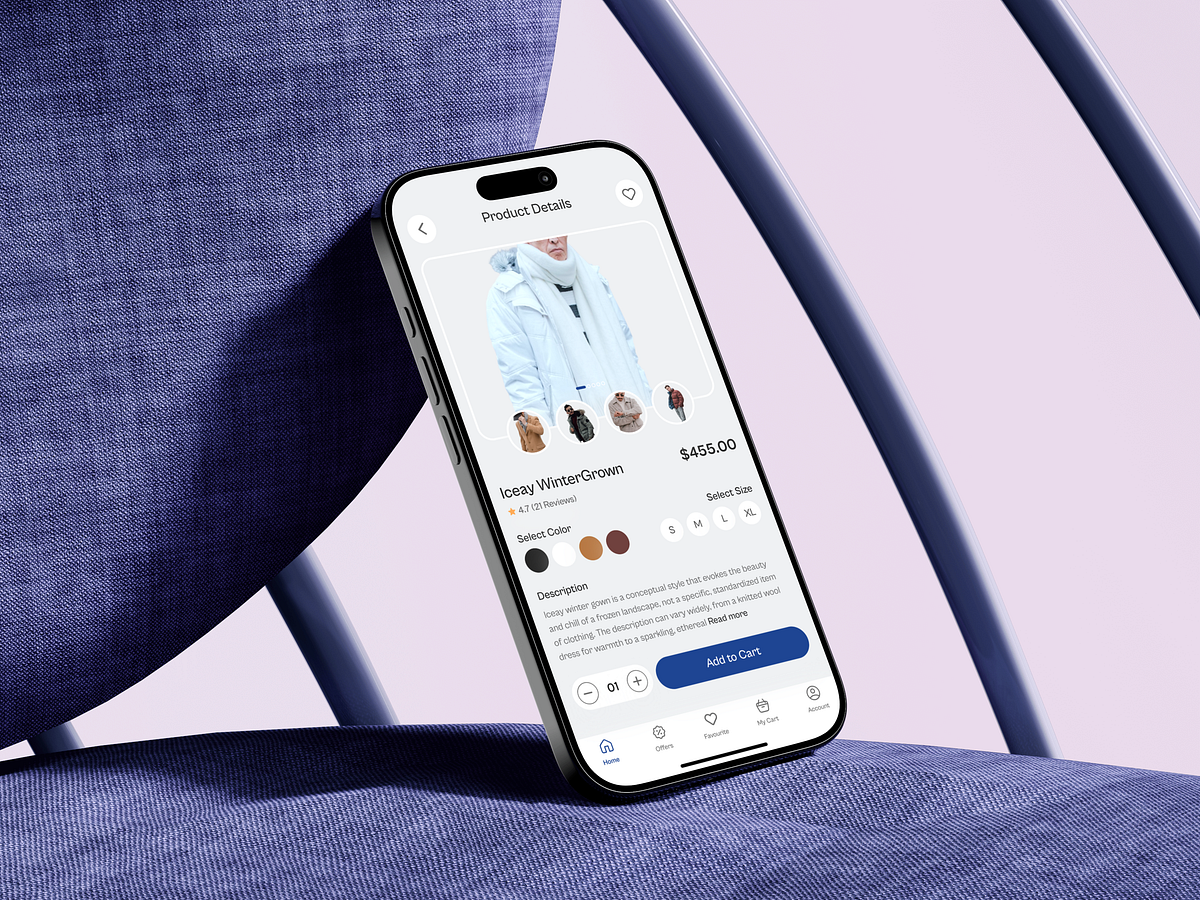
This product details screen of an eCommerce Fashion & Apparel Mobile App was designed around one critical moment: the decision to add to cart. In fashion eCommerce, this is where hesitation peaks. Users ask silent questions—Will this fit me? Do I trust the quality? Is this worth the price? My design process focused on answering those questions visually and progressively, without overwhelming the user. The hero image dominates first to build desire. Supporting thumbnails allow quick comparison without breaking context. Price and ratings appear early to establish value and trust before asking for commitment. Color and size selection are designed as friction points, so they’re made visually clear, thumb-friendly, and impossible to miss. The description is concise by default, expandable only when users want more detail—respecting both scanners and deep readers. The Add to Cart button stays visually strong and reachable, reinforcing momentum rather than interrupting it. This screen isn’t about adding features. It’s about removing doubt at the exact moment it matters most. What’s the one element on a product details screen that most influences your purchase decision?
Support this project
Upvote