eCommerce Marketplace Mobile App Home Screen Design

Project description
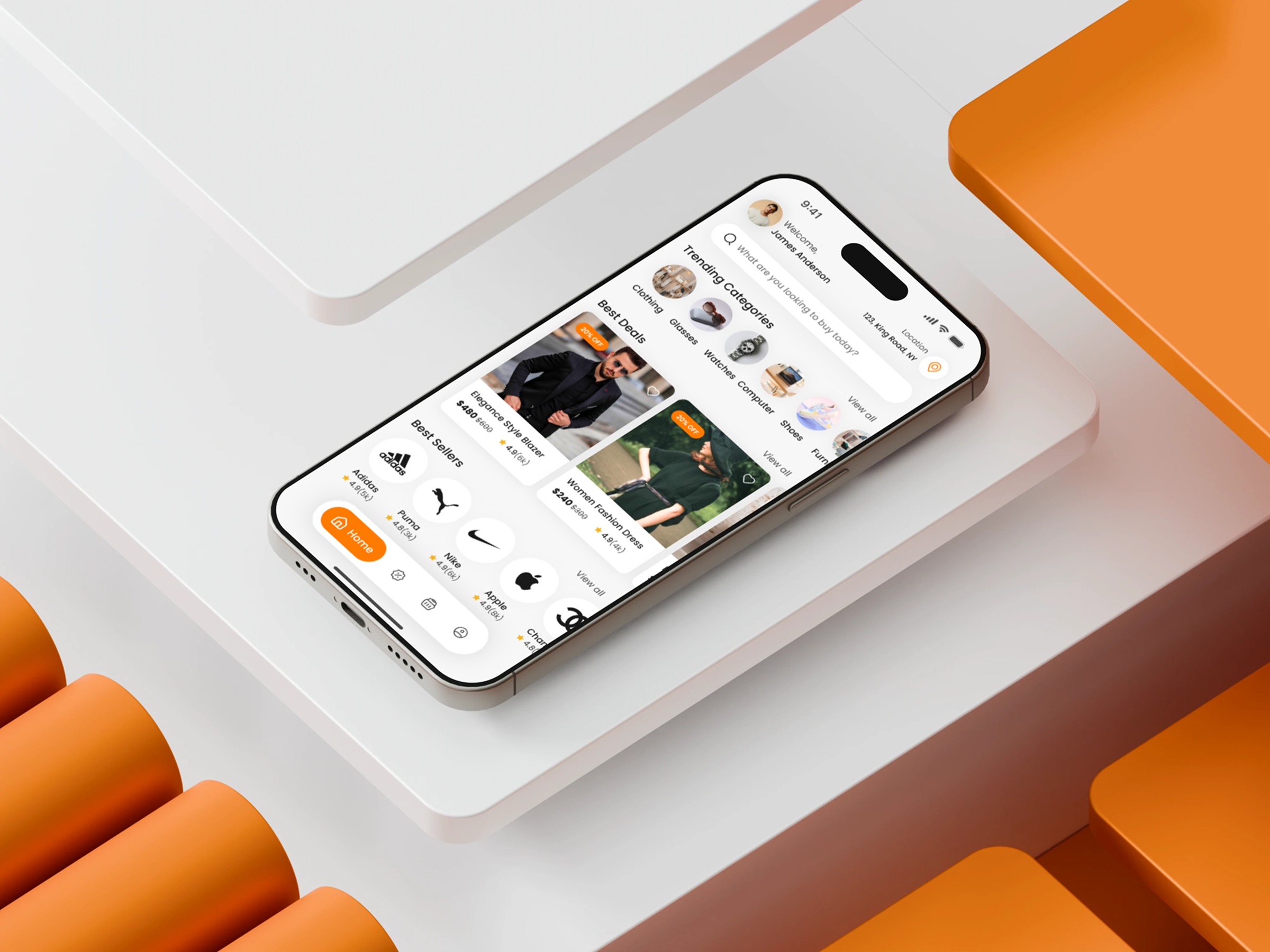
Just finished designing an eCommerce Marketplace Mobile App Home Screen with a strong focus on modern shopping behavior. Users today seek speed — not just visually, but cognitively. That became the core design direction. I arranged the layout around fast decision pathways: search-first interaction, horizontal category browsing, and modular product cards optimized for quick scanning. The challenge was creating structure without rigidity. I used a grid system that maintains order but still feels fluid and adaptable to different product types. Micro-hierarchies were key — the eye should naturally move from categories to deals to recommended items. Warm accents guide attention, while the white base ensures everything feels open and breathable. This design aims to reduce friction, inspire browsing, and build trust from the very first screen. If you could change one UX pattern in modern eCommerce Marketplace apps, what would it be?
Support this project
Upvote