eCommerce Marketplace Mobile App Product Details Screen Design

Project description
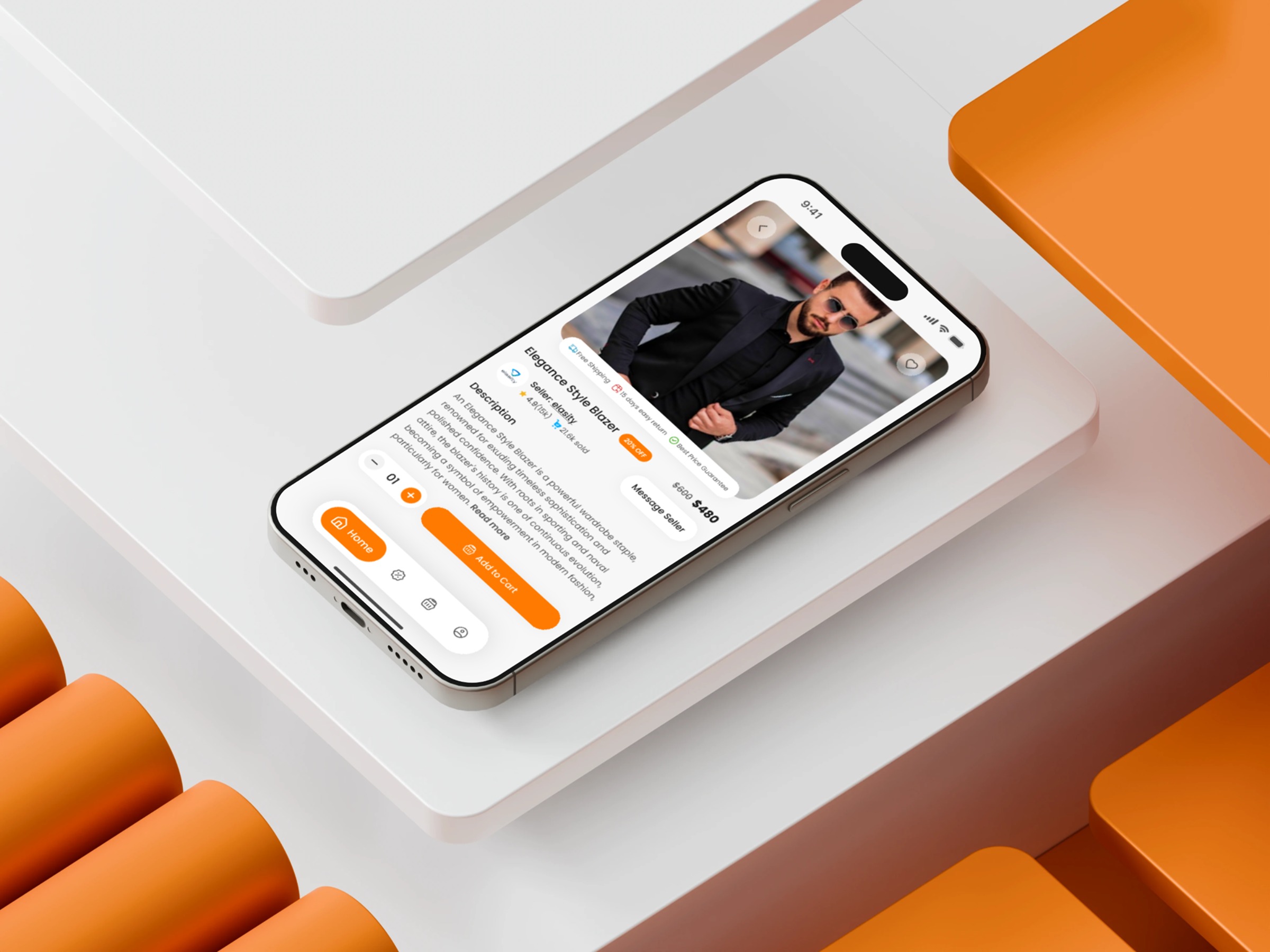
This Product Details Screen for an eCommerce Marketplace Mobile App was designed around one core insight: users make buying decisions faster when information feels predictable and emotionally reassuring. My challenge was to translate that insight into a clean, conversion-oriented layout. I led with a high-impact product image to anchor attention, then placed trust elements—reviews, rating, and brand info—directly beneath it. This reduces uncertainty early in the journey. The next challenge was organizing secondary content without clutter. I used clear typographic hierarchy and modular grouping to maintain flow and reduce scanning effort. Action elements like the quantity selector and “Add to Cart” button were intentionally separated to create stronger focus and minimize cognitive load. The interface uses warm contrast to highlight interactive zones without feeling aggressive. The goal wasn’t just aesthetics; it was creating a buying experience that feels seamless and intuitive. Which part of a product details screen do you think influences purchase decisions the most?
Support this project
Upvote