EdTech Online Learning Mobile App – Course Detail Screen Design

Project description
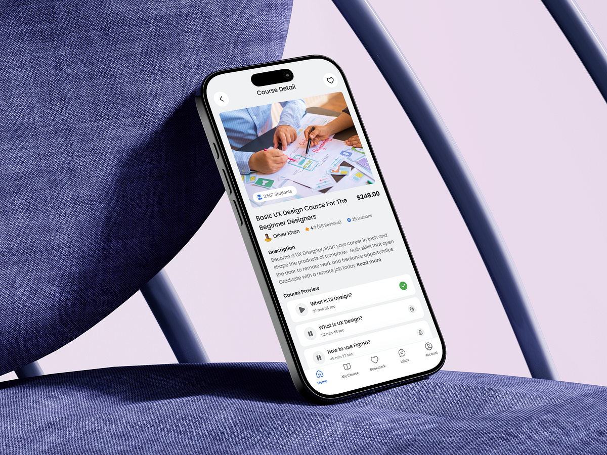
Designing this Course Detail screen for an EdTech mobile app was about answering one critical question for learners: Is this course worth my time and money? From a UX perspective, this screen acts as a decision checkpoint. I structured the layout to surface trust signals early—course image, title clarity, instructor credibility, student count, ratings, and lesson volume—so users don’t have to scroll endlessly to feel confident. Pricing is positioned clearly and without friction to avoid hidden surprises. The description is concise but purposeful, focusing on outcomes rather than marketing language. Below that, the lesson preview reduces uncertainty by letting users experience the learning style before committing. One of the biggest challenges was balancing information depth with cognitive load. The solution was progressive disclosure: show what’s essential upfront, then allow deeper exploration without overwhelming the user. This screen isn’t about persuasion through visuals—it’s about confidence through clarity. When users feel informed, conversions happen naturally. What single detail helps you decide fastest before enrolling in an online course?
Support this project
Upvote