EdTech Online Learning Mobile App – Home Screen Design

Project description
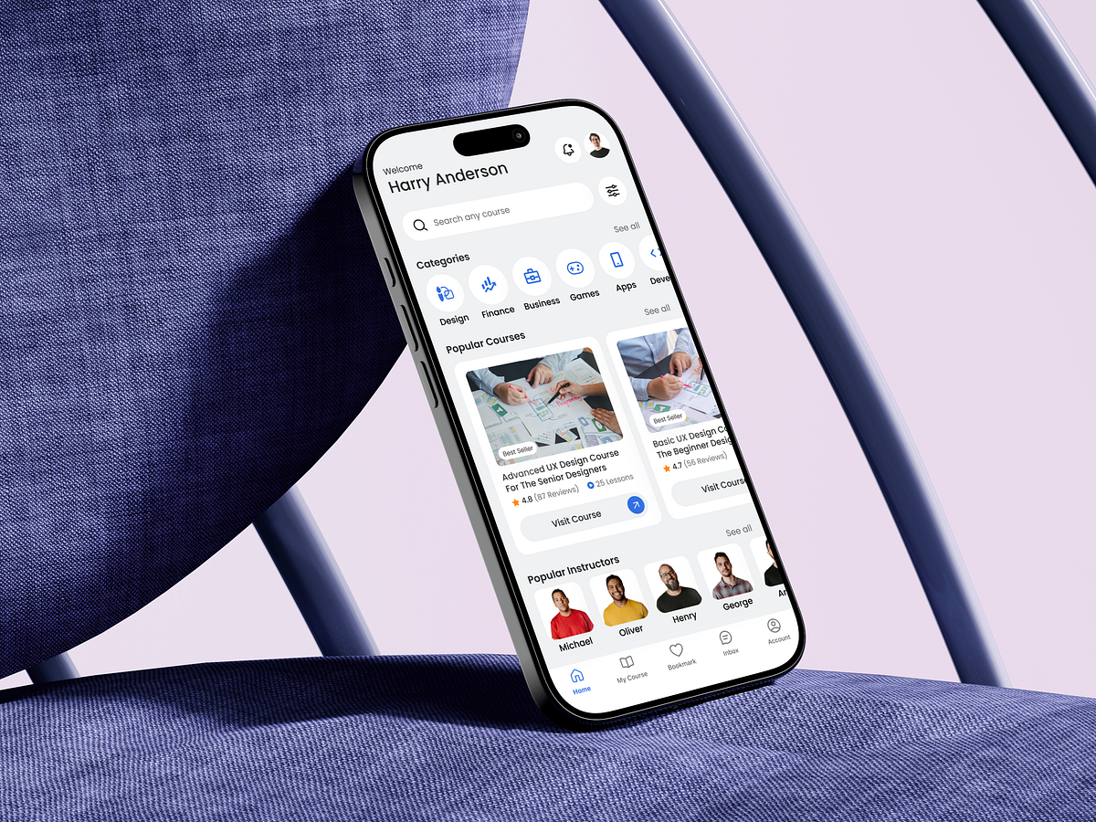
Designing this EdTech Online Learning Mobile App – Home Screen started with one core question: How do we help learners decide what to learn next in just a few seconds? The home screen is often the most overloaded surface in learning apps. My approach was to reduce cognitive load while increasing decision confidence. Instead of pushing everything at once, the layout follows a clear visual hierarchy: a welcoming personalized header, a prominent search entry, followed by structured learning categories and socially validated popular courses. Category icons are intentionally minimal and evenly spaced to support fast scanning. I avoided long text blocks and relied on recognizable visual cues so users can instantly identify their learning intent. Course cards balance credibility and clarity—ratings, reviews, and lesson counts help users evaluate value without opening details. One challenge was balancing exploration vs. guidance. To solve this, I placed popular courses and instructors strategically—supporting both self-directed discovery and system-assisted recommendations. This screen isn’t just about aesthetics—it’s designed to shorten time to learning, reduce drop offs, and gently guide users toward meaningful progress. If you were designing this home screen, what would you prioritize first: discovery, personalization, or motivation?
Support this project
Upvote