EdTech Online Learning Mobile App – My Course Detail Screen

Project description
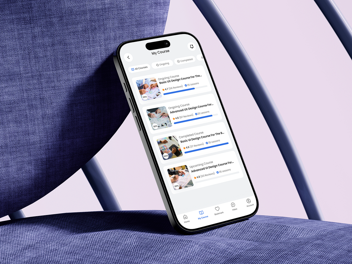
Designing the My Course screen wasn’t about listing content—it was about reducing learner anxiety. Most online learning apps fail after enrollment, not before. Users don’t quit because courses are bad; they quit because progress feels unclear and overwhelming. This screen was designed to fix that moment. I started by mapping learner intent: “What have I started?”, “What should I continue?”, and “What’s done?” That insight shaped the structure—clear course states (Ongoing, Completed, Upcoming) with visual progress indicators that remove decision fatigue. Progress bars are intentionally prominent. They create micro-motivation by showing momentum, not pressure. Ratings and lesson counts are secondary but visible—supporting trust without stealing attention from the main action: continuing learning. Card-based layouts keep scanning effortless, while consistent hierarchy ensures users never need to think twice about where they are. Even spacing choices were deliberate—to let content breathe and reduce cognitive load during repeated visits. This screen is less about UI polish and more about behavioral design—guiding users forward with clarity, confidence, and calm. How do you usually design progress visibility to motivate users without overwhelming them?
Support this project
Upvote